COMPANION
to
CORRELATION
is
UNDER CONSTRUCTION
by
Lubomyr Prytulak
©2006
First posted online 04-Apr-2003
Last updated 15-Feb-2006 23:54
Hit F11 on your keyboard to expand readable area.
|
Scientific research is divided into two great categories � correlational and experimental. Within the correlational category, the two most fundamental concepts are the correlation coefficient and the regression equation. These two concepts are the subjects of this book.
Since their introduction toward the end of the last century, the correlation coefficient, and to a lesser extent its companion, the regression equation, have permeated every branch of learning. After the mean and standard deviation, they are perhaps the most widely used of all statistical tools. Tens of thousands of them are published annually. Middle-priced hand calculators display them, no computation required on the part of the user, for any data one might care to punch in. They have escaped from the hands of experts, and passed into the hands of the people.
For tools of such central importance to scientific method and that find such widespread use, however, they receive surprisingly cursory treatment in research education. Following a demonstration of their basic equations and computations, statistics texts most often present a paragraph or two of cautions: see that the relationship is linear, don't generalize to untested values of the independent variable, don't jump to cause-effect conclusions, and little else. The result of such brevity of guidance is that as an interpreter of data � whether it be someone else's or his own � the student is left a babe in the woods. His evaluation of research is shallow and he remains blind to the grossest fallacies. It is in the midst of that darkness that the present book attempts to light a candle.
The premise on which this book is based is that to acquire minimal competence in the handling or the understanding of correlational data, the student must master not a few paragraphs of elaboration, but a whole book. This elaboration, furthermore, is necessary to a low-level understanding of no more than the correlation coefficient and the regression equation. For the more advanced topics that might be covered in an introductory statistics course � such as testing the correlation coefficient for statistical significance, computing confidence intervals for the slope of the regression equation, multiple correlation, or non-parametric measures of association � other elaborative texts will need to be written.
The present book is inspired by Campbell and Stanley's (1966) little masterpiece, Experimental and Quasi-Experimental Designs for Research. As their title suggests, Campbell and Stanley deal mainly with that other category of research � experimental. Nevertheless, they devote some nine pages to correlation, and those nine pages contain the clearest and most helpful introduction to the topic that I know of.
Campbell and Stanley's approach is unique in three ways. They focus attention on the very points that most often lead researchers astray. They demonstrate their principles non-mathematically, in graphs and tables rather than in equations. They illustrate their principles over a range of examples � hypothetical ones that offer the advantage of simplicity and clarity, and real ones that demonstrate relevance and applicability. The present book follows their example � it attempts to be practical, non-mathematical, and concrete. It differs from Campbell and Stanley in that it proceeds more slowly, in smaller steps, offers greater detail, and covers a much broader range of topics.
The chief use of this book, I envision, will be to complement and enrich a mathematical introduction to correlation and regression, of the sort that is offered in introductory statistics courses. The absence � or at least the scarcity � of formulas and equations within the body of the book carries the advantage of avoiding any clash of notations or approaches with those the student is learning in class. As data collection in science is typically numerical, it is impossible in attempting to understand such data to avoid some light mathematics, but this will never exceed an elementary-school level.
Upon thumbing through the book, the illustrations may seem daunting, and may suggest that a high level of mathematical competence will be required to understand them, but such is far from the case. Approached gradually, their meaning will be laid bare with less trouble than was imagined.
For the reader who happens not to be simultaneously enrolled in an introductory statistics course, however, the present book can be read alone. Comprehension does not depend upon being able to actually compute a correlation coefficient or a regression equation from raw data. In case such an independent reader does wish to be able to perform such computations, however, an appendix has been provided showing how he can do so. Buying a calculator that does the work is an alternative � for someone not going on to a mathematical study of the subject, little is to be gained from learning to work with the formulas when an easier way presents itself. However it is accomplished, though, being able to verify the various coefficients reported on the pages below may inspire the reader with confidence, and being able to calculate them for data of his own may encourage him to join the ranks of those who contribute to scientific knowledge.
The study of scientific method serves to reveal not only which instances of research conform to scientific method and which don't, but serves to reveal also which everyday utterances conform to scientific method and which don't. Scientific method is not merely a tool applicable to the laboratory, it is a tool applicable to all of life. Thus, one thing that can with confidence be expected from learning scientific method is that it will transform one's perception of everything that is said, and that the principles laid out in the present book will be discovered to have practical application many times each day. Many skills that one may acquire have some chance of eventually lying unused � we may study physics or chemistry or piano or photography or French or Computer Science � and may find that life takes us in directions in which our learning is rarely applied, but such an eventuality is impossible in the case of scientific method, as scientific method is the most powerful tool that mankind has discovered, and the most universally applicable. To fail to apply scientific method every day of one's life is to stop talking, stop reading, stop thinking, stop planning, stop trying to change the world.
In learning to apply scientific method either in the laboratory or out, one of the most useful skills is that of translating every problem into a table or a graph. Plentiful practice is provided for this skill, and the reader will benefit not only from following carefully what is said about each table or graph, but even more by creating new tables and graphs of his own. Some of what is written below is valuable primarily in teaching the skill of translating commonplace situations into tables and graphs, and if that were the only skill that were taught, it would be a valuable one.
Chapter 1
Basic Correlation and Regression |
Some Useful Idealized Data
An IQ test, let us imagine, is administered to 27 fathers. This IQ test is one on which it is possible to score from 0 to 20. The scores of the fathers come out as shown in blue in Display 1-1. That is, three fathers got 10, six got 11, and so on. The mean of all the father scores (we can compute, or simply see by inspection) was 12.
As it happens, each of these fathers had a single son, and the same IQ test was administered to each of the sons. As can be seen in red below, the son scores happened to distribute themselves in exactly the same way as the father scores � that is, three sons go 10, six got 11, and so on.
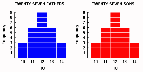
Display 1-1. The left frequency distribution shows imaginary IQ scores for 27 fathers, and on the right, for their 27 sons.
|
Now although it may seem that we have been told everything there is to know about the data collected, there is one piece of information still missing � the correlation between the IQs of the fathers and the IQs of the sons. The scatterplot in Display 1-2A shows one of the many possible correlations that is compatible with what we have been told so far. Display 1-2A, also, happens to resemble what we would be likely to find if we did carry out the imaginary study that we are discussing � we would find that father's and son's IQs were correlated, but not perfectly.
Which variable goes on the X axis?
In Display 1-2, we place father's IQ along the X axis and son's IQ along the Y axis � but why not the other way around?
Our convention will be to place on X whichever of the two variables is available for measurement earlier, and the other on Y. Thus, father's IQ goes on the X axis because normally we would be able to measure father's IQ years before the son is born.
Should the temporal rule not apply, we would place whichever variable seemed more likely to be the cause on X, and whichever seemed more likely to be the effect on Y. For example, if we found a correlation between coffee drinking and heart disease, we would place coffee drinking on X because we guessed that coffee drinking more likely caused heart disease than that heart disease caused coffee drinking.
If both of these rules failed, we would place whichever of the two variables was more stable on X, and the other on Y. In a correlation between height and weight, for example, we would place height on X because a person's height is more stable than his weight.
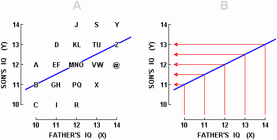
Display 1-2. A correlation of 0.50 between father IQ and son IQ � one of the many correlations that satisfy the distributional requirements for both fathers and sons laid down in Display 1-1. In both graphs above, Y is being predicted from X. In Graph B, individual data points have been omitted, and bent arrows showing prediction from each integer value of X have been inserted. Clumping of the arrows around the mean Y value of 12 constitutes the phenomenon known as "regression toward the mean."
|
To continue, we note that Display 1-2A contains the 26 letters of the alphabet along with the @ symbol. Each of these 27 symbols provides two pieces of information about each of the 27 father-son pairs � the IQ of the father, and the IQ of his son. Take point A, for example. By looking below it, we see on the X axis that the father scored 10, and by looking to the left of it, we see on the Y axis that his son scored 12. Or, in the case of point U, we see that the father scored 13 and his son also scored 13.
Usually, a scatterplot such as the one in Display 1-2A contains dots rather than letters. We are using letters right now because they make it easier for us to specify which data point, or which set of data points, we are talking about.
It is important to not forget that in Display 1-2A above (as well as Displays 1-3A and 1-4 below), the distributions shown in Display 1-1 continue to be representative of both fathers and sons. That is, we can see in Display 1-2A that three fathers scored 10 (points A-C) and three sons scores 10 (points C, I, R); six fathers scored 11 (points D-I) and six sons scored 11 (points B, G, H, P, Q, X); and so on.
Prediction
What would we do if after gathering the data in Display 1-2A, an untested father walked into the laboratory and asked us to predict what his unborn son's IQ will be?
If we did not know the IQ of this 28th father, the best we could do would be to predict that his son would have the mean IQ of sons in general, which is to say all the sons that we had ever measured � and that grand mean is 12. But if we tested this 28th father and found that his IQ was 10, we would change our prediction for this son to the mean IQ of all the sons whose fathers had scored 10 in the past. How many sons can we find, all of whose fathers scored 10 in the past? We can find three such sons, represented by points A-C. What was the mean IQ of these three sons? Son A had 12, B had 11, and C had 10; the mean IQ is (12+11+10)/3 = 11. We would predict, then, that the new father whose IQ is 10 will have a son whose IQ is 11.
Let's generate another prediction. Suppose that the new father turns out to have an IQ of 13. What do we predict his son's IQ will be? First, we locate all the sons whose father's scored 13 in the past. We find six such sons (points S-X). Next, we compute the mean IQ of these six sons: son S had 14, T had 13, U had 13, and so on, so that the mean is (14+13+13+12+12+11)/6 = 12.5. This mean is our prediction. That is, if the new father has an IQ of 13, we predict that his son will have an IQ of 12.5.
Generally, to predict Y when we are not given X, we predict the mean of all the Ys; and when we are given X, we predict the mean Y of all the points having that X. When we are given an X, then, that X tells us which column of data points to look at, and the mean Y of the data points in that column is our predicted Y. A "predicted Y," furthermore, is often written in the literature as a Y with an accent circumflex above it, but due to the difficulty of writing letters with an accent circumflex, the convention adopted here will be to write Yted, where "ted" stands for "predicted" and is contrasted with "tor" which stands for "predictor". A Yted, in our idealized data, is simply the mean Y of the data points in a given column. Note too that as in each column the data points are symmetrical above and below Yted, we can quickly learn to see Yted by inspection: it lies at the midpoint between highest and lowest data points.
Next, let us indicate the locations of the Yteds by drawing a line through them � this line is called a regression line. In Display 1-2A, the regression line is the positively-sloped blue line passing through the middle of the graph. If we are interested not in the original data, but only in being able to predict Y from X, we could use Display 1-2B which presents only the regression line (blue) and altogether leaves out the data points which told us where to put that blue line. In Display 1-2B, predicting Y from X would proceed by following one of the vertical red lines up to the regression line, then following that red line left. Readers wishing to know how to compute the equation of the regression line can consult Appendix C.
Regression Toward the Mean
In Display 1-2, we get our first glimpse of a curious phenomenon � whenever we predict a son's IQ, we predict he will be closer to average than his father. Thus, we see in either graph in Display 1-2 that fathers who score 10 have sons who average 11 � the dullest fathers have sons who are not quite as dull. At the high end of the X axis, we discover that fathers who score 14 have sons who average only 13 � the brightest fathers have sons who are not quite as bright. Our predictions are always less extreme, closer to average, or we may say "regressed toward the mean," which is why this phenomenon is known as regression toward the mean.
Let us be clear what regression toward the mean signifies. In a particular instance, we saw that the predicted 12.5 was closer to the mean of all the sons' scores than the predictor 13 was to the mean of all the fathers' scores. Restating this more generally, when Y is being predicted from X, regression toward the mean conveys that predicted Yted is closer to Mean-Y than predictor Xtor is to Mean-X. The predicted score is closer to the mean of all the predicted scores, than the predictor score is to the mean of all the predictor scores.
Regression Increases With the Extremity of the Predictor
Let us agree, to begin, on when a predictor is "extreme." A predictor is more extreme the father away it is from its mean. Thus, if the new father scores 12, that predictor score of 12 is not at all extreme, because it falls right on the mean. If the new father scores either 11 or 13, then that predictor is slightly extreme because it lies one unit away from the mean. And if the new father scores either 10 or 14, then that predictor is very extreme because it lies two units away from the mean.
Maximally extreme predictor. We have already seen that when the predictor is maximally extreme (10 or 14), the prediction regresses one whole unit � fathers who scored 10 (and so were two units below the fathers' mean) had sons who averaged 11 (and so were only one unit below the sons' mean), and fathers who scored 14 (and so were two units above the fathers' mean) had sons who averaged 13 (and so were only one unit above the father's mean).
Moderately extreme predictor. Let us note now that when the predictor is only moderately extreme (11 or 13), the prediction regresses less, only half a unit � fathers who scored 11 (and so were one unit below the fathers' mean) had sons who averaged 11.5 (and so were only half a unit below the sons' mean), and fathers who scored 13 (and so were one unit above the fathers' mean) had sons who averaged 12.5 (and so were only half a unit above the sons' mean).
Not at all extreme predictor. Finally, let us note that when the predictor is not at all extreme (when it is the mean, 12), then the prediction regresses not at all � fathers who scored 12 had sons who averaged 12.
That is why it is said that regression increases with the extremity of the predictor.
But from the very same data that demonstrates that the amount of regression increases with the extremity of the predictor, we are also able to conclude that the degree of regression is constant. That is, no matter what the extremity of the predictor, the extremity of the prediction will (in the data we are considering) be half as great, which is to say will be lower by a factor equal to 0.50, which for this particular set of imaginary data happens also to be the correlation coefficient, a concept that will be discussed further below.
In the context of our example, we predict that the son of an average father will be just like his father, that the son of an above-average father will be somewhat below his father, and that the son of a far-above-average father will be considerably below his father. Or, moving toward the lower end, we predict that the son of a below-average-father will be somewhat above his father, and that the son of a far-below-average father will be considerably above his father. But doesn't that sound like the sons are going to vary less than the fathers? It certainly might seem that way, but such a conclusion would be erroneous.
Regression Does Not Imply Decreased Variance
If Display 1-2 forces us to acknowledge that bright fathers are having duller sons and that dull fathers are having brighter sons, doesn't that imply that the sons are less variable � clumping closer around the average � than the fathers?
No, it does not. We have already seen � and can verify afresh in Display 1-2A � that in each generation there are three people who score 10, six who score 11, and so on. We know, therefore, that the sons vary exactly as much as the fathers. The sons varying less is an illusion. Our predictions for the sons do vary less than the predictor scores, it is true, but the sons' actual scores vary just as much.
What confuses us, perhaps, is that when the three fathers who scored 14 (points Y, Z, and @) manage to produce only a single son who scores 14 (point Y), it seems as if the next generation's quota of 14s is not going to get filled. But, as Display 1-2A reveals, three sons do manage to score 14 (points J, S, Y). One of these sons had a father who scored 14 (point Y); the other two sons had fathers who scored 13 (point S), and 12 (point J).
Thus, a 14-son is most likely to come from a 14-father (1/3 of all 14-fathers produced a 14-son), is less likely to come from a 13-father (1/6 of all 13-fathers produce a 14-son), and is still less likely to come from a 12-father (1/9 of all 12-fathers produced a 14-son. We see that although a 12- or a 13- father is less likely than a 14-father to produce a 14-son, because the number of 12- and 13-fathers is large (there are fifteen of them) compared to the number of 14-fathers (there are only three of them), it is the 12- and 13-fathers who contribute the majority of 14-sons. Thus, Display 1-2 shows that 2/3 of the 14 sons come from fathers who scored less than 14.
The principles of regression, then, tell us: (1) that the sons most likely to become brilliant are the sons of Bertrand Russell, Albert Einstein, and the like; (2) on the average, though, these sons will be less brilliant than their fathers; (3) the next generation's quota of brilliant sons will be filled mostly by fathers who are not themselves brilliant � not because such fathers have a better chance of producing brilliant sons (their chances are poorer), but because there are so many such fathers.
The same thing happens at the lower end of the X axis: (1) sons of the dullest fathers have the highest probability of being dullest themselves; (2) on the average, though, these sons will be less dull than their fathers; (3) the next generation's quota of dullest sons will be filled mainly by fathers who are not themselves dullest � not because such fathers have a better chance of producing dull sons (their chances are poorer), but because there are so many such fathers.
Regression Works Both Ways
Exactly the same principles hold whether we predict Y from X (as we have been doing above), or X from Y (as we are about to do below). To the English proverb, "A wise man commonly has foolish children," we are about to add our own, "A wise child commonly has foolish parents." The proverbs would become bulkier but more accurate if they were expressed with the following qualifications: "A wise man commonly has somewhat more foolish children, but still above average," and "A wise child commonly has somewhat more foolish parents, though still above average."
Tracing this phenomenon in the graph, we can imagine that instead of a 28th father, a 28th son walks into our laboratory and asks us to predict the IQ of his father. Before testing the son, the best we can do is to guess the mean IQ of all fathers (12). But if we test the son, we can venture a better prediction.
If the new son were to score 10 (his Y=10), then looking at Display 1-3A (which contains exactly the same data as Display 1-2A), we can restrict our attention to the mean of only those fathers whose sons scored 10 in the past. We see that there are three fathers whose sons scored 10 (C, I, R), and that as son C had a father with 10, "I" had a father with 11, and R had a father with 12, the mean father's IQ is (10+11+12)/3 = 11. Whenever sons got 10, their fathers averaged 11. If this does not have a familiar ring, you should go back a few pages and read up to the present point more carefully.
And now if, at the other extreme, the new son were to score 14 (his Y=14), we can quickly calculate that sons who previously got 14 (J, S, Y) had fathers who averaged 13.
Dull sons (whose mean is 10), in other words have fathers who on the average are not so dull (whose mean 11), and bright sons (mean 14) have fathers who on the average are not so bright (mean=13). What is going on?
Simply that regression works both ways. We find regression when we predict Y from X (Display 1-2) as well as when we predict X from Y (Display 1-3). If we put a line through the Xpredicted in each row in Display 1-3A, we get a regression line, only it is not the same one as before.
Generally, every scatterplot has two regression lines � one for predicting Y, as in Display 1-2 (known technically as the regression line of Y on X), and the other for predicting X, as in Display 1-3 (known technically as the regression line of X on Y). Display 1-3B, which contains the regression line for predicting X but not the individual data points from which the line originated, shows predictor scores on the Y axis leading to predictions on the X axis that are clumped toward the mean X of 12.
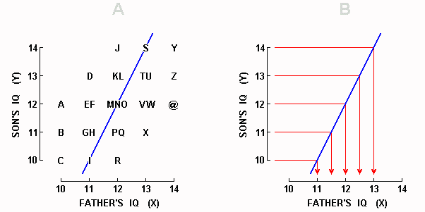
Display 1-3. The same scatterplot as in Display 1-2A, but this time with X being predicted from Y. Here, prediction starts from integer values of Y, and regression makes its appearance as the clumping around the mean X of 12 of the arrowheads which represent Xted values.
|
Having been forewarned by our discussion above, it is difficult for us now to be misled into supposing that fathers' IQs are less variable than sons' IQs � we know that predictions for fathers' IQs are less variable; actual fathers' IQs aren't; Xteds are less variable, Xs aren't. Remember that Xted stands for X-predicted.
Bi-directional regression is not merely an occasional phenomenon, or even a dependable one � it is inescapable. Whenever we have two imperfectly-correlated variables, we will find regression going from one to the other, and regression again on the way back. It is, as we shall see below, all around us. It is not surprising, then, that the phenomenon sometimes catches the attention of non-statisticians. Here, for example, is Woodrow Wilson addressing himself to a question which bears some resemblance to the one we have been discussing: What families will tomorrow's leaders emerge from?
Do you look to the leading families to go on leading you? Do you look to the ranks of men already established in authority to contribute sons to lead the next generation? They may, sometimes they do, but you can't count on them; and what you are constantly depending on is the rise out of the ranks of unknown men, the emergence of somebody from some place of which you had thought the least, to do the thing that the generation calls for. Who would have looked to see Lincoln save the nation? (cited in Padover, 1942)
That is, leading families tend to produce less-leading sons, and leading sons tend to emerge from less-leading families � that is simply regression in both directions, a phenomenon that is readily understood with the help of the scatterplots we examined above, but which without the help of graphs, seems mysterious and paradoxical.
Other Correlations
The correlation that we have been working with in Displays 1-2 and 1-3 is not the only one that is compatible with the distribution requirements for fathers as well as for sons laid down in Display 1-1. Display 1-4 repeats the correlation shown in Displays 1-2 and 1-3, but also shows four new correlations. But let us begin my locating in the monster graph below the two graphs with which we have been familiarizing ourselves above.
Our old Display 1-2 above can be found in Display 1-4B below. What is new is that instead of representing each father-son pair with a capital letter or an @, we now use a number to specify how many father-son pairs fall in each position in the graph. For example, points A, B, and C in Display 1-2A are now each represented by a 1 in Display 1-4B, points E and F are represented by a single 2, and points M, N, and O by a single 3. The blue arrows just above the X axis mark the five possible predictors � the Xtors � and the blue arrows just to the right of the Y axis mark the corresponding five possible Yteds.
In the same way, Display 1-4G summarizes Display 1-3. The difference between Displays 1-4B and 1-4G, then, lies not in the data but only in what is being predicted from what.
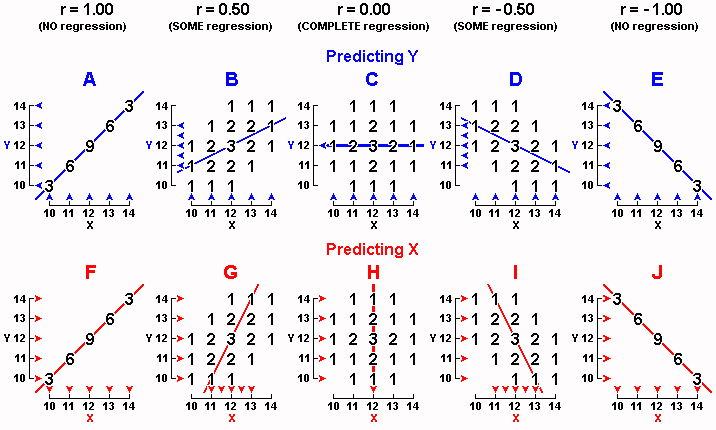
Display 1-4. Five different correlations between X and Y are shown when predicting Y (upper level) and repeated when predicting X (lower level). In every graph, both X and Y satisfy the distribution requirements laid down in Display 1-1.
|
Generally, Displays 1-4A to 1-4E on the upper level show five different correlations, and with Y always being predicted from X. Displays 1-4F to 1-4J on the lower level repeat the same five correlations, but this time with X being predicted from Y. And before we continue, one reminder: The frequency distributions shown in Display 1-1 do continue to hold for fathers as well as for sons in every single graph in Display 1-4. If you are unsure of this, stop now and convince yourself of it � in every graph, find three fathers who scored 10, then find three sons who scored 10, and so on.
Let's start by taking a look at Display 1-4A, in which we find that the three fathers who scored 10 all happened to have sons who scored 10; the six fathers who scored 11 all happened to have sons who scored 11; and so on. In other words, Display 1-4A tells us, "Like father, like son" � every son got exactly the same score as the father. This relation is referred to as a perfect positive correlation. If the numerical value of the correlation coefficient were computed, it would equal 1.00. Expressed another way, r = 1.00. Whenever all the dots in a scatterplot fall on a straight line having a positive slope, then r = 1.00.
Display 1-4E, to shift to the other extreme of what is conceivable, shows a perfect negative correlation: r = -1.00. In Display 1-4E, all the dots fall on a straight line having a negative slope. In a positive correlation, high values of X are paired with high values of Y; in a negative correlation, high values of X are paired with low values of Y. Thus, in Display 1-4E, every one of the three low fathers who scored 10 each had a high son who scored 14, and every one of the three high fathers who scored 14 each had a low son who scored 10. Display 1-4E indicates that dull fathers have bright sons and bright fathers have dull sons.
Generally, r is able to range from +1.00 to -1.00. At these two extremes, all the dots fall right on a straight line having a positive or a negative slope, respectively.
When the dots cluster around a positively-sloped line but do not fall right on the line (as in Display 1-4B), however, a positive correlation is said to exist, but the correlation is not perfect and the numerical value of r will fall between 0.00 and 1.00 (in Display 1-4B, r happens to be 0.50); and as the dots cluster more tightly around the line, the numerical value of r approaches 1.00.
Similarly, when the dots cluster around a negatively-sloped line but do not fall right on the line (as in Display 1-4D), a negative correlation is said to exist, but the correlation is not perfect and the numerical value of r will fall between 0.00 and -1.00 (in Display 1-4D, r happens to be -0.50); and as the dots cluster more tightly around the line, the numerical value of r approaches -1.00.
When the data show no tendency to cluster around any sloped line (as in Display 1-4C where the dots fall in a circle), no correlation, or a zero correlation, is said to exist, and r = 0.00. Any reader who is curious to compute r for himself can consult Appendices A and B.
Regression Increases as the Correlation Weakens
Returning to perfect-positive-correlation Display 1-4A, we see that fathers who scored 10 had sons who averaged 10, fathers who scored 11 had sons who averaged 11, and so on. In other words, there is no regression toward the mean.
And in perfect-negative-correlation Display 1-4E, fathers who scored 10 (two units below the mean) had sons who averaged 14 (two units above the mean), so that the sons were just as extreme as their fathers. Or, fathers who scored 14 (two units above) had sons who averaged 10 (two units below), so that again, the sons were just as extreme as the fathers. There is no regression toward the mean in Display 1-4E either.
In perfect-correlation Displays 1-4A and 1-4E, then, there is no regression � Yted is as far from mean Y as Xtor is from mean X. We are forced to conclude that when a correlation is perfect (positive or negative), regression vanishes. Regression occurs only when the absolute value of r is less than 1.00, which can be expressed as |r| < 1.00.
Looking, finally, at Display 1-4C where r = 0.00, we note that no matter what Xtor is, Yted = 12. When Xtor = 10, Yted = 12; when Xtor = 11, Yted = 12; and so on. When r = 0.00, then, we may say that regression toward the mean is complete. No matter what the father's IQ, we always predict the son's IQ to be 12.
Because predicting the overall mean Y is exactly what we do when we have no information on X, we may say that when X is unrelated to Y, knowing X is of no use in predicting Y � whether we know X or not, we end up predicting mean Y. A zero correlation has no predictive utility whatever.
The same thing happens when X is being predicted from Y in the lower level of Display 1-4: no regression when the correlation is perfect (Displays 1-4F and 1-4J), some regression when the correlation is less than perfect (Displays 1-4G and 1-4I), and complete regression when the correlation is zero (Display 1-4H).
Summary of Regression Phenomena
In summary, we may note that in Display 1-4's upper row of graphs where we predict Y, as we move in from the outer Graphs A or E toward the inner Graph C:
the correlation weakens,
the regression line approaches the horizontal, and
the arrows which mark Yted values cluster more and more tightly around mean Y.
Similarly, in Display 1-4's lower level of graphs where we predict X, as we move in from the outer graphs F or J toward the inner Graph H:
the correlation weakens,
the regression line approaches the vertical, and
the arrows which mark Xted values cluster more tightly around mean X.
We might also make the following observations with respect to the angle between the two regression lines:
to say that the regression lines for predicting Y and for predicting X are identical is to say that the correlation is perfect (compare the regression lines in Graphs A and F, or Graphs E and J);
to say that the two regression lines are perpendicular (at right angles) is to say that the correlation is zero (compare Graphs C and H);
and to say that the two regression lines fall between identical and perpendicular is to say that the correlation falls somewhere between perfect and zero (compare Graphs B and G, or D and I).
Examples of Real Correlations
Some actual correlations presented by Karl Pearson (1911, p. 21) are illustrative both of correlation magnitudes and as well of the diversity of variables that it is possible to correlate:
0.98 between the lengths of left and right femurs in man;
0.55 between a man's weight and his strength of pull;
0.21 between the size of family of mother and daughter;
0.05 between the length and breadth of Parisian skulls.
The above 0.05 correlation between length and breadth of Parisian skulls seems low when one considers that a child's skull will give two small numbers, and an adult's skull two large numbers; or a woman's skull will tend to give two numbers that are smaller than those given by a man's skull; or more generally that a person who is small for whatever reason will give two numbers that are smaller than those given by a large person � all of which should tend to produce a high correlation between length and breadth. One might conjecture, then, that the sample of skulls Pearson examined tended to be homogeneous, as perhaps all skulls of adult males, and that had he included measurements from children and women and dwarves and giants, then his correlation coefficient would have been high. One conclusion arising from questioning this strikingly low correlation � practically zero � is that it is not simply the case that two variables enjoy a single correlation, but rather that the correlation between them depends upon, among other things, the sample from which the data originate, a topic discussed in greater detail in Chapter 9 on the topic of Correlation Representativeness.
In the area of family resemblance in IQ, we may note (from Jensen, 1969, p. 49) that the father-son correlation that we have been considering above is indeed likely to be around 0.50, and is also likely to be equivalent to the father-daughter, mother-son, and mother-daughter correlations. The correlation between the IQ of a parent when a child and his own child is a bit higher, 0.56. Monozygotic twins give 0.87 when reared together, and 0.75 when reared apart. Siblings give 0.55 when reared together, and 0.47 when reared apart. Uncle (or aunt) and nephew (or niece) give 0.34. Grandparent and grandchild give 0.27. First cousins, 0.26; second cousins 0.16.
Nonsense Correlations
It is not uncommon for correlations of surprising magnitude to turn up between variables which seem to be unrelated. For example, Kerlinger and Pedhazur (1973, pp. 16-17) recorded the amount they smoked while writing different sections of their book, Multiple Regression in Behavioral Research. Later, the authors asked judges to rate the clarity of 20 passages from the book. The correlation between amount smoked while writing a passage and the clarity of that passage was a rather large 0.74. Similarly, Yule and Kendall (1950, pp. 315-316) report that from 1924 to 1937, the correlation between annual number of wireless receiving licences and number of mental defectives per 10,000 population was the almost-perfect 0.998, as well as that moving from north to south across Europe would probably produce a negative correlation between proportion of Catholics and average height.
Such cases are likely to be explained in one of the following ways:
Perhaps the variables are indeed interconnected in some hitherto unanticipated manner.
The correlation is spurious, and will not be replicated at other times or in other places.
A low underlying correlation is being inflated by any of several methods, as will be discussed farther below, such as deletion of moderate values, or the presence of one or more outliers.
An error in computation.
Perhaps the surprisingly-high correlation coefficient is a fabrication.
Linear Transformations
Display 1-5 shows two graphs, each having the familiar r = 0.50 data in Display 1-2A. The only thing that has been changed is how we label the axes. Our point here is that relabelling axes changes neither the correlation coefficient nor any of our conclusions concerning regression.
In Display 1-5A, first of all, we suppose not only that the sons are more intelligent than the fathers (the sons' mean has now shot up to 16), but that they are more variable as well (the sons' range is now 16 compared to the fathers' range of 4). These two changes, however, affect none of our conclusions � the correlation coefficient continues to be 0.50, and regression can still be found. In the case of X = 14 and Yted = 20, for example, the prediction of 20 is less extreme (three sons scored higher) than the predictor of 14 (no father scored higher).
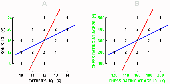
Display 1-5. The familiar r = 0.50 correlation is reproduced within both Graphs A and B, the only difference from previous graphs being how the axes are labelled, where label innovations are shown in green.
|
We qualify somewhat how we decide extremity. We decide a given score is more or less extreme on an axis not by looking at the units or the labels along that axis, but by looking at the given score's standing within its distribution � the fewer scores that exceed it, the more extreme it is.
No matter what the axis labels and units, we are always safe to expect that a predictor will be more extreme than the corresponding prediction. What we are not always safe to expect is that a high predictor will be higher than its corresponding prediction (or that a low predictor will be lower than its corresponding prediction). Thus, in Display 1-5A, the Xtor = 14 is more extreme than Yted = 20, but it is not higher. Xtor = 14 is more extreme because no father scored higher, and Yted = 20 is less extreme because three sons scored higher.
In the early Displays 1-2 and 1-3, we grew used to assuming that the value of a high predictor will be greater than the value of its corresponding prediction, but we were safe to do this only because X and Y had the same means and deviations about the means. When these conditions are not met, as in Display 1-5, we fall back on the safer and more general principle that the predictor will be more extreme within the distribution of predictor scores than is the prediction within the distribution of predicted scores.
Why, now, is this section titled "Linear Transformations"? Because the change of axis labels in Display 1-5 can be considered to be the result of multiplying the original labels by a constant, then adding another constant. For example, the Y axis in Display 1-5A can be viewed as the result of multiplying the X axis by 4, then adding -32; or Yted = 4Xtor - 32; which would be more conventionally, and succinctly, expressed as Y = 4X - 32. This method of transforming a dimension is referred to as a "linear transformation" because when the transformed units are plotted against the original units, they produce a straight line, as for example the blue regression line of Y = 4X - 32 in Display 1-5A.
We are able to express our conclusions both more succinctly and more precisely, then, by saying that a correlation coefficient is unaffected when one or both dimensions undergo a linear transformation. Another way of viewing a linear transformation is that it gives a dimension a new mean, or a new variance, or both, and that the correlation coefficient is insensitive to transformations of either the mean or the variance. Two qualifications, however, must be made. First, a transformation that involves multiplying by a negative value leaves the numerical value of a correlation coefficient unchanged, but reverses the sign. Second, a transformation that involves multiplying by zero leaves a variable that no longer varies, which results in an undefined correlation, a topic touched upon again in Chapter 9.
It is time now to test our understanding of linear transformations with a riddle. A researcher, we imagine, is investigating the relative contributions of heredity and environment to IQ. He takes one of his observations as suggesting a genetic component � the observation that mother-child IQ was 0.50. In an attempt to demonstrate the importance of environment, he subjects the children to an IQ-enrichment program, but is disappointed that when IQs are re-measured, the mother-child correlation continues to be 0.50. His conclusion: "Even two years of the most advanced IQ-enrichment program that we know how to provide" we imagine him writing "has failed to shake the iron grip of heredity on intelligence." In view of what we have just been discussing, is this researcher's conclusion justified?
Not at all. If, for example, the IQ-enrichment program had been wildly successful in that each child's IQ had increased 20% (multiply each IQ by 1.2), and also further increased by 20 points (then add 20), the children's IQs would have undergone a linear transformation which would not change the correlation of those IQs with any other variable, such as mother's IQ. Because the correlation coefficient is insensitive to changes in either the mean or the variance of its variables, even the astounding changes that we are imagining would leave the correlation coefficient unweakened. This researcher is performing the wrong analysis to answer the question he is asking, and in fact appears to be trying to conduct an experiment, which will be discussed in a separate volume.
Autocorrelation and Lag Correlation
One way to get two variables for a scatterplot is to measure something twice with a fixed time interval between measurements, which produces an autocorrelation. Measuring children's IQs on one occasion, and then say two years later, would be an example. Display 1-5b shows an imaginary autocorrelation with a lag of ten years.
Another way to get variables is to measure two different things with a fixed time interval between measurements, which produces a lag correlation. Measuring people's IQs, then measuring their incomes two years later, would be an example.
In the case of autocorrelation, our usual finding is that the two scores are positively, but less than perfectly, correlated. Also, the greater the interval of time separating the two measurements, the lower the correlation is likely to be.
For example, when the closing price on the New York Stock Exchange of shares of Ford Motor Company are correlated with the same closing price the following day, r = 0.94; five days later, r = 0.69; ten days later, r = 0.45; and thirty days later, r = 0.12.
In the case of adult IQ, an immediate retest is likely to give a correlation of 0.90 with a fall of about 0.04 units per year, so that with a five-year interval, the correlation would be around 0.70 (Thorndike, 1933; Eysenck, 1953).
A similar principle holds in the case of lag correlation � the longer the interval between measurements, the more is the correlation likely to approach zero. Demonstrating that this effect can hold even over very short intervals, Stockford and Bissell (1949, p. 104) report that the rating given an item on a questionnaire was correlated 0.66 with the following item, 0.60 with the item after that, and so on until when five or more items intervened, was correlated 0.46.
Gain Scores
In autocorrelations, if (in the phenomenon known as regression toward the mean) low initial scores rise and high initial scores fall, then gain must be negatively correlated with initial score.
In Display 1-2A, for example, let us assume that the X axis is a person's IQ, and the Y axis is the same person's IQ twenty years later. To get the gain, we calculate posttest minus pretest. Thus, Person A starting with 10 and ending with 12 gained 12 - 10 = 2. When all the gain scores are plotted as in Display 1-6A, we find the expected negative correlation, which in this case happens to be -0.50.
What is important to recognize about Display 1-6A is that it conveys exactly the same information as Display 1-2A (except that we have changed the meaning of the axes). Thus, Display 1-6A conveys, underneath the surface, that the X and Y axis are positively, but less than perfectly, correlated, and that this necessitates some regression towards the mean, and that this regression towards the mean is particularly brought to attention by means of gain scores. Therefore, no further speculation as to what is happening is called for, or in fact is admissible, and any researcher who imagines from Figure 1-6A that he has discovered something other than the necessary working of every less-than-perfect correlation shows a lack of understanding of correlation and regression.
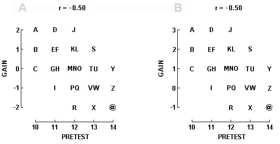
Display 1-6. Given a positive correlation between pretest and posttest, with data falling as it does in Display 1-2A, the correlation between pretest and gain scores will be negative as in Graph A. Graph B shows the same correlation, but now with a practice effect adding +1 to each score.
|
If, furthermore, there should be a practice effect from pretest to posttest � let us assume that previous exposure to the test permits all subjects to score one unit higher than they otherwise would, then the data would come out as in Display 1-6B � that is, the correlation would still be -0.50, but instead of low pretest scores rising and high pretest scores falling, we would now see low pretest scores rising (A, B, and C have a mean gain of 2.0) and high pretest scores not changing (Y, Z, and @ now have a mean gain of zero).
Precisely this pattern of results was found by Spielberger (1959) in his investigation of practice effects on the Miller Analogies Test (MAT), and had he recognized that practice along with regression completely accounted for his results, he might have felt it superfluous to speculate that "bright, psychologically sophisticated [subjects] would be most likely to profit from experience with a test such as the MAT, especially if their initial scores were depressed because they did not know what to expect on the test" (p. 261).
History
The basic techniques for analyzing correlational data were developed during the last two decades of the nineteenth century by Sir Francis Galton (1822-1911) and Karl Pearson (1857-1936). Before their contributions, scientists had no way of measuring the degree of association between two imperfectly-correlated variables, nor of generating optimal predictions from one variable to another with which it was imperfectly correlated.
Although we remember Galton here for his contributions to correlational theory, we note in passing that his career encompassed a colorful diversity of accomplishments, among them being explorations of Africa, the barometric weather map, and a system for classifying fingerprints that was adopted by Scotland Yard and eventually by the rest of the world. His work was guided by a passion for counting and measuring. One of his favorite maxims was, "Whenever you can, count" � a maxim he applied to such diverse phenomena as the rate of fidgeting among people attending a public meeting, and the attractiveness of women in different towns (which he recorded by means of a hidden device). Upon reading Charles Darwin's (his half-cousin's) Origin of Species in 1859, he concentrated his talents on questions of hereditary resemblance and evolution, for which work he has been accorded the title of "founder of the science of eugenics." The imaginary IQ data that we have been discussing in the present chapter, then, is precisely the sort of data that the techniques of correlation were initially developed to clarify.
Turning now to Galton's statistical contributions, we find that he pioneered the presentation of data in scatterplots, was the first to systematically discuss the phenomenon of regression toward the mean, to recognize that any scatterplot contained two regression lines and to plot them, and to note that these were frequently straight. To him, furthermore, we owe the introduction of the technical use of the word "correlation" as well as the introduction of r as a measure of the strength of an association. Initially, r stood for "reversion," was briefly abandoned in favor of w, and was finally reinstated, but this time standing for "regression."
This is not to say, however, that Galton brought matters to their contemporary state of development. His regression lines were fitted by eye rather than being computed mathematically, as they are today (see Appendices C and D), and his calculation of r, although giving much the same results as we would calculate today, was more primitive. That is, he proceeded by first transforming both sets of scores into deviation-from-the-mean scores, where for example the three raw scores 15, 16, 17 produce the three deviation-from-the-mean scores -1, 0, 1, and from which it can be seen that Galton's use of deviation scores had the effect of giving the means along the two dimensions the same mean of zero. Had Galton also known how to equate deviation, then his measuring the slope of the regression line would have given approximately the same correlation coefficient as modern computation gives today. The general rule is that when the standard deviations of the data on X and Y are equal (and at no other time), it so happens that the slope of the regression line (which, recalling high school geometry, equals rise over run) equals r (which the reader can verify for himself in Display 1-4 � although when predicting X from Y in the lower row of graphs, one must proceed as if the data had been replotted with the X values along the vertical axis and the Y values along the horizontal). Galton's r, then, was the slope of the regression line that he drew by eye after plotting his data as deviation scores.
To Karl Pearson, in turn, we owe the modern formulas for computing r, for which reason it is known today as "Pearson's r," and as well the modern formulas for computing the equations of the regression lines, as well as a host of elaborations and refinements which have contributed toward earning him the title of "founder of the science of statistics," but which fall beyond the scope of the present book.
From the Ideal to the Real
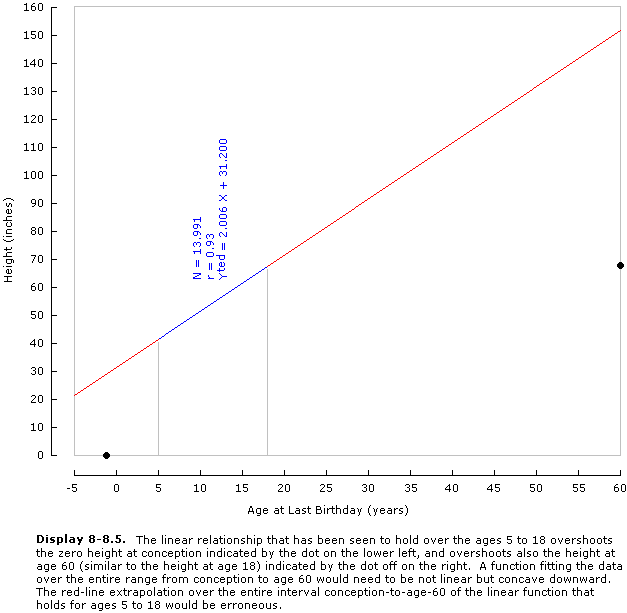
In the idealized data we have been considering so far, the regression line for predicting Y passes through the mean Ys in every column. In real data, however, this is rarely the case. Take Display 1-7, for example, which shows the relation between age and height for 13,991 Boston school boys, as presented by Bowditch (1877) in his Growth of Children.
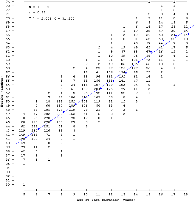
Display 1-7. Bowditch (1877) scatterplot showing height of Boston school boys as a function of age. Blue dots show the mean height in each column, and the regression line of height on age is seen to pass close to, but not exactly through, each dot.
|
When we plot the mean Ys in the columns of Display 1-7 as blue dots, we find that they are not perfectly collinear. We are unable, therefore, to pass our regression line exactly through the mean Y at every X, and so are unable to fit the regression line accurately by inspection. We proceed, instead, by mathematically computing the equation for such a regression line, and then using the equation to draw the line in the graph, a technique explained in Appendices C and D. Having done this, we see that the correspondence between observed and theoretical values is close but not perfect.
One reason for this lack of correspondence is sampling error � the smaller the number of observations in each column, the less orderly are the column means. When we fit a regression line to such data, that line passes not through the observed means, but rather through where we expect the observed means would lie if the number of observations were increased. A second reason, however, is that the data may be non-linear, so that the discrepancy between observed an expected values would remain no matter how many observations were added. For example, perhaps there is a spurt in growth after the 16th birthday (with gains averaging more than two inches per year), and perhaps growth has begun to slow (with gains averaging less than two inches per year) after the 18th birthday.
We may note, incidentally, that these data have historical significance in that they represent one of the earliest known scatterplots. Their original presentation, of course, was without benefit of any measure of strength of association. Calculating this now, we find that r = 0.93. And here we find occasion for a second incidental observation � that a correlation numerically approaching the perfect correlation of 1.00 can correspond to a scatterplot containing considerable variation around the regression line. That 14-year-olds range in height from 48 to 70 inches, for example, may suggest a correlation lower than 0.93. We can avoid confusion on the matter as follows. If we visualize an ellipse enclosing the data in a scatterplot, the correlation will be higher the flatter the ellipse. By a flat ellipse is meant one that resembles not a circle, but begins to approach a line. In Display 1-7, then, a considerable range of heights at each age does not prevent the correlation from being very high because the range of ages represented still permits a flat ellipse.
Display 1-7 serves also to dramatize the chief use of descriptive statistics such as the correlation coefficient and the regression equation � which is to summarize. The raw data are too complex to remember and too unwieldy to communicate. Their chief features, however, can be condensed into the three lines in the graph showing N, r, and the regression equation.
The summary conveys the strength of the relationship, facilitates prediction from age to height, and by including sample size gives an idea of how dependable the summary is. It is a lot easier to remember and communicate, and by means of it certain details emerge with greater clarity, such as that over the age range considered, growth was almost precisely two inches per year (which we see in the coefficient of X being 2.006), and that the same linear trend could not have held all the way back to birth, because if it had, the average newborn would be 31.2 inches tall (which we see in the intercept of 31.200) � which impossibility leads to the inference that in earlier years, growth exceeds two inches per year.
Our summary statistics, however, do not tell us all there is to know. If, for example, we wanted to know the probability of a 13-year-old being taller than 65 inches (in 1877 Boston, anyway), the complete data in Display 1-7 can given us an answer � of 1460 13-year-olds, 28 were more than 65 inches tall, so that the probability is 28/1460 = 0.0192. The summary statistics considered so far, however, are incapable of giving us that answer. But the summary could be expanded � if to it we added the standard error of estimate, a concept beyond the scope of the present book, then we could answer the same question, although our answer might differ slightly from the one we just calculated. Thus, it is possible to expand our summary statistics to reflect more and more features of the data, and still be rewarded with immense gains in parsimony.
Although the information in the raw data will usually remain more detailed and more accurate, it will also usually be so much more cumbersome that summary statistics will be preferred.
Although the chief purpose of summary statistics is to make the presentation of raw data unnecessary, we will see over and over again below that summary statistics can misrepresent the raw data, in which case no gain in parsimony can justify their use. Before accepting summary statistics as faithfully reflecting raw data, therefore, a standard procedure should be to first examine the raw data for certain features which signal that the summary statistics are misleading. The development of the social sciences would be accelerated if raw data were included with every publication, or at least made publicly accessible in a central archive.
We shall find Display 1-7 useful in arriving at further conclusions below.
From the the Real to the Simple
|

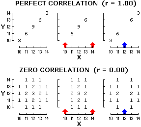
Display 1-8. Three ultra-simple scatterplots whose correlation coefficients are 1.00, 0.50, and 0.00.
|
In explaining the principles of correlation and regression to others, it may occasionally be helpful to rely on simple scatterplots that are easily remembered and quickly drawn, as for example the three in Display 1-8, each of which contains only seven dots, with frequency distributions of 2, 3, 2 along both X and Y axes, and presenting correlations of 1.00, 0.50, and 0.00. Nothing more complicated than this is needed to demonstrate the major characteristics of correlation and regression, as for example that each scatterplot contains two regression lines, and that the angle between the regression lines goes from zero in the case of a perfect correlation to 90 degrees in the case of a zero correlation, and that regression toward the mean is bi-directional and does not imply falling variance and increases with the extremity of the predictor and in the presence of low correlations, or that when X and Y scores have the same variance, the correlation coefficient is equal to the slope of the regression line of Y on X. Redrawing the two positively-sloped scatterplots with a negative slope readily demonstrates the same phenomena among negative correlations. These several correlation and regression phenomena are impossible to explain without the help of graphs, and when utmost simplicity is called for, such graphs as these may suffice.
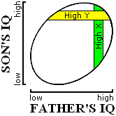
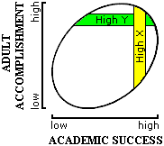
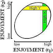
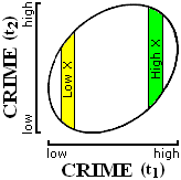
In the cases that we will be discussing below, we will usually not need to know exactly how many data points there are, or what their precise coordinates are, so that we will usually be neither able nor interested in drawing detailed scatterplots such as the ones we have been dealing with in the previous chapter. What we will know, however, will permit us to indicate the approximate shape these data points assume within the graph � when the correlation is positive but not perfect, for example, the data points lie roughly within a positively-sloped ellipse, such as any of the ones in Display 2-1. As this elliptical shape will be all we know about the data, and for our limited purposes, all we need to know, and as it is easier to sketch than a scatterplot which commits itself to specifying the position of every data point, we will rely on the ellipse graph heavily below, and so we must first learn to recognize the basic phenomena of correlation and regression in ellipse graphs.
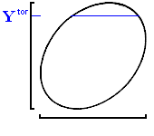
Let us begin, now, by finding regression toward the mean in an ellipse graph, first when predicting Y, and later when predicting X.
Predicting Y
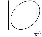
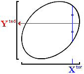
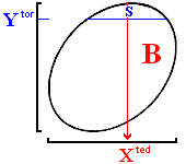
Starting Graph A in Display 2-1, we locate on the X axis the value of X (Xtor)from which we wish to generate a prediction, and moving straight up from it, we draw a vertical blue line inside the ellipse. Think of this vertical line not as a line, but as a column of data points all having the same X value, much like the column S-X in Display 1-2A, to which we restricted attention when the predictor was Father's IQ = 13. We recall, next, that the predicted Y (Yted) that we want is merely the mean Y of all the data points in the column having the given Xtor, and in our idealized data this has always been midway between the uppermost (or highest Y) and lowermost (or lowest Y) data points in a column. In Display 2-1, then, the Yted that we want is opposite the midpoint of the blue line we have just drawn inside the ellipse. Therefore, as shown in the Graph B, from the midpoint of that blue line we draw a red line straight out to the left � wherever we hit the Y axis is Yted.
|
Predicting Y
|
|
Predicting X
|
|
A: Draw a vertical blue line through the ellipse at predictor X (Xtor).
|
|
|
D: Draw a horizontal blue line through the ellipse at predictor Y (Ytor).
|
|
|
B: The predicted Y (Yted) for that Xtor will lie directly to the left of the midpoint of that blue line.
|
|
|
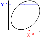
E: The predicted X (Xted) for that Ytor will lie directly below the midpoint of that blue line.
|
|
|
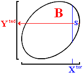
C: Regression toward the mean is evident in Xtor cutting off smaller area S, and Yted cutting off bigger area B.
|
|
|
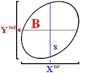
F: Regression toward the mean is evident in Ytor cutting off smaller area S, and Xted cutting off bigger area B.
|
|
|
Display 2-1. Demonstration of regression toward the mean in ellipse graphs which facilitate exposition by doing away with the labor of plotting individual data points. Note that area S (for Small) represents all scores that are more extreme than the predictor (blue line), and that area B (for Big) represents all scores more extreme than the prediction (red line).
|
Where, now, do we see regression? In Graph C, S (for "Small") is the area to the right of the blue Xtor, and B (for "Big") is the area above the red Yted. We see regression in area S being smaller than area B � the predictor cuts off a smaller area than the prediction. As area is proportional to the number of data points contained, the predictor is more extreme than the prediction, which is regression toward the mean. "Prediction" is here being used interchangeably with "predicted."
Predicting X
The manner of predicting X in ellipse graphs is so similar to the manner of predicting Y, that the reader will be able to follow the right-hand column in Display 2-1 without supplementary elaboration here.
Regression Lines and the Major Axis
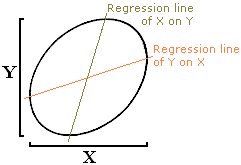
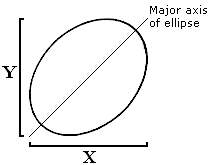
Display 2-2, Graph A shows an ellipse with both regression lines, and Graph B shows the same ellipse with its major axis. When a naive author wants to illustrate a regression line, he sometimes shows an ellipse together with its major axis, suggesting a weak understanding of everything that we have been discussing so far above. We see, however, that the major axis doesn't coincide with either regression line, but rather bisects the angle between the two regression lines. Only in the case of a perfect correlation do the two regression lines coincide with the major axis � but this is a case in which the ellipse is so flat that it forms a straight line.
A
|
B
|
|
Display 2-2. The two regression lines in Graph A are shown to be distinct from each other, and distinct from the major axis of the ellipse in Graph B.
|
Regression Increases with the Extremity of the Predictor
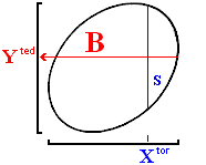
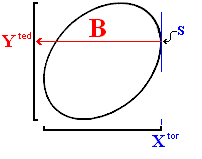
From left to right in Display 2-3, the Xtor, marked by a blue vertical line, moves from the mean to a tangent � which is to say, goes from totally non-extreme to maximally extreme. In each graph, the horizontal red line marking the prediction Yted is constructed so as to bisect the portion of the vertical blue predictor line that lies within the ellipse.
We observe that area S starts off being equal to area B in the left graph, but that as we move to the right and the extremity of the predictor increases, S shrinks more rapidly than B does � which is the same as saying that the more extreme the predictor, the greater the amount of regression.
A:
PREDICTOR IS
THE MEAN
|
B:
PREDICTOR IS
MODERATELY EXTREME
|
C:
PREDICTOR IS
MAXIMALLY EXTREME
|
B = S
NO REGRESSION
|
B > S
SOME REGRESSION
|
B >> S
MOST REGRESSION
|
|
Display 2-3. Ellipse-graph demonstration that regression towards the mean increases with the extremity of the predictor. Note that area S is always the area to the right of the blue Xtor line (except in Graph C where area S has been reduced to a single point on blue Xtor line, if we consider this blue Xtor line to be tangent to the ellipse); and area B is always the area above the red Yted line. As the predictor become more extreme, S shrinks rapidly, while B shrinks slowly, which is the same as saying that as the predictor becomes more extreme rapidly, the prediction becomes more extreme slowly, which is one of the corollaries of the phenomenon known as regression toward the mean.
|
Regression Increases as the Correlation Weakens
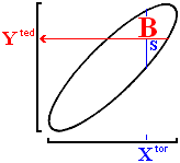
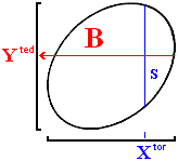
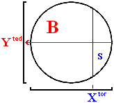
From left to right in Display 2-4, the extremity of the Xtor is kept constant while the correlation is lowered from very high to zero. As we have learned to expect, the blue Xtor line is bisected to locate the red Yted line.
In Graph A, we see that S approximately equals B (almost no regression). As we move to the right, the correlation weakens, and B increases in area relative to S � which is to say, regression increases as the correlation weakens.
A:
Correlation is
STRONG
|
B:
Correlation is
WEAKER
|
C:
Correlation is
ZERO
|
B = S
ALMOST NO REGRESSION
|
B > S
SOME REGRESSION
|
B >> S
COMPLETE REGRESSION
|
|
Display 2-4. Regression increases as the correlation weakens, demonstrated with ellipse graphs.
|
Practice Makes Perfect
You can, and should, learn to sketch out for yourself every imaginable ellipse demonstration of the basic phenomena of regression. To select a phenomenon to sketch, make these four choices:
demonstrate either regression increasing with the extremity of the predictor, or regression increasing as the correlation weakens;
when the correlation is either positive or negative;
when the predictor is either X or Y; and
when the predictor score is either greater than the mean or less.
With four binary choices, the total number of demonstrations is sixteen. Being able to sketch the graphs required for any of these sixteen demonstrations is an excellent test of whether you have grasped the concepts discussed above.
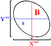
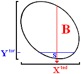
Sample problem. Here, for example, is a sample problem, with solution provided. Demonstrate regression increasing with the extremity of the predictor when the correlation is negative, the predictor is Y, and the predictor score is less than the mean.
The solution. The steps in any general solution are as below; the steps appropriate to the solution of the problem being solved here are italicized, and the resulting ellipse-graph solution appears in Display 2-5.
As two graphs are sufficient for any demonstration, draw axes for two graphs.
Draw an ellipse within each graph. But what ellipse?
When demonstrating the effect of extremity of the predictor, draw two identical ellipses, positively sloped if the correlation is positive, negatively-sloped if the correlation is negative.
When demonstrating the effect of weakening correlation, however, in the first graph draw a positively-sloped ellipse if the correlation is positive and a negatively-sloped ellipse if the correlation is negative, and in the second graph, draw a circle.
Within each ellipse, draw a predictor line to indicate the location of data points having the appropriate value of the predictor � a vertical line when the predictor is X, and a horizontal line when the predictor is Y.
When demonstrating the effect of extremity of the predictor, put the predictor line right through the middle of the ellipse in the first graph (zero extremity), and close to the tangent in the second graph (great extremity).
When demonstrating the effect of weakening correlation, however, put the predictor lines at a constant extremity.
Put vertical predictor lines to the right when the predictor is above the mean, and to the left when below; and put horizontal predictor lines high when the predictor is above the mean, and low when below. The area cut off by this predictor line is area S.
Finally, through the midpoint of the predictor line, draw a perpendicular line with an arrowhead on it to mark the prediction. The area cut off by this prediction line is area B.
The phenomenon of regression toward the mean is demonstrated by the ratio of S to B being close to one in the first graph, and approaching zero in the second.
A:
Predictor is
NOT EXTREME
|
B:
Predictor is
EXTREME
|
B = S
NO REGRESSION
|
B > S
MUCH REGRESSION
|
|
Display 2-5. Demonstration of regression increasing with the extremity of the predictor when the correlation is negative, the predictor is Y, and Ytor is less than the mean.
|
Record Holders
Robert Wadlow was the world's tallest person: 8 feet, 11.1 inches. Do we also expect that he was the heaviest? The question gives us some information on height, and asks us to infer something about weight. To answer the question, we must first decide what kind of correlation we are dealing with.
We can be certain, first of all, that taller people tend to be heavier � which is to say that the correlation between height and weight is positive. We can be certain, furthermore, that the correlation is less than perfect � at any given height, some people are heavier than others. A less than perfect correlation, finally, means that predicted scores will regress.
Now regression tells us that if we examine all the people who measured 8 fee, 11.1 inches, their mean weight will be less extreme than their height. As it happens, there is only one person at 8 feet, 11.1 inches, and so we predict that his weight will be less extreme than his height. No one has a better chance than he does of being heaviest, and yet his chances are slim. And it does turn out that Robert Wadlow's weight of 491 lbs is not as extreme as his height � he was the world's tallest man, but as the world record for weight is 1069 lbs, he is far from the heaviest.
Display 2-6 shows the approximate relation between height and weight. The four world record holders for low and high height and weight serve to outline our ellipse � these four points mark the spots where vertical and horizontal tangents make contact with the ellipse. Note that none of the four blue tangents has an arrowhead on it � because these four lines are predictor lines, not predicted lines.
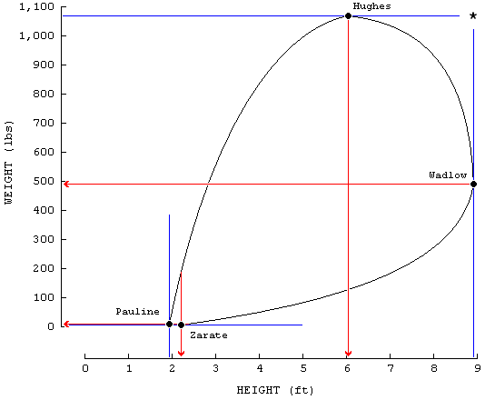
Display 2-6. Each of the four world-record holders lies on his own tangent (blue line). To demonstrate regression in any individual record holder, the predictor must be the world record (blue tangent). The data for the four record holders (McWhirter, 1977):
Tallest: Robert Wadlow, 8 ft, 11.1 in; 491 lbs.
Heaviest: Robert Earl Hughes, 6 ft, 1/2 in; 1069 lbs.
Shortest: Princess Pauline, 1 ft, 11.2 in; 9 lbs.
Lightest: Lucia Zarate, 2 ft, 2.5 in; 4.7 lbs.
|
The "ellipse" that the data force us to outline in Display 2-6 is highly irregular, due mainly to short people not being able to vary as much in weight as tall people, so that our use of the word "ellipse" has lost its mathematical meaning, and is now being used to refer to any rounded shape. This irregularity, however, does not affect anything we have to say, and may in fact be largely corrected by plotting not weight against height, but rather the logarithm of weight against the logarithm of height, as is done in Display 2-7, and where something closer to the elliptical shape that we are more used to makes its reappearance. The effect of taking the logarithm of a variable is to magnify its small values. We shall have more to say concerning logarithmic transformations farther below.
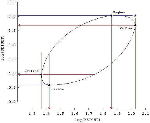
Display 2-7. Plotting the logarithms of height (in inches) and weight (still in pounds) produces four data points that can be envisioned as falling on the periphery of an elliptical scatterplot of data, a feat of imagination quite impossible when the raw data were plotted in Display 2-6. The moral is that the simplest units in which it is possible to measure may need to be transformed in order to produce orderly data. The heights and weights in logarithmic units now become:
Tallest: Robert Wadlow, 2.030, 2.691.
Heaviest: Robert Earl Hughes, 1.860, 3.029.
Shortest: Princess Pauline, 1.365, 0.954.
Lightest: Lucia Zarate, 1.423, 0.672.
|
For each of the remaining three record holders, we find that by following our standard procedure for generating predictions, regression can be detected in every instance.
Generally, whenever we come across a record holder on any dimension, our best bet is that even though that person has the highest probability of holding the record on an imperfectly-correlated dimension, he is unlikely to hold the record on that second dimension. Our bet, of course, becomes safer the more weakly the two dimensions are correlated.
Viewed from a different perspective, this principle may be expressed as follows. For a single person to be both as tall as Wadlow and as heavy as Hughes, he would have to fall in the position indicated by an asterisk in Display 2-6. For anyone to fall in this position, however, is unlikely because it lies far outside the ellipse which encloses the data points. That is, if the data assume any rounded shape, which we are here calling "elliptical," and if the holder of a single record lies on a tangent to this ellipse, then it is not possible for him to also fall on a second tangent perpendicular to the first � and yet in order to hold a record on a second dimension, that person would have to lie on that second tangent as well. Thus, a record holder on one dimension is unlikely to be a record holder on a second dimension.
As we know that a given person does occasionally hold records on more than two dimensions, we should consider what circumstances sometimes do make the unlikely come to pass:
A multiple record holder is more probably the more highly correlated the dimensions are. When the correlation is perfect, in fact, the record holder on one dimension is necessarily the record holder on the other dimension as well.
A multiple record holder is more probably the smaller the number of data points under consideration. One data point by itself, to take the extreme case, holds four records � highest and lowest on X, as well as highest and lowest on Y. To take the next most extreme case, with only two data points, each one holds two records � whichever is highest on X, for example, must also be either highest or lowest on Y. With three data points, as least one is guaranteed to be a multiple record holder. With the number of data points just above three, a multiple record is not longer guaranteed, but is still highly likely. As the number of data points climbs still further, however, the probability of a multiple record holder falls. When the number of data points reaches millions or billions, multiple record holders become almost non-existent.
Even with a large number of data points and a weak correlation, a multiple record holder can still occur. This is because the ellipse indicating the distribution of data points is meant to indicate not the boundary beyond which no data point may ever fall, but only the boundary beyond which data points become rare � so if the rare data point does stray outside the ellipse and does set records on both dimensions, we will consider that as a rare deviation from a usually dependable generalization.
How not to check up on regression
What is to stop someone from pointing out that Robert Wadlow weighs 491 lbs (which is extreme, but not a record), and then predicting that on height, he will be even less extreme. Then, when Robert Wadlow's height is discovered to be more extreme, why not say that regression is disconfirmed?
This seeming disconfirmation of regression is fallacious because it relies on an illegitimate test of regression. Looking back at Display 1-2A, we see that when X = 10, the regression to Yted = 11 is not replicated in every data point. There exists, in addition to point B whose Y = 11 has "regressed" correctly, point C whose Y = 10 has not "regressed" at all, as well as point A whose Y = 12 has "regressed" too far � has shot one unit past mean Y = 11. I am putting "regressed" in quotation marks because the word is not meant to be applied to individual data points in a column � it is meant to be applied to the mean Y of all the data points in a column (and, when predicting Y, regression applies to the mean of all the data points in a row.) The Yted in the X = 10 column, then, does regress; the individual data points in that column do various things.
Our conclusion, then, is that the only valid check on regression is one which looks at all the data having the value of the predictor: all the data in a given column when predicting Y, or all the data in a given row when predicting S. Selecting one data point out of the many available at a given value of the predictor, and saying that it disconfirms regression, makes the error of excluding from consideration relevant data.
Returning now to Robert Wadlow in Display 2-6 � when we used his record height as the predictor, we did verify regression by looking at all the data available at that height. Robert Wadlow rose to 8 feet, 11.1 inches, no one else did, so there was only him to look at, and we did not ignore or exclude anybody, as summarized in Display 2-8A, where the more elliptical shape is returned to for expedience, without this invalidating our argument. This was legitimate, and regression was supported. But when we used weight as the predictor, we should have looked at all the people weighing Robert Wadlow's 491 lbs. We can see in Display 2-8B that there are many such people. They lie along the horizontal line segment that falls within the ellipse opposite 491 lbs. If we bisect this line segment (as we do in Display 2-8B) and travel straight down, we will meet the X axis at the correct predicted height for people weighing 491 lbs, and that predicted height will be regressed. But if we disregard everybody weighing 491 lbs except Robert Wadlow (which we do in Display 2-8C), and if we go on to claim that his observed maximally-extreme height disconfirms regression, we commit the error of ignoring relevant data. The relevant data we ignore is all the other people who weight 491 lbs.
The simple rule is that in demonstrating regression, all data having the predictor value must be taken into consideration. The corollary to that rule is that when the predictor value is a lone world record, then a single point is all the relevant data there is.
Make sure you understand this point by answering the following questions for each of the four record-holders in Display 2-6:
For a single record-holder to provide a legitimate demonstration of regression, which variable must be the predictor?
When the correlated variable on which a record is not held is used as a predictor, what people must be taken into consideration along with the record-holder?
The answers are as follows:
Robert Wadlow: When the predictor is height, Wadlow can be considered alone because there is nobody else as tall. When the predictor is weight, all the other people who weigh 491 lbs must be considered as well.
Rober Earl Hughes: When the predictor is weight, Hughes can be considered alone because there is nobody else as heavy. When the predictor is height, all the other people who are 6 feet, 1/2 inches must be considered as well.
Princess Pauline: When the predictor is height, Pauline can be considered alone because there is nobody else as short. When the predictor is weight, all the other people who weight 9 lbs must be considered as well.
Lucia Zarate: When the predictor is weight, Zarate can be considered alone because there is nobody else as light. When the predictor is height, all the other people who are 2 feet, 2.5 inches must be considered as well.
Chapter 3
Incomplete Data: Ellipse Graphs |
Four regression phenomena that invite frequent notice and frequent misinterpretation are located in the four regions shown in Display 3-1. The exact placement of any given region is of no importance � so long as its main boundaries are both vertical, or both horizontal, the region can be thinner or fatter than shown, or fall closer to the mean of farther away, without affecting either what we call it or any of our conclusions concerning it. For example, Display 3-2 shows four different High-X regions, all having in common that they contain data points whose X values all fall above mean X, and therefore all sharing the characteristics that we are about to discuss below, and differing only in how far above the mean their X values lie, and the range of these X values.
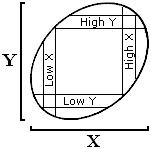 |
|
Display 3-1. Names for four regions of partial data that are commonly brought forward to support erroneous conclusions. Low X and High X constitute one set of parallel regions (which can be used to erroneously suggest that the variance of Y is less than the variance of X), and Low Y and High Y constitute the other set of parallel regions (which can be used to erroneously suggest that the variance of X is less than the variance of Y). Low X and High Y constitute one set of perpendicular regions (the arrowhead pointing to the Y axis, and which can be used to erroneously suggest that mean Y is greater than mean X), and High X and Low Y constitute the other set of perpendicular regions (the arrowhead pointing toward the X axis, and which can be used to erroneously suggest that mean X is greater than mean Y).
|
In any particular example below, the region under discussion may be more accurately represented by one of the types shown in Display 3-2 rather than the types shown in Display 3-1. Most often, it will be the entire region which is more extreme than a given value, as in Display 3-2C and D. Our convention, nevertheless, will be to diagram each example using regions like the ones shown in Display 3-1 � what holds for such a region holds for them all, and if the reader wishes a closer correspondence between example and diagram, he is invited to sketch in the correction himself.
|
 Display 3-2. Alternative areas all characterized as "High X".
|
Our discussion below falls under three headings. Cases in which only one of the regions in Display 3-1 are relied upon to arrive at a fallacious conclusion are discussed under "I: Single Regions". Cases in which two parallel regions (such as Low X together with High X) are relied upon to arrive at a fallacious conclusion are discussed under "II: Parallel Regions". And cases in which two regions at right angles (such as Low X together with High Y) are relied upon to arrive at a fallacious conclusion are discussed under "III: Perpendicular Regions".
I: Single Regions
Elementary Demonstration
To give an introductory demonstration of how incomplete data might be used to arrive at an erroneous conclusion, and of how we are able to rebut that conclusion, let us revert back to Display 1-2A. If someone were to say that because IQ=13 fathers were observed to have IQ = 12.5 sons, that therefore the new generation must be less intelligent, he would be relying on the High X data points S-X that fall in the X=13 column. Note the correspondence between this X=13 column in Display 1-2A and the High X column in Display 3-1. in Display 3-3, these High-X data are represented by the shaded column. These data are called "High X" simply because they were selected for having a certain above-average value on X � that is, they hall had X=13.
 |
|
Display 3-3. Green High X is used to fallaciously suggest that fathers are more intelligent than their sons. Yellow High Y, however, demonstrates that the same fallacious reasoning also suggests that fathers are less intelligent than their sons.
|
In our rebuttal, we are able to point to an alternative single region which contradicts the impression given by the first. One such region is High Y. For example, in Display 1-2, we are able to point out that sons who scored 13 had fathers who averaged only 12.5, which now suggests that the new generation is more intelligent. Our rebuttal relies on the High-Y data points D, K, L, T, U, Z falling in a row at Y=13. Again, note the correspondence between the Y=13 row in Display 1-2A and the High Y row in Display 3-1. In the ellipse graph in Display 3-3, this High Y data is represented by an unshaded row. We see that this data is called "High Y" because it is selected for having a given above-average value on Y � that is, it had to have Y=13.
In Display 3-3, we rebut an erroneous conclusion based on the shaded region with our own clashing conclusion based on the unshaded region. Generally below, we will follow this rule: the incomplete data relied upon to arrive at an erroneous conclusion will be shaded; the incomplete data that we pull out to arrive at the opposite conclusion, and so to reveal the fallacy of anyone relying on incomplete data for any conclusion, will be unshaded. It is important to note that in our rebuttal, we do not offer our contradictory conclusion as true. What we do, rather, is point out that as the same line of reasoning is just as capable of leading to the opposite conclusion, that line of reasoning must be fallacious.
A complete rebuttal would require a lengthy explanation which, in fact, echoed everything that has been said above, for which in most exchanges there is insufficient time. Our suggested rebuttal acknowledges that in many situations, the only reply that can be squeezed in is a lightning-fast riposte, and so restricts attention to the minimal rebuttal which is capable of having a strong effect.
Early promise of men of accomplishment. The people that have given us the outstanding accomplishments of our time have been surprisingly unpromising in their youth. Charles Darwin, for one, recalls being judged by all to be "rather below the common standard of intellect" (Darwin, 1876/1966, p. 25). Thomas Edison, for another, ranked "always at the foot of the class" (Josephson, 1959, p. 20). Or, Albert Einstein, not being able to speak fluently even at the age of nine, was predicted by his headmaster to "never make a success of anything" (Clark, 1971, p. 27).
In view of such observations, would it not be wise for us to redirect our scholarships, our research grants, and our hopes for future achievement from those whose academic performance has been outstanding, to those whose academic performance has been modest.
|
 |
Display 3-4. Green High Y is used to suggest that adult accomplishment is preceded by mediocre school performance. Yellow High X, however, shows that adult accomplishment is still most likely to come from those with high academic success.
|
No, in all likelihood, grades and later achievement are positively, but less than perfectly, correlated. In Display 3-4, the observation that men of outstanding achievement were scholastically unpromising is shaded area High Y. Note that Darwin, Edison, and Einstein provide particularly striking examples because they fall into the leftmost portion of area High Y (for men so highly accomplished, they were particularly unpromising in their youth). But the conclusion that we are imagining arises not from considering any one portion of area High Y, but from considering all of High Y. The observation relevant here is that when we look at all those who turn out to be highly accomplished, or at a representative sample of them, then we are bound to notice that on the average their earlier academic performance lagged behind their later accomplishment. True, there are contrasting individuals who fall in the rightmost portion of area High Y (highly accomplished as well as precocious, like John Stuart Mill, Voltaire, or Norbert Weiner), but these are proportionately too few to discredit the generalization that exceptional adult accomplishment does indeed tend to have been preceded by less exceptional youthful performance.
But in response to the question of where we should turn to encourage genius, we must reply that it still should be to those with the highest academic performance (High X, shown unshaded in Display 3-4). It is the child prodigies of yesteryear who, even though they disappoint their promise, still deserve the scholarships and research grants because they have the highest probability of later accomplishment.
At the same time, the observation that students with modest grades are less likely to become intellectually productive should not lead us to recommend that society stop sowing its scarce seeds in their infertile soil � even though each such student is unpromising, their large numbers guarantee that the lion's share of tomorrow's achievements will come from them. Harry Truman noted that The C students run the world; we might add that they also supply it with the bulk of its fresh ideas and discoveries.
Recapturing Happiness
How fondly we recollect these solitary days of pleasure, and hope for their recurrence, and try to plan the circumstances that made them bright; and arrange, and predestinate, and diplomatize with fate for a renewal of the remembered joy. As if any joy could ever be built up out of such and such constituent parts! As if happiness were not essentially accidental � a bright and wandering bird, utterly irregular in its migration; with us one summer's day, and forever gone from us the next!
Braddon 1887/1974, p. 134
|
Are we able to fit Mary Elizabeth Braddon's observation into one of our scatterplots?
 |
|
Display 3-5. Green High X is used to suggest that a second exposure (at time 2) to a situation that previously (at time 1) brought high enjoyment is likely to prove disappointing. Yellow High Y, however, could be used to suggest that a second exposure to situations that previously tended to bring some enjoyment now bring even greater enjoyment.
|
Yes. First, we suppose that when a person experiences each of a number of situations, he rates how happy it made him. At some later time, he re-experiences each situation and gives it a second rating. It is reasonable to expect that whatever made him happy the first time will tend to make him happy the second time, and whatever made him miserable the first time will tend to make him miserable the second time. The later ratings, however, will not be identical with the earlier. The correlation, in other words, will be positive but less than perfect, as in Display 3-5.
The area described by Braddon, then, is High X � situations that make us very happy at one time will disappoint us at a later time. Trying to recapture happiness by reconstructing a situation that occasioned great happiness in the past, then, is likely to yield a diluted joy. Nothing is so good, hyperbolizes the English proverb, as it seems beforehand.
In contradiction of this observation, we can point to High Y � our experiences of bliss occur in situations that tended to produce milder joy in the past. Our expectations, therefore, now seem over-fulfilled; and our attempt to recapture happiness by exposing ourselves to these situations is over-rewarded. Everything terrific, we can hyperbolize in contradiction of the above proverb, seemed poorer beforehand.
This is not to say, of course, that we waste time seeking out those very situations that made us intensely happy in the past (High X) � we are right to seek them out because they are the most likely to make us intensely happy in the future. On the average, however, they will disappoint us, and on the average, tomorrow's crop of bliss (High Y) will spring from situations which, though previously pleasant, fell short of thrilling. Someone who avoided all situations that were only mildly promising, therefore, would deprive himself of the majority of his deepest joys.
Reforms
One place that unrecognized regression makes its appearance with particularly devastating effect, as discussed by Campbell (1969), is in attempts at social reform.
Programs of reform are usually introduced in response to a crisis: a crackdown on speeding is ordered after an unprecedented number of traffic fatalities, police are given greater power in the midst of a crime wave, the money supply is tightened after inflation has taken an unacceptable spurt, or a curriculum is revised after achievement tests have hit a new low.
|
 |
Display 3-6. A reform aimed at combatting crime at time t1 is likely to be instituted during a crime wave (High X), so that reform or no reform, crime is likely to have diminished at some later time t2. The bias of the practice could be laid bare if the same reform were instituted during a lull in crime (Low X), at which time regression would be working to make it look as if the reform promoted crime.
|
Why this manner of instituting reform is unfortunate is that by regression alone, any situation that is extreme today (High X) tends to become less extreme tomorrow, as shown in Display 3-6. If an extreme situation followed by reform today becomes less extreme tomorrow, therefore, it is impossible to estimate the effect of the reform � it could be that
regression helped alleviate the problem a little, and reform helped some more, or
regression helped, and reform had no effect, or
regression helped a lot, and reform hurt a little.
How much this manner of testing reform stacks the cards in its favor could be brought to light by instituting the reform during a period of low crisis (Low X in Display 3-6). Now, regression would be working toward discrediting the reform by suggesting that it promotes crisis.
With regression making his reform look successful, then, the legislator or administrator takes undeserved credit and adds another law or policy of untested benefit to an already burdensome accumulation.
In properly evaluating a reform, having control observations � parallel observations of the same crisis, but denied the reform � is indispensible. As both crisis with reform and crisis without reform would be subject to the same regression, any difference between them would have to be attributed to the reform. This would be conducting an experiment, which topic will be discussed in a separate book.
Note, incidentally, that when we speak of regression "helping" or "hurting" or "producing" or "resulting in," we do not mean to imply that regression has causal powers in the same way that observable events do. Rather, we are quite content to hold that only an event can act as a cause, and so that regression, not being an event, has no causal powers. Regression, rather, specifies the probably effect that unknown events are likely to have. Thus, when we say that "regression produces" and the like, it must be taken a shorthand for the more awkward "the principles of regression lead us to expect that unknown events produce."
Therapy
|

|
Display 3-7. Therapists have difficulty distinguishing the efficacy of their therapy from the regression toward the mean that takes place spontaneously in the Low X region between a patient's successive visits.
|
Therapists of all kinds (physicians, psychologists, chiropractors, and so on) as well as their patients are often faced with the same difficulty of interpretation. Particularly when it comes to symptoms that are continually waxing and waning in an irregular pattern and with little progressive improvement or deterioration over time (such as headache, back pain, allergy, skin disorder, arthritis, insomnia, anxiety, loss of appetite, and so on), treatment tends to be applied when the symptom is most severe. With regression (which in a clinical setting is called "spontaneous recovery" or "spontaneous remission") working to alleviate the symptom, it becomes impossible from the clinical evidence available to either patient or therapist to evaluate the effect of the treatment. However strong the doctor's or patient's confidence in a treatment, however often each has "seen it work," their faith in the treatment is unjustified. Much of medicine, it must be recognized, is carried on without feedback as to its effectiveness.
Physicians often pride themselves on curing all their patients with a remedy that they use. But the first thing to ask them is whether they have tried doing nothing, i.e., not treating other patients; for how can they otherwise know whether the remedy or nature cured them?
Bernard, 1865/1957, p. 194
|
This insight, far from new even a hundred years ago, seems unknown to many even today. "A week after being put on vitamin K therapy, the infant's symptoms disappeared" ("The Overlooked Vitamin K," 1972), is all the proof of causality some under-educated physicians require. Lest the reader imagine that such primitive reasoning is rare, Ross (1951) reports that of 100 articles in leading American medical journals, 45% were lacking any comparison with a control group, 18% were inadequately controlled, and 10% claimed an inability to control, leaving only 27% that were properly controlled. "There must be something wrong with so-called 'scientific' medical education," laments Mainland (1950, p. 923), "when a young physician says that he has obtained promising results by treating migraine with histamine and yet cannot understand why a professor of pharmacology should ask about controls."
Occasionally, we find even the details of regression misinterpreted as support for the effectiveness of clinical intervention.
In 20 of 22 studies [...] the longer the duration of treatment or the more sessions, the better the outcome! It is a temptation to conclude � and it may be an accurate conclusion � that if psychotherapy is a good thing, then the more the better.
Luborsky, Chandler, Auerbach, Cohen, & Bachrach, 1971, p. 154
|
We have already discussed this phenomenon under the heading of autocorrelation and lag correlation in Chapter 1 above, and concluded that when we measure the same thing twice, the correlation drops the longer the interval between the two measurements. Our own interpretation of the detail in the above quotation, then, must be that the longer the time interval between a pretest of psychological adjustment and a posttest, the lower the correlation, and the greater the regression. In more concrete terms, when someone is despondent today, regression tells us to expect that he will be slightly less despondent tomorrow, noticeably cheerier next month, and almost indistinguishable from your average bloke next year. Therefore, if that's what we do observe, we have no reason to credit any therapy that may have been introduced, and have no reason either to conclude that a lot of therapy helped more than a little therapy.
How much spontaneous remission is there? While on the topic of spontaneous remission, we might note that the question is sometimes put (as by Lambert, 19767) of how much of it we are to expect from adult neurotics. Expressed as the percent of neurotics that improves without treatment, arguments have been advanced for 30%, 43%, 53%, and 67%. The only sensible answer to such a question, however, must be "It depends!"
It depends first on the correlation between degree of maladjustment on the pretest and posttest. The lower the correlation, the greater the spontaneous remission. Thus,the more a subject's condition fluctuates from day to day, the more clinicians disagree in their evaluation of his condition at any one time, or the more time between pretest and posttest, then the more spontaneous remission there will be.
It depends second on how extreme the subjects are on the pretest � the more maladjusted they are, the more spontaneous remission there will be.
And it depends third on how we define "spontaneous remission" � the smaller the improvement that we are willing to count as a spontaneous remission, the more spontaneous remission we will find.
Because the percent of neurotics who show spontaneous remission depends on so many factors, one study with all factors stacked against spontaneous remission should have little trouble finding close to 0%, while another study with all the factor stacked for spontaneous remission should have little trouble finding close to 100%. Trying to discover a single figure that is in any way definitive or representative is naive.
II: Parallel Regions
The Teacher's Influence

|
|
Display 3-8. The teacher uses Low X to support his conclusion that poor students improve, and High X to support his conclusion that good students deteriorate. However, Low Y could similarly be used to support the conclusion that poor students deteriorate, and High Y to support the conclusion that good students improve.
|
A teacher cannot help remembering which students stand at the top of the class on a midterm examination, and as the results of the final examination come in, cannot help looking for these same students. Generally, the teacher is disappointed � for he finds that these top students have slipped. He wonders why it is that his teaching is unable to keep the best students from backsliding. His self-recrimination, however, is somewhat mollified at the other end of the scale � those who failed his midterm have taken his exhortations to heart and have pulled up smartly.
Display 3-8 shows the probable relation between grades on a midterm and grades on a final � it has to be positive and it can't be perfect. Our teacher has been focussing his attention on the two shaded regions: High X and Low X. High X contains students who did well on the midterm, and who averaged lower on the final ("the best students deteriorate"). Low X contains students who did poorly on the midterm, and who averaged higher on the final ("the poorest students improve"). What has caught the teacher's attention, then, are the two green parallel regions Low X and High X. His two observations, taken together, suggest that the variance of Y is lower than the variance of X.
Our rebuttal appeals to the opposite pair of parallel regions � the horizontal pair shown in yellow in Display 3-8, and arrives at the opposite impressions. Low Y contains students who did poorly on the final and who had done not quite so poorly on the midterm ("the poorer students sink to the bottom"), and High Y contains students who did well on the final and who had done not quite so well on the midterm ("the better students float to the top"). Now the variance of X seems to be lower than the variance of Y.
Stimulating Environments
|

|
Display 3-9. University of Iowa researchers used Low X to conclude that dull subjects found their environments stimulating, and High X to conclude that bright subjects found their environments unchallenging. However, Low Y could similarly be used to suggest that dull subjects found their environments unchallenging, and High Y to suggest that bright subjects found their environments stimulating.
|
Quinn McNemar (1940) was instrumental in correcting some early misinterpretations of studies of environmental influence on IQ that had been conducted at the University of Iowa. The misinterpretations were that those who were bright deteriorated because their environments were insufficiently challenging, and those who were dull improved because their environments were stimulating. The Iowa researchers who arrived at these conclusions had noticed areas High X and Low X in Display 3-9 . High X contains the bright subjects who deteriorated, and Low X contains the dull subjects who improved. The two observations together seem to suggest that the variance of Y is lower than the variance of X.
Again, our rebuttal appeals to the opposite pair of parallel regions � the horizontal pair � shown in Display 3-9, and arrives at the opposite conclusion. Low Y contains those that are dull on a later test and who had been not quite so dull on an earlier one (one could say, "the dull deteriorate because of an unchallenging environment"), and High Y contains those that are bright on a later test and who had been not quite so bright on an earlier one (one could say, "the bright improve because of a stimulating environment"). Now the variance of X seems to be lower than the variance of Y.
To illustrate his criticism, McNemar points to some observations of his own.
Fifty-four children of initial IQ's between 140 and 149 lost an average of five points [...] on a retest. Shall we attribute this loss to lack of environmental stimulation? To do so would stretch the imagination of even the most hopeful environmentalist, since this loss occurred within a week. The loss represents nothing more than statistical regression as we pass from Form M to Form L of the New Stanford-Binet [...]. A similar loss occurs when we pass from Form L to Form M, and gains occur for those classified as inferior on either form and tested a week later on the other form.
McNemar (1940, p. 85)
|
An admirable demonstration of the entire phenomenon is presented by Baltes, Nesselroade, Schaie, and Labouvie (1972). These researchers showed first that the very intelligent and the very unintelligent in 1956 both moderated by 1963, and then in a "time-reversed control analysis" on the very same data, showed that the very intelligent and the very unintelligent in 1963 had both been more moderate in 1956.
Mediocrity in Business
In his book, The Triumph of Mediocrity in Business (1933), Horace Secrist accumulates a vast amount of data showing that extremes in business, when followed over time, are found to converge toward mediocrity. The author states that this tendency is not merely a statistical side-effect of his analysis, but is rather expressive of prevailing business relations.

|
|
Display 3-10. Green parallel regions suggest that businesses become more mediocre over time. However, the same flawed reasoning could point to the yellow parallel regions as evidence that businesses become more extreme.
|
Secrist also reported such details of regression as that it increased with the extremity of the initial measure, and that it was accompanied by no reduction of variance. The observation that was critical in misleading Secrist � that is, in leading him to believe that his pattern of results was a discovery in the field of economics and not just an inevitable result of his method of analysis � was that when he applied the same method to non-economic data, the pattern vanished. For example, cities that were hottest and coldest in an initial year stayed hottest and coldest in subsequent years.
In rebuttal, we are able to point out that Secrist is starting out with businesses located in the High X and Low X regions in Display 3-10. Regression leads us to expect that at a later time, the same businesses will indeed have regressed. In Hotelling's (1933, p. 465) words, "The conclusion is mathematically obvious [...], and does not need the vast accumulation of data to prove it." The reason that non-economic data failed to show any similar regression is probably that in the non-economic data chosen, the underlying correlation was high, and as we have seen, the higher the correlation, the less regression. In the case of city temperatures over successive years, a scatterplot (Secrist, 1933, p. 427) reveals that the correlation is indeed very high, and explains why no regression was observed.
Thus, if we selected extreme businesses and looked back in time instead of forward (yellow regions in Display 3-10), we would find that they had diverged from earlier more moderate positions, which we could just as illogically elaborate into a book The Triumph of Polarization in Business.
III: Perpendicular Regions
Fluency
When Peter talks to Mary, he finds himself occasionally groping for a word: he is familiar with the word, he has it on the tip of his tongue, but he can't get it out. When this happens, Mary is often able to guess the word he is looking for from what he has just been saying. Such occurrences, repeated again and again, and remembered by the two of them, particularly by Peter, lead Peter to credit Mary with a greater fluency than he has himself. Is Peter's ego-deflating conclusion justified by his observations?
No, it is not. We would expect Mary to be able to supply words for Peter even if there was no difference in fluency between them. The explanation can be found in Display 3-11.
|

|
Display 3-11. Peter uses the shaded Low X and High Y arrow to erroneously conclude that Mary tends to be more fluent than himself (these regions create an pointing toward the Y axis). The unshaded High X and Low Y arrow, on the other hand, could be used to erroneously conclude that Peter is more fluent than Mary (these regions create an arrow pointing toward the X axis).
|
First of all, the speed with which Peter and Mary can think of different words is probably positively correlated. For example, suppose that we present each of them with a list of definitions, and measure how long each takes to think of the word. Some words, both Peter and Mary would be able to think of quickly:
Both Peter and Mary can think of the words called for by the above meanings quickly (cow, cat, horse, elephant).
Other words, both Peter and Mary cannot name as quickly:
A flightless, New Zealand bird with a long bill.
A South American rodent often bred in captivity for its fur.
A one-humped camel.
A mammal that can curl into an armored ball.
Words for the above meanings take both Peter and Maray longer to think of (kiwi, chinchilla, dromedary, and armadillo). And also, the positive correlation cannot be perfect � some words will be a little easier for Peter, others for Mary.
The words on the tip of Peter's tongue, then, are words he thinks of slowly � Low X. By regression, of course, Mary thinks of these words faster. That is why Mary is able to supply them for Peter.
But there is a second observation that is bothering Peter. It is that when Mary speaks, some of the words that come quickly and easily to her are words that Peter realizes would not have occurred to him at all � at least not without pausing and groping, and probably stumbling. Words that are fast for Mary are High Y; by regression, Peter thinks of them more slowly.
Notice that the hypothesis that is worrying Peter is that Mary is faster than himself, which is to say that mean Y is greater than mean X. Notice, too, that the data offered � the two shaded regions in Display 3-11 � are at right angles to each other, or perpendicular. That is why these incomplete data are referred to as perpendicular regions. Perpendicular regions, then, can be used to suggest a difference in means. We know that this suggestion is misleading � the means may or may not differ, but simply pointing out regression in Low X and in High Y is insufficient to prove this difference.
Peter's greatest hope for recovering his self-esteem is to notice the contrasting perpendicular regions shown in yellow in Display 3-11. When Mary pauses for a word, Peter is often able to supply it for her (Low Y); and words that do trip lightly off Peter's tongue, Mary enviously realizes, would have made her pause (High X).
As a mnemonic, we may view two perpendicular regions as forming the head of an arrow; whichever axis the head points toward will seem to have the higher mean. In Display 3-11, the Low X and High Y arrow points toward the Y axis (Mary seems faster), whereas the High X and Low Y arrow points toward the X axis (Peter seems faster).
Our recommendation to Peter, therefore, must be that he base conclusions concerning mean speeds on mean speeds, and not on an inference concerning mean speeds drawn from a misleading subset of the data. In the absence of data on mean speeds, Peter should spend as much time contemplating the two yellow regions in Display 3-11 as he does contemplating the two green regions.
Mood Moderation
Marko and Oksana are walking along a street when they hear sounds of a band coming from around the corner. As they approach the corner, they catch sight of a parade. Marko, not having seen a parade in he knows not how many decades, beams with delight and drinks in the sights and sounds. Turning to share his enthusiasm with Oksana, however, he notices that her smile seems reserved, and wonders whether she is smiling not at the parade, but at his childish delight. This reflection dampens his enthusiasm, and calls to mind the number of times that Oksana had held back from sharing his enjoyment rather than joining in it.
No longer watching the parade, but dwelling instead on the hypothesis that Oksana kept him from having fun, Marko recalled also the number of things that Oksana found boring or distasteful, but that he tended to derive some enjoyment from.
Does Marko have reason for confronting Oksana with the accusation that she is a negative person whose contribution to their relationship was to decrease its happiness?

|
|
Display 3-12. Marko uses the green High X and Low Y arrow to erroneously conclude that he tends to be more enthusiastic than Oksana. On the other hand, the yellow Low X and High Y arrow could be used to erroneously conclude that Mary tends to be more enthusiastic than David.
|
With the evidence presented so far, Marko does not have a case. Specifically, if numerous activities which both Marko and Oksana have had a chance to rate on likeability are plotted, we can reasonably expect that the correlation will be positive but less than perfect, as in Display 3-12. The two regions that make Oksana seem the killjoy are High X and Low Y. Hight X is Marko's enthusiasm tending not to be fully shared by Oksana. Low Y is Oksana's aversions tending not to be fully shared by Marko. These regions form the green High X and Low Y arrow pointing at the X axis, and suggest that mean X is greater than mean Y (and appearing to signify that Marko's average reactions are ones of higher enjoyment than are Oksana's). In the fluency example higher above, the Low X and High Y arrow was noticed first; here, the only difference is that the High X and Low Y arrow is noticed first.
Weakening Marko's case, then, is the Low X and High Y arrow: here, he is the one pulling Oksana down. In High Y, Oksana's enthusiasms tend not to be fully shared by Marko. And, in Low X, Marko's aversions tend not to be fully shared by Oksana.
The principles of regression, then, lead us to speculate that people have a damping or stabilizing or moderating influence on each other � when one is high, the other pulls down; when one is low, the other pulls up. One may go on to wonder whether such a principle might contribute toward explaining why married people live longer, commit suicide less often, avoid alcoholism, and so on � that having a companion to keep you from extremes reduces stress and slows wear and tear.
The Ultimate Triumph of Good
An ancient Persian mass contains the observation that "There is no saint without a past and no sinner without a future." The sentiment is uplifting � it suggests that saints have reached their exalted positions by improving (they have pasts which are less saintly � High Y in Display 3-13), and that sinners will rise from their abysmal positions by improving as well (they have futures that are more less sinful � Low X). We have here another example of perpendicular regions being used to support (here it would be to imply) a difference in means � that is, if saintliness were increasing over time for all, then the mean saintliness at t2 would be higher than at t1.
|

|
Display 3-13. The ancient Persian mass uses the Low X and High Y arrow to suggest the optimistic view that the world is becoming more saintly. The High X and Low Y arrow, on the other hand, could be used to suggest that the world is becoming less saintly.
|
If the devil wanted to cast a gloomier view on the coming victory of good over evil, what two opposing regions could he point to? He could point to the two unshaded regions: High X ("There is no saint without a future" � the saint can be expected to sin), and to Low Y ("There is no sinner without a past" � the sinner has fallen from a condition closer to saintliness). The saint will become less saintly, the sinner has been more saintly � the trend, the devil could reply, seems to be toward declining saintliness.
Reliance on perpendicular regions to suggest a difference in means can also be shown in attempts to prove that:
Men marry women less intelligent than themselves (by examining male professors and their wives, as well as female cleaning ladies and their husbands).
Book covers promise more than they deliver (by having subjects pick books with the most enticing covers, then rate them on both cover and content, as well as recalling the worst books they have read and rating these on cover and content as well).
The economy is improving (by examining last quarter's performance of companies that are doing exceptionally well this quarter, as well as the performance of companies that were verging on bankruptcy last quarter).
Delay in committing to a real estate purchase, reduces the likelihood of buying (by asking people highly enthusiastic yesterday how they feel today, as well as by asking people highly unenthusiastic today how they felt yesterday).
-
Drawing an ellipse graph for each of these examples will clarify it as well as providing valuable exercise.
Training Trials
That an observation is attributable to regression is not always obvious, and may elude even those who have taken several courses in statistics. Consider the following riddle, based on actual observations, which was put to a sample of graduate students by Kahneman and Tversky:
A problem of training. The instructors in a flight school adopted a policy of consistent positive reinforcement recommended by psychologists. They verbally reinforced each successful execution of a flight maneuver. After some experience with this training approach, the instructors claimed that contrary to psychological doctrine, high praise for good execution of complex maneuvers typically results in a decrement of performance on the next try. What should the psychologist say in response?
Kahneman and Tversky (1973, pp. 250-251)
|
The graduate students did not respond well � even though they had all been exposed to a thorough treatment of regression, none of them recognized that regression could account for the hypothetical observation.
What is the explanation based on regression? The key to the answer lies in recognizing that the correlation between how well a flight student performs on trial n and how well he performs on trial n+1 is positive, but less than perfect. A second key insight is that the improvement from one trial to the next is small, so that while the mean performance on trial n+1 does tend to be higher than on trial n, this improvement is negligible compared to the effect of regression, a matter that received some attention in Display 1-5B.

|
|
Display 3-14. The green High X and Low Y arrow points to the X axis, and is used to discredit learning theory; whereas using the same illogic, the yellow Low X and High Y arrow points to the Y axis, and could be used to support learning theory.
|
In Display 3-14, then, a student who does well on trial n is in the High X region: we expect him to do worse on trial n+1. More precisely, we expect him to do a little better on trial n+1 because he is improving with practice, but we also expect him to do a lot worse because he did particularly well on trial n, which is to say, because of regression, so that our net prediction is that he will do worse. Without an understanding of regression, our selectively remembering High X experiences might encourage the erroneous conclusion that reward not only fails to help learning, but actually hurts it.
With the help of Display 3-14, furthermore, we are able to visualize three other regions that the imaginary flight instructor in the above riddle missed. One further observation that appears to similarly contradict the efficacy of reinforcement is that Low X (students who had done very poorly and who had not been reinforced on trial n, tended to improve despite the lack of reinforcement on trial n+1).
But then two observations that seem to support the efficacy of reinforcement are as follows. High Y students who did very well on trial n+1 and had also done quite well (and so, had been reinforced) on trial n � "reinforcement of good maneuvers is followed by even better maneuvers." When the flight instructor looked forward from a good trial, then, he thought he found learning theory disconfirmed, but had he happened to look backward, he would have thought he found it confirmed. And then there is also Low Y (students who had done very poorly on trial n+1 had done somewhat poorly (and not been reinforce) on trial n � "non-reinforcement of poor performance leads to even poorer performance."
Discussing both Low X and High X regions, Kahneman and Tversky (1973, p. 251) go on to point out a paradox which suggests that unrecognized regression may be a perpetual obstacle in the path of harmonious interpersonal relations. That is, we normally reward others when their behavior has been exceptionally good � but by regression alone, they are likely to deteriorate after being rewarded. Also, we normally punish others when their behavior has been exceptionally bad � and by regression alone, they are likely to improve after being punished. Thus, the effect of regression is to expose us to a lifetime schedule in which we are most often confronted with a deterioration in the performance of others after rewarding them, and most often confronted with an improvement in the performance of others after punishing them.
Chapter 4
Incomplete Data: The Fourfold Table |
Collapsing Data Into Tables
We turn now to correlational data that are simpler than the ones we have been discussing above.
First, consider that it is possible to express Display 1-2A not as a scatterplot, but as the 5X5 table in Display 4-1A.

Display 4-1. The data in Display 1-2A are presented in a 5X5 Table A. Entries along the bottom are column totals, and along the right are row totals, the two sets of totals collectively being known as "marginals". Heavy red lines within Table A show the only distinction to be retained when the data are collapsed into the 2X2 Table B.
|
In Display 4-1A, the entry within each cell indicates the number of cases having the X and Y values shown above and to the left of that cell. The labels identifying levels of X are moved from the bottom of Display 1-2A to the top of Display 4-1A so as to make room for column totals, which along with the row totals shown on the right, sometimes prove useful.
The second change we introduce is to begin making fewer distinctions on each axis than before � usually, only two. Although the IQ measure we have been imagining can conceivably range from 0 to 20 (with observed values being the integers 10 to 14), we now begin to recognize only two values, and we label these with words rather than with numbers.
For example, we may decide to label everybody with an IQ of 12 or lower as "dull" and everybody with an IQ of 13 or higher as "bright". In other words, we collapse the 5X5 Display 4-1A into the 2X2 Display 4-1B � otherwise known as a fourfold table � by retaining only the cell boundaries that are drawn in heavy red lines in Display 4-1A.
The collapsed Display 4-1B, we see, is less informative. Detail has been lost. If we had to generate predictions, they would be less precise than before.
Why, we might ask, would any researcher be satisfied with such gross categories? A good answer is that sometimes two, or a small number, of categories are all that are available, or that are relevant. For example, a researcher may be interested in differences between males and females, Democrats and Republicans, customers of Hertz and customers of Avis, citizens of the U.S. and citizens of Canada, and so on.
Often, however, a numerical dimension is available and is relevant, but is split into two gross categories anyway. People differing in height, for example, may be split into tall and short; differing in age, into old and young; differing in income, into rich and poor; differing in intelligence, into bright and dull. The only defense for such a wholesale discarding of information is reduction of labor for the researcher � a defense, moreover, which might be accepted for a quick pilot study, but which disqualifies the research from being considered thorough or comprehensive. Imagining parallels in other spheres serves to underline the primitiveness of the practice � a physicist who did not care to make more velocity distinctions than fast or slow, a meteorologist who did not care to make more temperature distinctions than hot or cold, a historian that did not care to make more chronological distinctions than now and long ago.
In any case, whether binary, non-numerical categorization is forced on the researcher by the nature of his data, or is preferred by him as a matter of convenience, it is prevalent in the social sciences, and so requires understanding.
Returning to Display 4-1B, now, we calculate that r = 0.33. Going from 5X5 categorization to 2X2, we see, lowers the correlation coefficient � a phenomenon we shall examine in greater detail in Chapter 8. Performing the same collapse on Displays 1-4A to 1-4E gives us Display 4-2.

Display 4-2. Display 1-4A to 1-4E are collapsed into the fourfold tables above. Individuals who had IQs of 12 or lower are here categorized as "dull", and those who had IQs of 13 or higher as "bright". Note that Table B above is identical to Display 4-1B, and was constructed according to the same rules.
|
Regression Toward the Overall Proportion
Can we see regression in the fourfold table? Yes, only now it may be simpler to think of it not as regression toward the overall mean, but as regression toward the overall proportion.
If father's intelligence is the predictor in Display 4-2, for example, we note in the right-hand column that when 9/9 = 1.00 of the fathers were bright, only 5/9 = 0.56 of the sons were bright. Thus, 5/9 = 0.56 has regressed toward the proportion of brightness for all sons, which is 9/27 = 0.33. Or, if sons' intelligence is the predictor, when we note in the upper row that when 9.9 = 1.00 of the sons were bright, only 5/9 = 0.56 of the fathers were bright. Thus, 5/9 = 0.56 has regressed toward the proportion of brightness for all fathers, which is 9/27 = 0.33.
If we preferred, we could continue to view regression in fourfold tables as tending toward the mean by the expedient of assigning the numerical value of 0 to "dull" and 1 to "bright". Regression, then, would be demonstrated by way of the same computations as when we used proportions. To consider only one case, where father's IQ is the predictor, in the right-hand column all fathers scored 1.00, and the sons' mean was not a corresponding 1.00 but 0.56, which was closer to the mean for all sons, 0.33.
The Correlation Coefficient in the Fourfold Table
It is often desirable to know which of the five categories exemplified in Display 1-4 a correlation coefficient falls into: perfect positive, positive, zero, negative, or perfect negative. In a fourfold table, we can determine this easily: from the product of the entries on the positive diagonal, we subtract the product of the entries on the negative diagonal. If our answer is positive, the correlation is positive; if zero, the correlation is zero; if negative, the correlation is negative. For any non-zero correlation to be perfect, furthermore, both entries on one of the diagonals must be greater than zero, and both entries on the other diagonal must be zero.
Three examples from Display 4-2:
In Table C, the product of the entries on the positive diagonal, 12*3 = 36, minus the product of the entries on the negative diagonal, 6*6 = 36, is zero. The correlation, therefore, is r = 0.00.
In Table D, the product of the entries on the positive diagonal, 4*4 = 16, minus the product of the entries on the negative diagonal, 5*14 = 70, equals -54; therefore, the correlation is negative. We know it is not perfect negative, furthermore, because neither product is the result of multiplying zero times zero.
In Table E, the product of the entries on the positive diagonal, 0*0 = 0, minus the product of the entries on the negative diagonal, 9*18 = 162, equals -162; and so the correlation is negative. As the entries on one of the diagonals are both zero, furthermore, the correlation is perfect negative.
If, finally, we should wish to compute the actual correlation coefficient on the data in a fourfold table, we can simply divide the answer we obtained above (that is, the difference between the diagonal products) by the square root of the product of the four row and column totals, as is demonstrated under "Phi" in Appendix E.
Incomplete Data
Let us start with the r = 0.00 Display 4-2C. This table tells us that the probability of having a bright son is 0.33 whether the father is bright (3/9 = 0.33 bright fathers had bright sons), or dull (6/18 = 0.33 dull fathers had bright sons).
It often happens, however, that fourfold table data come to us in pieces. We may hear, for example, of six families in which bright sons had been born to dull fathers � and nothing else � in which case we would have learned only that there is a 6 in the upper-left cell of Display 4-2C. Let us imagine, now, that we come across this fragment of information from Display 4-2C, and let us imagine also some other fragments of information from the same Display 4-2C. The question before us is, how many of these different fragments of data, considered by themselves, would suggest the erroneous conclusion that the underlying correlation is negative � that is, that dull fathers tend to have bright sons? The chief possibilities are shown in Display 4-3.
|

Display 4-3. Six varieties of incomplete fourfold table. The data presented are all fragments of the r = 0.00 data in Display 4-2C. The correlation being suggested is negative (except in the case of the marginals, which happen to be incapable of suggesting anything in this particular context).
|
The simplest case, already touched upon above, is the single cell. If we hear "Researcher locates six bright sons born to dull fathers," we may be tempted to conclude that bright sons tend to be born to dull fathers, when in fact the observation offered in support of the conclusion is inconclusive.
In the case of the single column, we might hear "Fully one-third of dull fathers have bright sons". Although we are closer to knowing the complete table, a full half is still missing � the comparable proportion for bright fathers.
In the case of the diagonal, we might hear "Researcher discovers twelve cases that disconfirm heredity � six bright sons born to dull fathers, and six dull sons born to bright fathers".
The partial data that most often succeeds in misleading, and that happens to be most seductive in our example as well, falls in a single row: "For every bright son born to a bright father, there are two born to dull fathers." How many unsophisticated readers of the psychological literature, one wonders, would be convinced of a negative correlation on the basis of just such a single row?
We could think of three cells as a combination of the single column and the single row: "Fully one-third of dull fathers have bright sons, and for every bright son born to a bright father, two are born to dull fathers."
Finally, resorting to marginals consists of reporting the column totals, or the row totals, or both. In the present example, however, the marginals happen not to provide any appealing statement; we will see the seductive misuse of marginals when we discuss the "Ecological Correlation" in Chapter 5 below.
We see, then, that the presentation of incomplete fourfold tables is capable of suggesting that dull fathers tend to have bright sons, when the complete data indicate that they do not.
Above, then, we have seen the chief varieties of incomplete fourfold table. Let us run through the first five of these categories of incompleteness using different examples.
The reader will notice in these examples that the category which corresponds to the higher numerical labels (as bright rather than dull) is attached to the right-hand column and to the upper row. Categories which are unrelated to any numerical sequence (such as male-female, Democrat-Republican, and so on), must be placed arbitrarily; and as this placement determines whether a correlation comes out positive or negative, in such cases the sign of the correlation becomes arbitrary.
Single Cell
Mosley's longevity
Sir Oswald Mosley, leader of the British Fascist Party during World War II, supplies us with a single cell argument from his autobiography, My Life:
I owe much to the chance that in my first year in the House of Commons two remarkable old gentlemen [...] gave me the same advice: always to sleep some time between the midday and the evening meal. One adviser was Lloyd George, and the other Churchill; I took their advice, and am convinced this is one of the chief reasons why I am now alive and very fit after such a strenuous life.
Sir Oswald Mosley, My Life, 1968, pp. 9-10.
|
How shall we construct a fourfold table from the above? First, Mosley suggests that napping promotes long life � napping is offered as the cause, long life as the effect. In Display 4-4, therefore, napping goes along the top of the table, long life on the left.
Which cells, now, does Mosley fill? Only one, the upper right � In Display 4-5 we see that three people napped and lived long: Lloyd George, Churchill, and Mosley. How many people did he encounter in the lower-right cell � that napped and weren't long-lived? Mosley does not say (any cell entries that are enclosed in parentheses are not Mosley's). How many people did he encounter in the left column � that never napped � and how did these divide themselves between long-lived (top left cell) and short-lived (bottom left cell)? Mosley does not say.
|

|
Display 4-4. A single cell in a fourfold table is used to suggest that napping after lunch prolongs life. Possible entries that are antagonistic to this suggestion are shown in smaller red font.
|
What Mosley implies, we see, is a positive correlation, but all he gives us is a single cell out of the four that are needed to establish the correlation. How are we to respond?
It is our scientific duty to assume an unsympathetic posture. If the speaker has a hypothesis that he wishes us to believe, it is up to him to supply confirmatory data; if he does not, our attitude should be, "For all we know, the missing figures are ... " followed by our filling in figures that are strongly unsympathetic. If the speaker wants to prevent us from assuming the worst for his proposition, then let him fill in the empty cells, and not leave their filling in up to us. We assume this hostile attitude toward the speaker's inadequately-supported hypothesis not because we disbelieve his hypothesis, and not because we wish to gain acceptance for the opposite hypothesis, but only to demonstrate to him just how inadequate his data is.
We are free to imagine, then, that the cells Mosley leaves empty in Display 4-4 might be filled in with the entries enclosed in parentheses � that is, that Mosley knew 30 people who napped, and that only 3 of these were long-lived; and that he knew 30 people who didn't nap, and that 37 of these were long-lived. The single-cell data he presents, in other words, is compatible with a strong negative correlation in which a whopping 0.90 of the non-nappers lived long lives, but only 0.10 of the nappers.
In Display 4-5 and from now on, incidentally, whenever we wish to insert our own antagonistic entries, we will place them in parentheses in oder to distinguish them from entries provided by the speaker.
Collecting positive instances
The presentation of positive instances in support of a hypothesis amounts to the presentation of single-cell data, and so must be rejected as inconclusive. Suppose, for example, that we read five case histories of people who upon being suddenly awakened from a deep sleep, went berserk, each time murdering their awakeners, and sometimes others that were within reach. Do such case histories indicate that it is dangerous to suddenly awaken someone from a deep sleep?

|
|
Display 4-5. Positive instances fall in a single cell of a fourfold table, and so fail to establish a correlation. Here, the report of five instances of someone being suddenly awakened and then going berserk fails to establish a correlation between the two events.
|
Not at all. All we have been given is a single 5 in the upper-right cell in Display 4-5. But how many times are people awakened suddenly without going murderously berserk � that is, what is the entry in the cell on the lower right? We do not know. We do know that this number is large. Possibly, the world over, it happens millions of times every day. Over the period spanned by the five case histories, that number could have reached into the hundreds of billions. For all we know, then, of one hundred billion occurrences of someone having been suddenly awakened from a deep sleep, only five have witnessed the awakened sleeper going berserk.
Also, how many people go murderously berserk who haven't just been awakened from a deep sleep (upper left cell), and how many neither go murderously berserk nor have just been awakened (lower left cell)? We don't know. The given data, then, are compatible with a broad range of correlations. It is entirely possible, for example, that awakening someone from a deep sleep tends to find that person dopey and at his least violent.
And the same sort of argument can be found to apply to all accumulations of positive instances � whereas they are commonly accepted as establishing correlations, they are in reality inconclusive because they offer only single cells. The medicine man of the Batak tribe of Indonesia who adds a feather to his hat for every surviving patient would need three more hats to add feathers to if he was to convince a scientist of the existence of a positive correlation between his services and the recapture of health.
Single Column
Aquiline noses
|

|
Display 4-6. A single column in a fourfold table being used to suggest that aquiline noses are equally distributed over Jews and non-Jews alike.
|
Is there a correlation between the hooked or aquiline nose and Jewish descent? The discovery that in fair samples of Jews, only 14 per cent have the "characteristic Jewish Nose" is an unambiguous reply.
Cohen & Nagel, 1934, p. 313.
|
Our rebuttal, of course, is that the proportion of hooked noses among non-Jews could be 5%, in which case there would be a positive correlation in Display 4-6; or it could be 25%, in which case there would be a negative correlation.
What Cohen and Nagel (1934) are justified in saying, of course, is that if there is a correlation between nose shape and Jewish descent, the correlation must be a weak one, and so that at best the hooked nose could be only an undependable sign of Jewish descent. But however justified such a conclusion might be, the conclusion of a zero correlation is not.
False positives
In tests administered to a large number of people to determine which of them has a certain disease, those whose results are positive understandably feel apprehensive and fear that they have the disease. They may be surprised to discover that the preliminary test is only used to determine who will be subjected to a more conclusive clinical examination, that their own clinical examination shows them to be free of the disease, and even that 96% of all the people who give positive results on the test turn out to be quite healthy. Do such observations justify the conclusion that the diagnostic test is ineffective, or that it has a zero or negative correlation with actual state of health? Going even farther, should the statistic that 96% of all those who test positive are in reality disease free lead to a welcoming of a positive test result as indicative of a very low probability of having the disease?
Not at all. The observation that 96% of all positives are false positives originates from single-column data produced by a test that is good but less than perfect, combined with the disease tested for being rare. Here's how.
Suppose, first, that when a person really has the disease, the test comes out positive 90% of the time, and that when he is really healthy, the test comes out positive 10% of the time (as agreed, the test is good but not perfect). Suppose also that only one person out of every 200 really has the disease (our second assumption was that the disease was rare). Data compatible with these suppositions are presented in Display 4-7.

|
|
Display 4-7. When a disease is rare, then even a very good diagnostic test is likely to produce a large number of false positive. Specifically 199/208 = 96% of all people who score positive on the test turn out to be healthy.
|
In conformity with our suppositions, Display 4-7 shows us that 9/10 = 90% of the sick people test positive, 199/1990 = 10% of healthy people test positive, and 10/2000 or one person out of 200 is really sick. Where, then, are all the false positives? They are in the right-hand column � of the 208 people whose test was positive, 199 were actually healthy, and 199/208 = 96%.
We can see, then, how it is that a positive reaction to a diagnostic test may nevertheless be compatible with high hopes of being discovered to be healthy.
A similar high incidence of false positives is what encumbers the prediction of any rare behavior. For example, a man with a psychiatric history goes on a shooting spree. Why, people ask, was his act not anticipated and prevented? The reason is that whatever predictor of shooting sprees is used will not be perfect, and shooting sprees among psychiatric patients are rare. These two factors combined guarantee that the overwhelming majority of psychiatric clients that any test or criterion singles out as being dangerous will in fact be harmless, which is to say that the overwhelming majority of positives will be false positives.
In the same way, even though a predictor is correlated with a given outcome, whenever that outcome is rare, the vast majority of positive predictions will be false. Thus, we may expect that:
most patients that psychological screening singles out as suicide-prone won't commit suicide;
most social introductions that promise to lead to close friendships don't;
most tips that police decide to investigate prove unhelpful toward solving a notorious crime;
most people detained because they fit the description of a wanted criminal turn out not to be him;
most people who under conditions of imperfect viewing seem to be friends turn out to be strangers.
Constructing a fourfold table for each example above will serve to clarify it, and to provide the exercise that is essential to mastery. Although on the one hand the greatest utility may lie in being able to grasp the phenomenon of false positives as it appears in important social issues like disease detection, prediction of destructive behavior, or apprehension of criminals, it is also valuable to continue to see demonstrated how the same principles that clarify the interpretation of social science data are equally applicable to everyday life, and may serve in that mundane application to explain observations that may otherwise be misinterpreted, and to encourage expectations that are reasonable, and for such reasons the demonstration in Display 4-8 of how a fourfold table is constructed so as to show a high rate of false positives will concern the second instance above � that most social introductions that show promise of leading to close friendships don't:

Display 4-8. Demonstration of the inevitability in certain circumstances of a high rate of false positives, in the context in which a first impression of a person is considered to be a diagnostic test, with the outcome which is to be predicted being the eventual establishment of a friendship.
|
To refresh our memories of why false positives are being discussed here � the false positive statistic by itself invites the conclusion that the diagnostic test in question is without value, and that the underlying correlation between predictor and predicted is in the vicinity of zero, or even opposite to what would be helpful. Tracing the false positive statistic back to its origin within a fourfold table, however, serves to reveal that it is but a small fragment of data from the table, and by itself incapable of indicating the strength of the correlation between the two variables, or the utility of one as a predictor of the other. Only data from all four cells of a fourfold table enable us to view the strength of a relationship, and to compute a correlation coefficient; data from only a single column permit neither. As the false positive rate permits the entries in a single column to be inferred, misuse of the false positive rate can be viewed as presenting incomplete data of the single column variety.
Single Row
Johnson's Inquisition
It was an unusual inquisition for a young ministerial candidate. But then William Johnson, 25, was an unusual candidate � an admitted homosexual. Some 96 delegates from 19 United Churches of Christ in the San Francisco area met in nearby San Carlos last week to decide whether Johnson should be ordained. [...] Might he have a contaminating effect on church youth? "There is a mythology that homosexuals prey on children," said Johnson, "when 98 percent of all pedophiles are heterosexuals."
Better Than Lying, 1972, p. 65.
|
|

|
Display 4-9. A single row of a fourfold table being used to suggest that heterosexuals are more likely to be pedophiles than homosexuals.
|
Display 4-9 shows that the data provided fall in a single row, and that if the bottom right cell were to be filled in by a very large number, then only a small proportion of all heterosexuals would be pedophiles, and if the bottom left cell were filled in with a zero, then 100% of all homosexuals would be pedophiles.
In a similar fashion, we can insert each case below into a single row of a fourfold table, and show that as no correlation has been established, the conclusion does not follow:
a large proportion of men and women in Who's Who were born in large cities, which means that large cities tend to produce achievers;
most child molesters are related to the victim, or are friends of the family, so that a child is at greater risk when accessible to someone he knows than when accessible to a stranger;
two-thirds of all horses that win a race have been raced within the two previous weeks, so that betting on horses that have been raced recently increases our chances of winning;
twice as many pedestrians that are hit while crossing at intersections are hit by right-turning vehicles as by left-turning vehicles, so that motorists should be particularly careful when turning right;
two out of every three drivers killed in automobile accidents were travelling 40 mph or less, so that motorists should accelerate quickly to get out of the dangerous 0-40 mph range;
twice as many four-door cars were involved in single-vehicle accidents as two-door cars; therefore insurance rates should be higher for four-door cars;
53,300 American soldiers died in battle during World War II, whereas during the same period, 132,000 civilians were killed at home, so that a young American is safer enlisting than remaining a civilian.
Diagonal
Percent correct

|
|
Display 4-10. A graphologist's claim that he is 84% correct is computed by summing the entries on the positive diagonal (lower left and upper right), but is compatible with the interpretation that an employee is more likely to turn out good when predicted to be bad than when predicted to be good.
|
A common presentation of diagonal data is the "percent correct" figure. Suppose, for example, that a graphologist examines the handwriting of 100 applicants for employment, then recommends some to the employer, and not others. The employer hires all of them, and a year later he reports which ones have proven satisfactory and which ones have not. On the basis of the employer's report, the graphologist claims that his predictions are "84% correct," which suggests that there is a positive correlation between predictions and outcome. The number 84 is the sum of the number of employees that were predicted to be good and that turned out to be good (upper right cell in Display 4-10), and the number that were predicted to be bad and that turned out to be bad (lower left cell in Display 4-10). The percent correct figure, then, is the sum of two entries lying on a diagonal in the fourfold table � in this particular case, the positive diagonal. Of course if the number of subjects involved were other than 100, then the sum would be divided by the total number of subject that had been involved.
Display 4-10 shows a filling in of the unspecified cells in a manner compatible with the 84% correct figure, but that is unsympathetic to the graphologist's claim of efficacy. That is, the correlation produced in the completely-filled-out table is negative, with a greater proportion of good employees among those the graphologist predicted would be bad than among those he predicted would be good. The reason that the percent correct figure is so high is that most employees turn out to be good, and most of the graphologist's predictions are that an employee will turn out to be good.
We see in Display 4-10, furthermore, that if the graphologist had predicted that every employee would be good, he would have raised his success statistic from 84% correct to 92% correct.
In the same way, Finley (1884) summarized his very genuine ability to predict tornadoes as being 98.18% accurate, which however did not do his performance justice because always guessing "no tornado" would have given him 98.50% accuracy. In taking Finley (1884) to task for his method of summarizing his data, Gilbert (1884) prefaces his remarks with an expression of humility that perhaps we, absorbed in criticism as we are, should occasionally remember ourselves.
It is easier to point out errors than to enunciate the truth; and in matters involving the theory of probabilities the wisest are apt to go astray. The following substitute for Mr. Finley's analysis is therefor offered with great diffidence, and subject to correction by competent mathematicians.
Gilbert, 1884, p. 167.
|
Note that in Display 4-10, all cell entries except the grand total of 100 are shown in parentheses, because we made them all up � our only constraint was that the entries on the positive diagonal had to add up to 84, but how these distributed themselves between the lower left cell and the upper right cell was left to our imaginations.
Three Cells
Psychokinesis
Suppose that the Journal of Parapsychology publishes a paper reporting a PK (psychokinesis) experiment in which a subject was asked to try to make a fair coin come up heads ten times in a row. Incredibly, the subject was able to do it. His success has a probability of (1/2)10 = 1/1024 of occurring by chance, so that chance does not seem to offer a plausible explanation. The experiment, furthermore, was conducted under the surveillance of a number of critical observers whose shrewdness and integrity are beyond question. What essential piece of information is missing which makes it impossible for us to evaluate the claim of PK?
|

|
Display 4-11. Three cells of a fourfold table being used to suggest a positive correlation � that attempting to exercise PK increases the instances of ten heads being tossed in a row. However, red entries show that the data are compatible with a zero correlation � that attempting to exert a PK force has no effect.
|
If "chance" were asked to generate a PK force producing heads, it would succeed in every one of ten tosses in about one experiment in every 1024. This information is entered in the left-hand column of Display 4-11. The actual observation of a single success, furthermore, can be entered in the upper-right cell. What has been given, then, is three cells of a fourfold table; what is missing is the entry in the cell on the lower right. What we have not been told is how many times this PK experiment has failed. And we are absolutely certain that it has failed � not everyone that tries for ten heads in a row gets them, and even the subject reported in the experiment must have failed at least a few times in his life. Knowing of a single success, or even of the total number of similar successes, is uninformative. What we need to know is the rate at which such successes are observed.
Our unsympathetic filling in of the missing cell in the table shows that even if we were to acknowledge that the successful experiment was in fact authentic, we might nevertheless expect that along with it there were 1023 unsuccessful experiment that were equally authentic but not equally publishable. Without a full count of all PK experiments � those that fail as well as those that succeed � it is impossible to evaluate the ones that succeed.
Single Row in a 2X3 Table
Disease detectives
Incomplete data can be used to suggest correlations in tables larger than 2X2, this one pertaining to the manner of spread of sexually-transmitted disease (STD):
Massachusetts disease detectives, who rank among the best organized in the nation, say that prostitutes are to blame for only about 3% of cases; "They usually know how to take pretty good care of themselves." Male homosexuality is blamed for 16% and heterosexual free love for 81%.
Disease Detectives, 1970, p. 60.
|
|

|
Display 4-12. A single row in a 2X3 table being used to suggest that prostitutes are least likely to pass along a Sexually Transmitted Disease (STD), and that heterosexual free love is most likely. However, red cell entries demonstrate that the data provided are compatible with the opposite conclusion.
|
Does this data support the conclusion that the ranking of contact types from least likely to spread STD to most is � prostitute, male homosexual, heterosexual free love?
No, the data that is provided falls in a single row of a 2X3 table, as shown in Display 4-12. By a judicious filling in of the lower row, we are able to show that the data provided is compatible with the opposite impression: with 100% of prostitute contacts transmitting STD, 50% of male homosexual contacts, and 1% of heterosexual free love contacts.
In all of the above examples, it might be well to repeat, our attitude of skepticism is not one in which we state the speaker's position is false, and is not one in which we affirm that the opposite position is true. Our skepticism, rather, serves to point out that while the speaker may be right, his data do not prove him to be right. We contradict him not because we believe the contradiction, but because we wish to demonstrate that his data is compatible with the contradiction.
Accepting Incomplete Data
If we read that 62% of gun murderers have previously been arrested for crimes of violence, then even though we have been given no more than a single row of a fourfold table, as in Display 4-13, we are able to infer a positive correlation. The reason is that we can be certain that if the cells in the lower row were filled in, fewer than 62% of the cases would fall into the right-hand cell. That is, if we looked at all the people who had not murdered with a gun, we could confidently expect that fewer than 62% of them would have been previously arrested for a violent crime. Thus, even though the single-row data are incomplete, we can be sure that the correlation is positive. Note that in arriving at this conclusion, we didn't guess exactly what the missing entries were � all we did was decide that we were sure that the percent of the entries in the lower row that was also in the right cell was markedly less than 62%.

|
|
Display 4-13. A single row in a fourfold table is used to suggest a positive correlation � that gun murderers have a higher probability of having been previously arrested for a violent crime than do non gun murderers. In this case, the data must be accepted as having established the positive correlation even though the fourfold table is incomplete.
|
One reason fourfold tables are left incomplete, we can infer from the above example, is that the missing data are inaccessible. For one thing, in Display 4-13 there are more people in the lower row than in the upper, so that the labor of counting them would be greater. And for another, questions of who to include and who to exclude from this lower-row count are thornier than in the upper row � questions such as, should we count women, children, the old, the hospitalized, and so on? Cell entries in the lower row will fluctuate wildly depending on the precise answers we give such questions, and so any set of entries we settle for will always seem arbitrary. We can well understand, therefore, why a researcher might sometimes imply a correlation from the few low and accessible entries of a fourfold table, rather than calculating a correlation from all four entries.
When large obstacles stand in the way of filling in missing cells, then, and when there can be no shadow of doubt of the direction of the correlation should the vacant cells be filled in, then the incomplete information is useful and must be accepted as such. Whereas the earlier examples in the present chapter showed us incomplete fourfold tables being used in casual, unreflected, or manipulative reasoning, we see now that incomplete fourfold tables can also have a legitimate use � when only partial data are available and this partial data unmistakably point out the direction of the correlation.
In this category, probably, would fall such single-row observations (though the same leniency must be extended to single-column and other varieties of the incomplete fourfold table as well) as that:
98% of women with cancerous or precancerous changes in the cervix have previously been infected with herpes virus (therefore, herpes infection is correlated with the cervix changes);
41% of women suffering pelvic infections were IUD users (therefore, IUD use is correlated with pelvic infections);
85% of people entering a Texas jail had long hair (therefore, hair length is correlated with being jailed);
100% of heroin addicts had previously smoked marijuana (therefore, marijuana use is correlated with heroin use.).
Gregg's (1941) discovery of the relation between German measles in early pregnancy and congenital defects is an outstanding example of the legitimate reliance on incomplete data. His observation was that of 78 defective children, 68 had mothers who had experienced rubella. Recognizing that the proportion of mothers who had experienced rubella in early pregnancy was unlikely to be that high for normal children, Gregg published his observations, incomplete though they were.
The danger of acknowledging some correlations on the basis of incomplete data, of course, lies in the possibility of being mistaken as to what the missing entries must be, or as to what the ratio of one missing entry to another must be. A believer in parapsychology would probably argue that the entry in the lower-right cell in Display 4-11 could not possibly be as high as 1023; a disbeliever would argue that 1023 was quite plausible. When there is any doubt at all, our choosing to view the researcher's incomplete data as inconclusive and the implied correlation as unestablished would be taking a step toward encouraging more thorough research.
Be Prepared For Variations
Given a categorization of errors such as the above, the reader may imagine that once he has sensitized himself to them, he will be safe. In fact, however, there are so many ways of going wrong or being misled that the next one he encounters make it likely to contain some subtle difference which will make it tricky to analyze and refute. I mention one such variation merely to illustrate the diversity that is possible.
For example, part of a Fiat advertisement claims that "For every Volkswagen sold in Italy, six Fiats are sold in Germany." The data in the advertisement fall on the negative diagonal in Display 4-14.
|

|
Display 4-14. A Fiat advertisement puts blue entries on the negative diagonal (upper left and lower right) in a fourfold table to the new use of implying that the sum of the right column is greater than the sum of the left column. However, red entries demonstrate that the opposite conclusion has not been excluded.
|
The question is, just what is this advertisement trying to imply? Probably not a correlation, because neither positive nor negative correlations would help sell Fiats. A positive correlation in Display 4-14 would mean only that a car was more likely to sell in its country of manufacture, and a negative correlation would mean only that a car was less likely to sell in its country of manufacture � neither of which throws Fiat in a more favorable light.
What the advertisement must be implying, rather, is that people prefer Fiats to Volkswagens � which is to say that Fiat outsells Volkswagens, which is to say that the sum of the right-hand column in Display 4-14 is greater than the sum of the left. The way we have filled in vacant cells, however, indicates that the advertisement is compatible with the sum of the left column being higher, and thus compatible as well with statements that cast a far less favorable light on Fiat's popularity:
Germans prefer Volkswagens to Fiats 10 to 1,
Italians prefer Volkswagens to Fiats 10 to 1,
For every Fiat sold in Italy, 600 Volkswagens are sold in Germany.
What is critical here is that data lying on a diagonal of a fourfold table are being used to imply something not about the correlation in that table, but about the sum of the columns. At first glance, the advertisement may give the impression of probably being one of the classic varieties of incomplete-fourfold-table deception, but were we to assume that it implied a correlation, we would be unable to specify which correlation, or how that correlation might be expected to promote sales. Only when we recognize the new use to which the incomplete data is being put does our refutation become clear.
Chapter 5
Incomplete Data: The Ecological Correlation |
Ecological Correlation Over Area

|
|
Display 5-1. An imaginary ecological correlation of 1.00 over Cities P-R suggesting that blacks are more illiterate than whites.
|
Suppose that the data offered in support of the conclusion that Blacks tend to be more illiterate than Whites is as shown in Display 5-1. That is, in City P, 30% of the inhabitants are Black and 10% of the inhabitants are illiterate; in City Q, 40% are Black and 20% are illiterate; and in City R, 50% are Black and 30% are illiterate. These data are plotted in a Goodman square (Goodman, 1959, pp. 616-618) which we see shows the full range of percentages from 0% to 100% on both axes, and which is divided into four triangles by an X from corner to corner. Reasons for plotting the data in a Goodman square will be discussed later in the present chapter.
Let us now consider whether these data can be taken as evidence of a correlation between race and illiteracy. Can you pinpoint any error in arriving at this conclusion? Suppose, even, that instead of three, a total of thirty cities had been examined, and data from all 30 continued to fall on, or nearly on, the regression line that seems to be emerging in Display 5-1?
The error is that each dot in the scatterplot represents the marginals of one fourfold table, as shown in Display 5-2. To simplify computation, we assume 100 inhabitants per city. The numbers we saw plotted in Display 5-1 are in boldface, and the others are filled in by subtraction.

|
|
Display 5-2. Each data point in Display 5-1 is revealed as originating from the marginals of its own fourfold table.
|
But if (as we agreed in our discussion of incomplete fourfold tables) the marginals from one fourfold table fail to establish a correlation between the variables named along the margins, then we must conclude here that the marginals from several fourfold tables fail as well. It is how the data distributed themselves inside a fourfold table that determines the correlation, but about this internal distribution the marginals give us meagre information.
What we will do next is calculate the strongest possible positive correlation that is compatible with the marginals, and then the strongest possible negative correlation.
First of all, if our chief interest is the correlation between race and illiteracy, we see no reason for keeping the data from each city separate, so we add them all together to produce the "All Cities" Display 5-3. The upper-right marginal in this new table, for example, was calculated by summing the upper-right marginals of the three separate-city tables: 10 + 20 + 30 = 60.

|
|
Display 5-3. The marginals in the three fourfold tables in Display 5-2 are summed to produce the marginals for an All Cities table.
|
Next, to compute the strongest possible positive correlation, we insert the biggest entry compatible with Display 5-3 marginals into the upper-right cell, which biggest entry is 60. The remaining cells fill themselves in by subtraction, and the result is shown in Display 5-4B. The resulting correlation coefficient is 0.61, which supports the impression conveyed by our initial scatterplot in Display 5-1 � that Blacks are more illiterate. Remember, though, that we are not proposing this positive correlation as true; we are merely proposing it as the upper limit of what might be true. Next, let us compute the lower limit. How strong a negative correlation is compatible with the data given?
To compute the strongest possible negative correlation, we insert the biggest entry we can into the upper-left cell of Display 5-3, which is 60, and again fill in the remaining cells by subtraction. The results appear in Display 5-4A. This time the correlation coefficient turns out to be -0.41, which now supports the conclusion that whites are more illiterate. The Display 5-1 scatterplot suggesting Black illiteracy, we now see, is compatible with an underlying tendency toward white illiteracy.
It is the data within the four cells of an All Cities Table, we now realize, that could tell us the true correlation between race and illiteracy, but from only the marginals descriptive of each city, such cell entries cannot be inferred. From the data given, the only thing we can be sure of is that the range within which the true correlation for the people examined must fall is -0.41 to 0.61, a range so great that we may say that the original data are uninformative. Well, they are informative if we are interested in the characteristics of cities, but uninformative if we are interested in the characteristics of the people who live within the cities.

|
|
Display 5-4. Using the marginals from the All Cities Display 5-3, the cells can be filled in so as to produce individual correlations ranging from -0.41 to 0.61.
|
It is the data within the four cells of an All Cities Table, we now realize, that could tell us the true correlation between race and illiteracy, but from only the marginals descriptive of each city, such cell entries cannot be inferred. From the data given, the only thing we can be sure of is that the range within which the true correlation for the people examined must fall is -0.41 to 0.61, a range so great that we may say that the original data are uninformative. Well, they are informative if we are interested in the characteristics of cities, but uninformative if we are interested in the characteristics of the people who live within the cities.
The perfect positive correlation with which we began this discussion is called an ecological correlation after Robinson (1950). An ecological correlation applies to the properties of groups � in the above example, a group is all the people in one city � and is contrasted with an individual correlation which applies to the properties of individuals. We may view an ecological correlation as one that is computed from the marginals of several tables (usually several fourfold tables, although we shall see below that marginals from bigger tables can also be used). But just as the marginals of a single table fail to establish the correlation within that table, so the marginals of several tables fail to establish the correlation within the table which sums those several tables.
Now that we have seen the difference between an ecological correlation and an individual correlation, we may ask whether the two really have been observed to differ substantially. Perhaps the earliest demonstration of such a difference (although he didn't use the terms "ecological" and "individual") was presented by Thorndike (1939) who pointed out that an ecological correlation of 0.67 between poverty and juvenile delinquency corresponded to an individual correlation of only 0.18. Robinson's (1950) more thorough discussion offers many additional examples. On the question of race and illiteracy, for example, he points out that in 1930, the ecological correlation suggesting higher Black illiteracy was 0.95 when each fourfold table contained data from one of nine Census Bureau divisions, and was 0.77 when each fourfold table contained data from one of 48 States. The individual correlation, however, was only 0.20. This low individual correlation indicates that Blacks do tend to be slightly more illiterate than Whites. Without taking a more detailed look at the data, however, the discrepancy between the low individual correlation and the high ecological correlations does not point to any single conclusion: it could be that Black illiteracy increases as the concentration of Blacks increases; it could be that White illiteracy increases as the concentration of Blacks increases; other possibilities can be imagined. All we really know is that the greater the concentration of Blacks, the greater the overall illiteracy rate for Blacks and Whites, but we do not know each racial group's contribution to this overall increased illiteracy.
Occasionally, real data even show that an individual correlation and its ecological counterpart differ in sign. Robinson (1950), for example, reports ecological correlations suggesting that the foreign-born are more literate (-0.62 when using Census divisions, and -0.53 when using States) when in fact they are more illiterate (0.12). The weak individual correlation indicates that the foreign-born are slightly more illiterate, but the discrepant strong ecological correlations which are of opposite sign again can be interpreted in many ways � perhaps foreign-born illiteracy drops as the concentration of the foreign-born rises; perhaps the foreign-born settle in high-literacy areas; and so on.
Note that the larger the units into which data are grouped, the stronger does the correlation become. In the case of race and illiteracy, the correlation based on 97,272,000 individuals, on 48 States, and on 9 Census Bureau divisions were 0.20, 0.77, and 0.95. Similarly, in the case of country of birth and illiteracy, the correlations based on the same expanding units were 0.12, -0.53, and -0.62. The magnitude of an ecological correlation can be seen to be inflatable by increasing unit size, and potentially out of all proportion to the underlying individual correlation.
Palpable though the error of mistaking an ecological correlation for an individual correlation is, it is frequently made. Robinson (1950) lists some fourteen prominent studies, some of which have attained the status of classics.
Although these studies and scores like them depend upon ecological correlations, it is not because their authors are interested in correlations between the properties of areas as such. Even out-and-out ecologists, in studying delinquency, for example, rely primarily upon data describing individuals, not areas. In each study which uses ecological correlations, the obvious purpose is to discover something about the behavior of individuals. Ecological correlations are used simply because correlations between the properties of individuals are not available. In each instance, however, the substitution is made tacitly rather than explicitly.
Robinson, 1950, p. 352.
|
The ecological correlation is called "ecological" because its different stables usually represent different places, as different cities, states, census tracts, precincts, and so on. It is also possible, however, to produce an ecological correlation from the marginals of tables which represent different levels of non-geographical variables, such as time or religion, each of which I will illustrate below. In this more general sense, as we have noted above, the ecological correlation applies to the properties of groups (no matter how these groups are distinguished), whereas an individual correlation applies to the properties of individuals.
|

|
Display 5-5. An ecological correlation of r = 1.00 over years suggesting that car owners don't read as well as car non owners.
|
Ecological Correlation Over Time
In his English class, let us suppose, a high-school teacher notes that in 1990, 15% of the class owned cars and 30% failed a standardized reading achievement test. In 1991, 25% owned cars and 50% failed. In 1992, 10% owned cars and 20% failed. These three data points plotted in Display 5-5 yield an ecological correlation of 1.00, suggesting that owning a car is accompanied by poor reading.
The reader would benefit from using the above data to:
construct three fourfold tables with marginals,
sum to produce an All-Years table, and
compute lowest and highest individual correlations compatible with the marginals of the All-Years table. To simplify computation, assume 100 students per year.
Your answer can be checked against the solution in Display 5-6.
|

|
Display 5-6. Each data point in Display 5-5 is shown to come from the marginals of its own fourfold table (upper row). Computation of individual-correlation limits is shown in the bottom row.
|
What is noteworthy about this example is that the tables whose marginals yield the data for the ecological correlation differ not in geographical location but in calendar year. Any pair of variables followed over time in the same manner, furthermore, produce a correlation with each other that is ecological rather than individual. For example, each of the following cautions against misinterpreting ecological correlations whether they are (a) based on observations within various geographical regions, or (b) based on observations at different times within the same region. (For the sake of argument, each example assumes that nothing more is known about the phenomenon than the single ecological correlation in question.)
if murder increases with alcohol consumption (either from region to region, or from time to time), then we still can't tell whether it is the drinkers that are murdering or the non-drinkers;
if suicide increases with unemployment (either from region to region, or from time to time), we can't tell whether the unemployed are committing suicide or the employed;
if lung cancer increases with smoking (either from region to region, or from time to time), we can't tell whether it is the smokers who are getting the cancer or the non-smokers;
when Emile Durkheim (1897/1951, p. 185) concludes that "A proof of the slight effect of marriage is the fact that the marriage rate has changed but very little since the first of the century, while suicide has tripled," we are nevertheless able to wonder whether the increased suicides are concentrated among the married or the unmarried.
|

|
Display 5-7. An ecological correlation of -0.93 over three religions, suggesting that drinking at family meals inoculates the drinker against alcoholism.
|
Ecological Correlation Over Religion
Imagine that a researcher discovers that at a certain college, 40% of the Protestants drank alcohol at family meals in their youth, and that 10% developed alcohol problems while at college. For Catholics, the figures were 25% and 20%, and for Jews 90% and 5%. The ecological correlation of -0.88, plotted in Display 5-7, suggests that early exposure to alcohol in a family setting inoculates an individual against alcoholism.
But given 100 students per religion, the only data we have been given are the marginals for three fourfold tables, as shown in Display 5-8, and which can be found to yield individual-correlation limits of -0.38 (indicating that inoculated students are indeed freer of alcohol problems) to 0.35 indicating that inoculated students have more alcohol problems). In this example, then, we see an ecological correlation being computed from the marginals of tables that differ neither in geographical location nor in date, but in religion.
Ecological correlations, our three examples reveal, appear in disguises which take practice to penetrate. We may hear, to consider fresh examples, that:
|

|
Display 5-8. Each data point in Display 5-7 is shown to come from the marginals of its own fourfold table. Computation of individual-correlation limits is shown in the bottom row.
|
the higher the illiteracy, the higher the death rate from tuberculosis (therefore, the uneducated aren't as healthy);
as unemployment increases, so does the murder rate (therefore, the jobless become violent);
the higher the employment for females, the lower it is for males (therefore, men are living off their wives);
the higher the proportion of women that turn out to vote in a precinct, the greater was the percentage voting in favor of a candidate (therefore, women favor that candidate);
the greater the proportion of Jews, the greater the stronger the criticism of Israel (therefore, Jews provoke hostility).
While each above conclusion may be true, none is proved by the data offered � because each correlation offered is ecological, no individual correlation has been established between the variables named. That is, complicating the simplicity of the initial impression, it could be that:
as illiteracy increases, more literate people get tuberculosis;
as unemployment increases, more employed people commit murder;
as the proportion of women voting increases, more men favor the given candidate;
as the proportion of Jews increases, Jewish antagonism to Israel grows.
Ecological Correlation Over Individuals
If we have agreed that ecological correlations are computed on groups, and individual correlations on individuals, is it nevertheless possible to view some correlations computed on individuals as being ecological?
|

|
Display 5-9. When data from people J-L are used to infer that a person's aggression is related to his humor, the correlation can be viewed as an ecological correlation which fails to establish the relation.
|
Suppose, to elaborate an example from Galtung (1967, p. 47) that for each of three people, we obtain indices of "aggression" and of "humor". We get these indices by following each person around and sampling 100 of his interpersonal actions. Whenever an action seems "agressive" (according to some definition that need not concern us here), we put a check mark in his "agressive column, and whenever it seems "humorous" (again, according to some definition or other), we put a check mark in his "humor" column. After having sampled the 100 actions, we are able to compute for each person two figures � the percent of his actions that were aggressive, and the percent that were funny. Suppose, finally, that the two indexes correlate positively, as in Display 5-9.
Now insofar as this correlation is computed on individuals, then it must indeed be acknowledged to be an individual correlation, and yet from another point of view, it can be seen as ecological.
This other point of view states that we are not merely interested in knowing that a person contains so many aggressive and so many humorous processes rattling around inside him, but rather we are interested in knowing how these processes relate to one another. Primarily, we want to know whether the two processes of impulses tend to occur together or apart, to which question Displays 5-9 and 5-10 provide no answer. Thus, in Display 5-10, Person J could have a zero in his lower-right cell, in which case we might say he was reserving his humor for when he was aggressive. But on the other hand, Person J could just as easily have a zero in his upper-right cell, in which case he would always be reserving his humor for when he was not aggressive, which would throw an entirely different light on the working of his personality.
|

|
Display 5-10. Each data point in Display 5-9 is shown to come from the marginals of its own fourfold table. Computation of individual-correlation limits is shown in the bottom row.
|
But, it may be objected, while we were going to the trouble of following people around and sampling their behavior, we could just as easily have categorized each behavior on both dimensions simultaneously, as by putting a single check mark in the appropriate cell in Display 5-10, so that later we would be able to compute the desired correlation.
This is true. But I had reasons for contemplating the wasteful procedure which totalled the number of aggressive and of humorous acts without keeping track of for which behavior sample they occurred, or whether they corresponded. One reason was that I wanted to show the continuity of this data with previous ecological correlation examples, and so I imagined a researcher wastefully tallying marginal counts only. And the other reason was that I wanted to create data resembling data that come from a typical personality study in which a breakdown of behaviors into the four cells would be unavailable.
That is, a more conventional way to investigate the relation between aggression and humor would have been to have subjects fill out a questionnaire asking about the frequency of their aggressive acts, and a questionnaire asking about the frequency of their indulgence in humor. The result would be that we would be able to establish a correlation between the frequency of aggressive acts and humorous acts, but would have no idea of their relation to each other.
In conclusion, just as a geographical region contains a collection of people, and a correlation that holds over regions need not apply to people within regions; so in the same way a person may be said to contain a collection of events, and a correlation that holds over people need not apply to events within people. "One will not infer, says Galtung (1967, p. 47) "from a high correlation between wearing a tuxedo as opposed to a white dress in marriages and being a locomotive engineer (as opposed to not being one) that the latter wears a tuxedo to work [...]." Following Galtung's lead, we may multiply such caveats endlessly, as by saying "One will not infer from a high correlation between income and opera attendance, that people make money while watching operas."
They new topic that ecological correlation seems to be leading us into is that of inferring cause and effect from correlational data, a topic that will be considered again at greater length in Chapters 11 through 13. At the moment, let us return to other topics connected to the ecological correlation.
Calculating Narrower Limits for the Individual Correlation
Inspecting the points we have plotted in Displays 5-1, 5-5, 5-7, and 5-9, we notice that they always fall into just one of the four triangles into which the Goodman square is divided. Whenever this happens � that is, whenever fourfold tables fall into a single triangle � then computing the limits for the individual correlation in two different ways gives exactly the same result. What are these two different ways?
Total Table Method. The total-table method is one we have been using so far. That is, we sum the marginals of individual fourfold tables into a total table, then fill in cells so as to produce first the strongest negative correlation compatible with the marginals, and then the strongest positive correlation.
Separate-Table Method. The second way of computing limits is to fill in cells within each separate table so as to produce the strongest negative correlation, then sum the corresponding cell entries and marginals to obtain the strongest-negative-correlation table. Then to repeat the process trying for the strongest positive correlation in each separate table, then sum to obtain the strongest-positive-correlation table.
Each method can be seen to be named after whichever table first receives cell entries.

Display 5-11. The triangles of the Goodman Square (Goodman, 1959, pp. 616-618) can be labelled A to D. When data from two ecological units, P and Q, fall into more than one triangle, as into Triangles A and C above, then the separate-table limits for the individual correlation become narrower than the total-table limits.
|
Now as the separate-table and total-table methods yield exactly the same limits in the data considered so far, we must turn to different data to effect a comparison, data such as those in Display 5-11. Display 5-11 shows on the left a Goodman square containing no data, but which assigns the labels A-D to the four triangles into which the square is divided, and which makes explicit our convention of plotting percent of all observations that fall in the right column (evident in the bottom marginals) of a fourfold table on the X axis, and the percent of all observations that fall in the upper row (evident in the right-hand marginals) on the Y axis. Next, data from two ecological units are shown in alternative forms � as two dots in a Goodman square, and as marginals in two fourfold tables. Note that if we know the number of observations per dot in a Goodman square, we know the marginals of the fourfold tables that correspond to each dot, and if we know the marginals in each table, we can plot the dots in the Goodman square. Considering only two fourfold tables instead of three is of no importance � it just simplifies our discussion. It is understood, also, that considering three dots per Goodman square also aided simplification � in typical data, a much larger number of dots would be present.
What is important in Display 5-11, and what is unprecedented in the present chapter, is that our ecological data now fall into more than one triangle � A and C � in the Goodman square.
What Display 5-11 reveals is that when we are fortunate enough to have ecological data that fall into more than one triangle in the Goodman square, the separate-table method offers an immense advantage � which is that its correlation-coefficient limits are narrower, so that our estimates become more precise. The unhelpful total-table limits of -1.00 to 1.00 are now put to shame by the improved separate-table limits of -0.60 to -0.20, which though still broad, at least indicate that the individual correlation must be negative. To make sure that the two methods of computing limits are clear, Display 5-12 breaks them down into steps which the reader will benefit from being able to reproduce.

Display 5-12. Detailing of the total-table and separate-table methods of computing limits for the individual correlation. The separate-table method can be seen to produce narrower limits for the underlying individual correlation (-0.60 to -0.20) than does the total-table method (-1.00 to +1.00). The correlation coefficients appearing in the table can be computed using the procedure in "Computing Phi" in Appendix E.
|
With real data in which a greater number of fourfold-table marginals may be scattered over a larger area of a Goodman square, the separate-table limits may converge even more strikingly. Duncan and Davis (1953), for example, who were first to demonstrate the advantages of separate-table limits, provide three examples, from which the individual correlation, total-table limits, and separate-table limits are as follows:
| Hypothesis |
Individual
Correlation |
Total-Table
Limits |
Separate-Table
Limits |
| Whites are less likely to be in domestic service. |
0.29 |
-0.08 to 0.90 |
0.17 to 0.32 |
| Whites are more likely to own their dwelling units. |
0.12 |
-0.52 to 0.17 |
0.06 to 0.14 |
| Older dwelling units are more likely to be crowded. |
Unknown |
-0.71 to 0.12 |
-0.25 to 0.11 |
The detailed principles governing the Goodman square are beyond the scope of the present book to explore. By computing limits from the marginals of several pairs of fourfold tables, however, the reader can convince himself that compared to the total-table limits, the separate-table limits have:
a lower ceiling when data fall on opposite sides of the positive diagonal (as in Triangles A and B),
a higher floor when data fall on opposite sides of the negative diagonal (as in Triangles B and C), and
both lower ceiling and higher floor when data fall on opposite sides of both diagonals (as in Triangles A and C in our example in Display 5-11).
In applying these rules, data falling right on a diagonal may not be considered to lie on the opposite side of that diagonal.
Also, when data from fourfold tables falling in the same triangle in the Goodman square are summed, the separate-table limits are unchanged � it is only summing over tables from different triangles that broadens the limits. Thus, it is possible to sum individual tables into no more than four sub-total tables without any expansion of separate-table limits. Furthermore, the closer the data points lie to the edge of the Goodman square, the narrower do the separate-table limits become, and when all data points lie on two or more edges, then both limits equal the individual correlation, as discussed below.
Some Ecological Units Yield Narrower Limits Than Others
Suppose that we want to estimate the individual correlation between sex and political preference on a campus which has six students, and on which all students live in sex-segregated dormitories, belong to a political club, and fulfill extra-curricular requirements by participating either in music or athletics. It is possible to subdivide the campus, and therefore to compute separate-table limits, from several sorts of ecological units, some of which yield more precise estimates of the individual correlation than others.
Of course if our goal were to estimate the individual correlation, our best course of action would be to compute it directly, which such a small number of students would make easy. Our example, however, is intended to represent a situation in which many thousands of individuals are involved, and in which only one sort of data � not necessarily the optimal sort � is available.
Let us now consider four alternative ways of subdividing the data so as to produce fourfold table marginals from which separate-table limits can be computed. These four ways are shown in Display 5-13. In every case, the total-table limits are the maximally unhelpful: -1.00 to 1.00. What the separate-table limits are, we consider next.
First, each table can stand for a single student so as to produce six dots in the Goodman square in Display 5-13A, as well as six tables separate tables. As the cells of each table can be filled in only in one way, the cells of the separate-tables can filled in one way only whether we are trying for the strongest negative correlation or the strongest positive correlation, and the limits are a low of 0.33 and a high of 0.33, which of course pinpoints the individual correlation of 0.33 exactly. What this approach serves to reveal is that computing the individual correlation is a special case of working from the marginals of fourfold tables, but where each set of marginals falls on a corner of the Goodman square, which also satisfies the condition of it falling on the edge of the square, and as we have seen when this latter condition was met, the separate-table method forces us to compute the individual correlation equally well whether there is one individual per table or many.
In Display 5-13B, next, our ecological units are dormitories, a blue one and a pink one. As one column in each table always contains zeroes, we again are given no latitude in filling in cells, so that our separate-table limits again converge on 0.33. This is an alternative demonstration of the principle that ecological units falling into more than one triangle, and also falling on edges of the Goodman square, permit the individual correlation to be accurately estimated using the separate-table method.

Display 5-13. Alternative ecological units yield separate-table limits of differing precision. Ecological units lying on the perimeter and falling in opposite triangles produce limits that exactly capture the individual correlation (rows A, B, and C), but when the ecological units approach the center of the Goodman Square (as in row D), the limits diverge.
|
Display 5-13C shows the same thing but with the dots on the horizontal edges rather than the vertical. Here, the ecological units are bumper stickers observed either on each student's automobile, or attached to some other object owned by the student, left over from the previous presidential election. Again, the cells can be filled in one way only, and the separate-table limits again converge on the individual correlation of 0.33.
Display 5-13D, finally, uses extracurricular activity as the ecological unit. As the data fall on opposite sides of the positive diagonal, we expect the separate-table computation to lower the ceiling compared to the total-table computation, which is what we see that it does do. But as the dots are not only off the edges of the Goodman square, but far away from them, the limits remain disappointingly broad. Row D marks the first time within Display 5-13 that attempting to fill cells so as to produce maximally negative and maximally positive correlations makes any difference.
Our conclusions are as follows. That some ecological data permit more accurate estimates of the individual correlation than others. Ecological data, therefore, cannot be dismissed as being irrelevant to an individual correlation until their separate-table limits for the correlation coefficient have been computed. How narrow these limits turn out to be depends on the distribution of the ecological data within the Goodman square. The ecological units most useful in estimating an individual correlation are ones close to more than one edge of the Goodman square. Expressing the same conclusion in different ways, we may also say that the most useful ecological units are ones with strong imbalances in row frequencies (see Row C), or in column frequencies (see Row B), or in both (that would be Row A). As units containing a small number of observations are more likely to achieve this end, they are more likely to produce narrow limits (Row A showing the limiting case where the number of observations per ecological unit equals one, and exact capture of the individual correlation is guaranteed).
Before leaving Display 5-13, let us run down its column of Goodman squares and examine the correlations. In Goodman square A, first of all, the ecological correlation of 0.33 happens to equal the individual correlation. In the remaining three squares, however, the ecological correlation is 1.00, 1.00, and -1.00. Such gross disagreement serves to remind us that the ecological correlation may yield a very poor estimate of the individual correlation.
In contrast to the informative estimates of the individual correlation that can be yielded by ecological data as in the Duncan and Davis (1953) examples above, or in much of the hypothetical data in Display 5-13, we are also able to find ecological data that tell us disappointingly little about the individual correlation, such as the data in Durkheim's (1987/1951) Suicide, an example of which appears in Display 5-14. Display 5-14J shows a positive ecological correlation between literacy and suicide. We note, incidentally, that the data are somewhat curvilinear (see "Non-Linearity" in Chapter 8) and that the highest point seems not to fit in with the others (see "Outliers" in Chapter 8) � both of which anomalies make our correlation coefficient and regression equation somewhat unrepresentative. Be that as it may, our chief interest being the individual correlation � what can we say about it?

Display 5-14. Alternative portrayals of an ecological correlation between literacy and suicide over 16 Italian provinces (Durkheim, 1897/1951, p. 164). The Goodman square in Graph K reveals that all the data fall into Triangle B, and furthermore that the data points effectively fall on the X-axis, a configuration which, though yielding a very precise estimate of the individual correlation, is unhelpful because that estimate spans zero.
|
As has been pointed out by Selvin (1965, p. 129), plotting any of Durkheim's data in a Goodman square (Display 5-14K), locates it within a single triangle � Triangle B. We see furthermore that the data falls on a flat line. The reason for the flat line is that the range of suicides per million inhabitants of 8.1 to 62.9 in Display 5-14J converts to a percent of inhabitants committing suicide of 0.00081 to 0.00629 in Display 5-14K, which range is visually indistinguishable from zero.
The data all falling into a single triangle tells us that the separate-table limits will be no narrower than the total-table limits. What these limits actually are we could compute if we knew the population of each province, which unfortunately Durkheim does not provide. If the populations were the same from province to province, then the limits would be -0.003 to 0.011. The limits we would find if we knew the true populations for each province would not be much different. To such limits, we have two contrasting reactions. On the one hand, we see that their range is narrow � a mere 0.011 - (-0.003) = 0.014 � and feel that we can be proud of having estimated the individual correlation to a high degree of accuracy. But a less positive reaction, and the overriding one, must be that such limits � narrow thought they be � are unhelpful because they span zero, such that we cannot even tell whether the individual correlation is positive or negative, which destroy's the data's ability to support any theory of suicide.
That the limits place the individual correlation close to zero, furthermore, can be taken neither as a sign of the accuracy of the separate-table method, nor of the unimportance of the relationship, as the correlation coefficient is forced downward by the terrific imbalance between marginals on the suicide dimension (almost nobody appears in the suicide row) not being matched by the imbalance between marginals on the literacy dimension (the population is much closer to evenly split between couples that are both literate, and couples that are not). The topic of such tabular imbalance lowering the correlation coefficient is discussed further under "Marginal Distributions" in Chapter 8).
Any reader who is missing Emile Durkheim's (1897/1951) Suicide from his own library can borrow a copy from any university or public library, and from the data on p. 164 can verify the separate-table limits we have been discussing above.
Display 5-14 serves also to demonstrate that just because data are ecological is no reason to plot them in a Goodman square. I have been doing so for expository reasons, but in other contexts the practice is neither conventional nor advisable, and is prone to obscure a relationship by packing the data tightly together while leaving the rest of the graph uninformatively blank.
Ecological Correlations With Non-Binary Variables

|
|
Display 5-15. An ecological correlation of -1.00 suggesting that Blacks are more illiterate than Whites. Note that instead of the percent illiterate in each city that we discussed with the help of Display 5-1, the Y axis now shows the mean literacy score in each city.
|
In the above discussion, all variables were binary � a person was either black or white, was literate or illiterate, had passed or failed, and so on.
All our conclusions, however, continue to hold even when one or both variables are allowed more than two distinctions. For example, let us suppose that in our literacy example, instead of classifying each person as literate or illiterate, we had placed him into one of three categories of literacy, labelled 1, 2, and 3, with 1 being least literate and 3 being most literate. We consider three distinctions only to keep things simple � anything we find will be as easy to apply to thirty distinctions as to three.
Suppose, next, that the data come out as in Display 5-15, with City P having 30% Blacks and a mean literacy score of 2.47, City Q having 40% Blacks, and 2.27, and City R having 50% Blacks and 2.07. The correlation in Display 5-15 is -1.00 and suggests Black illiteracy. The question is, is this correlation ecological, and can we continue to view each data point as originating from the marginals of a table?
The answer to both questions, as shown in Display 5-16, is Yes. We see that percent Black comes from the column marginals in each table, as it did before. The mean literacy, in turn, is computed from the row marginals of each table � in City A, for example, if 57 people scored 3, 33 scored 2, and 10 scored 1, then the mean literacy score is 2.47.
|

|
Display 5-16. Each data point in Display 5-15 can be seen to originate from the marginals of its own 2X3 table. To simplify computation, 100 inhabitants are assumed per city. The data provided in Display 5-15 are the sum of the right-hand column and the mean literacy score, shown below each table, computed from the row marginals.
|
The mean literacy scores that we saw in Display 5-15, then, are derived from the row marginals in Display 5-16. Given only each mean literacy score in Display 5-15, we can't tell exactly what these row marginals were, so that we must view this variety of ecological correlation as telling us the marginals on one dimension (race) but only telling us something about the marginals on the other dimension (what mean they produce).
In summary, as is always the case with a misused ecological correlation, we are given not the information on individuals that we want, but information on groups which might seem to be the same thing, but is not. From the ecological correlation shown in Display 5-15, and even from the more complete marginal data shown in Display 5-16, the individual correlation we would like to see is impossible to compute.
Examples of ecological correlations in which one variable is a mean rather than a percent or a proportion (along with an unwarranted conclusion) might be that:
as the percent of Canadians in Canadian Psychology Departments increases, the mean publications per faculty member decreases (therefore, Canadians are less productive);
the lower the average monthly rent in a census tract, the higher the ratio of children to women (the poor have more children);
as the mean Law School Admission Test (LSAT) score in a law school increases, so does the proportion of students who pass the bar exam (high LSAT scorers do well on bar exams);
the higher the mean salt intake per capita, the greater the proportion of inhabitants with hypertension (eating salt causes heart disease).
The problem is, of course, that from the ecological correlation given, it is possible that, among other things:
as the percent of Canadians increases, the non-Canadians become unproductive;
as the average rent decreases, it is the higher-rent women in the area who have more children;
as the mean LSAT score rises, it is the low scorers who pass the bar exam;
where the mean salt intake is high, it is the low-salt eaters that get hypertension.
The similarity of ecological correlations involving proportions and those involving means might best be laid bare by pointing out that a proportion is a mean of zeros and ones. If, for example, one illiterate person is assigned a 0 and one literate person is assigned a 1, then the proportion of literate people is 1/2 = 0.50, and the mean literacy is (0+1)/2 = 0.50 as well. In the same way, if one illiterate person is assigned a 0 and one literate person is assigned a 100, then the percent of literate people is 100*(1/2) = 50%, and the mean literacy is (0+100)/2 = 50. The only remaining difference between fourfold tables and larger tables, then, is that the ecological correlation data permits us to compute marginals for the former but not for the latter.
Ecological Correlations Can be Valuable
There is nothing wrong with ecological correlations in themselves. They tell us something about the world just as any other correlations do. Although the individual person is understandably a popular focus of study, he need not be the only one. The study of geographic areas, or historical periods, or religious movements is perfectly legitimate as well, and such study might not only tolerate ecological correlations, but might prefer them.
While there is nothing wrong with ecological correlations in themselves, there is something wrong with the way they are often used � and that is when the focus of interest is individuals, the ecological correlations are offered as equivalents of individual correlations.
Can an Individual Correlation be Impossible?
|

|
Display 5-17. A fourfold table which is able to specify that individual correlation that corresponds to an ecological correlation between number of physicians per capita and infant mortality rate.
|
Sometimes, an ecological correlation is offered because no corresponding individual correlation bearing on the issue can be conceived. Menzel (1950), for example, states that a negative ecological correlation between the number of physicians per capita and the infant mortality rate would be instructive even though "a corresponding individual correlation would patently be impossible." Of we were dissatisfied with this ecological correlation suggesting, but failing to prove, that the availability of physicians is related to lower infant mortality, could we really not imagine any corresponding individual correlation that would settle the question?
A corresponding individual correlation which would address itself to the issue is indeed possible, and is shown in Display 5-17 with empty cells filled in sympathetically to the hypothesis that physician involvement lowers infant mortality. Our conclusion must be that when a variable like the health care that is administered to an individual is thought to have an effect on whether or not that individual survives, it does not seem plausible that the only conceivable correlation should be ecological.
Chapter 6
Incomplete Data: Nobody Can Cross |
|

|
Display 6-1. Scatterplot showing the attractiveness to an employer of nine prospective employees when they come unrecommended (in the left column) and when they come recommended (in the right column). Even though the recommendation raises everybody one unit on the attractiveness scale, three people will be hired, and three more will not be hired, whether they are given a recommendation or not.
|
A Jewish aphorism goes: Good men need no recommendation, and bad men it wouldn't help. The aphorism contains some truth, no doubt, but at the same time if we asked a former employer for a letter of recommendation and he refused with the explanation that "Good men need no recommendation, and bad men it wouldn't help," we would likely feel dissatisfied. Would our employer be justified in refusing us his recommendation, or would be justified in feeling dissatisfied? Let us analyze the aphorism with the help of Display 6-1.
Display 6-1 differs from previous scatterplots that we have encountered in two ways. First, the X axis is binary; second, both columns present data on the same nine people � the left column as a potential employer might rate them if they came unrecommended, and the right column as he might rate them if they came recommended. We imagine, furthermore, that the difference between 3 and 4 on the scale marks the difference between an employee that will be hired and one that won't.
What the scatterplot supposes is that a recommendation makes all nine applicants seem one unit more attractive. In spite of this, however, the aphorism with which we started remains true � the three uppermost candidates have such strong qualities that they will be hired even without a recommendation; these are the good men who need no recommendation. They are already across the cutting line. And the three lowermost candidates have such weak qualities that they won't be hired even with a recommendation; these are the bad men whom it wouldn't help. They are so far below that they can't cross the cutting line, at least not merely with the help of a letter of recommendation. What the aphorism invites us to overlook, however, are the three middle candidates whose good and bad qualities are so balanced that with a recommendation they will be hired, but without a recommendation they won't; these are the in-between men whom the aphorism omits to mention. As they teeter on the brink of getting a job, with the boost of a recommendation they can cross the cutting line.

Display 6-2. A manipulation which raises a distribution can be portrayed by means of continuous frequency distributions, which makes it unnecessary to plot individual data points.
|
|
What the scatterplot shows, then, is that whereas the aphorism suggests that a recommendation produces no effect, in fact the aphorism is compatible with the hypothesis that a recommendation does produce an effect. Our refutation, note, is not to put forward the contradictory claim that a recommendation does produce an effect. We may or may not know that it does. Our refutation, rather, is to point out that the data presented give us no reason to abandon the hypothesis that the recommendation has an effect.
We will in future find it more convenient to convey the information in Display 6-1 by means of continuous frequency distributions, with their bases facing left, as in Display 6-2. Continuous frequency distributions offer the advantage of allowing us to make our point without first going to the labor of plotting individual data points.
By the way, our displays do not scale the exact boundaries and overall sizes of the three regions that we are discussing so as to bring them into correspondence with the verbal statements. In the case of a strong manipulation, perhaps a large can cross area would be more accurate, as the one shown on the left in Display 6-3; or in the case of a weak manipulation, a small can cross area, such as any of the three shown on the right in Display 6-3, which one depending on the location of the cutting line used in categorization.
One notes, incidentally, that most social problems are likely not susceptible to amelioration by means of any single strong manipulation, such as that shown on the left in Display 6-3; and in fact may be only accessible to manipulations that produce even weaker effects than the one shown on the right, with the can cross area essentially shrunk down to a barely-perceptible sliver. The cumulative effect of many such weak interventions, however, may be substantial, so that the choice seems to be between doing nothing and doing many things which produce substantial amelioration only when considered together. Any reformer, furthermore, would do well to place his cutting line as close as possible to the mean of the distribution, as for example where the cutting line distinguishing C from Not C has been placed, as in doing so he maximizes the can cross area, and thus also maximizes the number of individuals who can be counted as having been redeemed by his reform.

Display 6-3. Graphic presentation of a can cross region in the case of a strong manipulation on the left, and for alternative cutting points in the case of a weak manipulation on the right.
|
And let us finally make contact with the fourfold table by expressing the same analysis using it. Like Display 6-1, Display 6-4A differs from previous ones in that as the same people are represented in both columns, the sums of the columns must be equal.
|

|
Display 6-4. The error of Nobody Can Cross is shown to be the diagonal type of incomplete fourfold table. In the present case, our attention is directed at the yellow-cell entries in upper-left and lower-right cells in an effort to suggest a zero correlation � that a recommendation has no effect on hiring. We see, however, that while the presence of entries on the negative diagonal does prove that if the correlation is positive it cannot be perfect positive, by itself it fails to prove that the correlation is zero.
|
If we wish, we can map the movement of the different kinds of people from the left column to the right with arrows as in Display 6-4B. The people referred to in the aphorism are the good men in the upper left cell and the bad men in the lower right � none of these find themselves lifted from the lower row where applicants don't get hired to the upper row where they do. In inviting us to believe that a recommendation is of no help, the aphorism draws our attention to only two cells in the fourfold table, and in so doing draws our attention away from the rest of the table. The error, therefore, is a species of incomplete fourfold table, the cases referred to lying on a diagonal, upper left cell and lower right cell in the present case. As the error's chief feature is to deny the existence of can cross individuals, we refer to the error as Nobody Can Cross.
Our refutation of this error is two-pronged: we way first that even if the majority isn't moved across a given line, a minority � that minority which teeters on the brink � may be; and we say second that even the majority that isn't moved across the line may be shifted quantitatively, either closer to the line for the can't cross people, or higher above it for the already across people.
Applied to the aphorism with which we began this chapter, our refutation is to say, Yes, but I might be neither a good man, nor a bad man, but an in-between man whom a recommendation could help. Also, if I am a good man, then a recommendation might make be look even better, so that in addition to being hired, I will command a higher salary; and if I am a bad man, then a recommendation might make me look not quite so bad, so that when I am rejected, it will be less contemptuously.
In summary, to prove that a manipulation had no effect, or that two variables are unrelated, it is insufficient to point to the numbers of people who have not been recategorized on the dependent variable � rather, all the data in the fourfold table must be taken into account.
The error of Nobody Can Cross � that is, the error of denying the in-between people who can cross, and denying quantitative changes in those that are already across and those who can't cross � is commonplace, and one of the easiest errors to identify and refute. It is always an argument for inaction:
Don't take this precaution � it may be unnecessary (already across) or it may not work (can't cross).
Don't persuade (think only of those already persuaded and those beyond persuasion).
Don't advertise (think only of those who already buy and those who will never buy).
Don't educate (think only of those who already know and those who are incapable of learning).
Don't punish (think only of those who don't need to be deterred, and those who can't be).
In all cases, also, forget about quantitative changes, and above all, don't let your mind wander to the in-between people teetering on the brink. Below are a few examples of the error of Nobody Can Cross, with accompanying graphic refutation.
Advertising for Violence
|

Display 6-5. Plausible effect of viewing gun advertising: gun lovers are even more strongly predisposed to buy guns, gun haters hate guns less intensely, and those who are ambivalent are moved to buy their first gun.
|
It may be that propaganda could influence those interested in violence [...]. Assume that the world is divided into those who enjoy violence, and who will [...] seek out situations in which violence is displayed [...] and those who eschew such situations. [...] If we could mount television programs and spot advertisements that demonstrated knuckle-dusters, ornate knives, handsome guns, and their various means of use, we could sell them to the former group; we would hardly influence the latter. The same is true in sex. Assume an arbitrary division between homosexuals and heterosexuals; intrasex stories and advertising interest the former; they do not divert heterosexuals. We are equally unlikely to persuade the violent in nonviolence.
Morris & Hawkins, 1970, p. 82.
|
Yes, but there are people who are ambivalent toward guns, whom advertising might push into actually buying one. Also, advertising might make those who already own guns find greater delight in them, or might induce them to buy more guns; and might make those who will never own a gun more tolerant of others' owning them.
The Incompetent Lawyers
|

Display 6-6. Plausible effect of different durations of training in law: the good become better, the bad become not quite so bad, and the in-between are lifted from incompetent to competent.
|
Chief Justice Burger is right for once in complaining that most lawyers are incompetent at trial work. But more training isn't the answer. Most would be incompetent after 10 years of training. And the good ones would be good after six months' apprenticeship with a first-rate trial lawyer. Skill in specific areas of the law is as much a matter of aptitude and temperament as of training.
Peters, 1974, p. 41.
|
Yes, but there are the in-between lawyers who would be incompetent after six months but good after ten years. Also, a lawyer who was good after only six months might be better still after ten years, and one who was bad after ten whole years might have been worse after only six months.
Below are two more instances of the error of Nobody Can Cross, presented without refutation. Note how each statement is a call for inaction. If you have doubts about the analysis for any particular example, construct a graph for yourself following the same procedure as has been demonstrated above.
If we are strong, our strength will speak for itself. If we are weak, words will not help.
John Fitzgerald Kennedy, Kansas City Times, 04-Jan-1977.
|
NOT CLEAR WHAT THE ACTION IS THAT IS BEING ADVISED AGAINST ABOVE.
Now, we are told Premier William Davis will set down a number of principles, intended to guide his ministers on what is acceptable behavior in private business. I expect that most ministers will welcome it, as will the press and the people.
But I raise one doubt: a good man won't need such guidelines; a bad man will find a way around them.
Bagnell, 1972, p. .
|
Similarly, we are able to find Nobody Can Cross arguments for the ineffectiveness of:
refuting quackery (De Morgan, 1915, pp. 354-355);
environmental influences on character (Howells, 1885/1951, p. 107);
third-party promotion of an amorous relationship (Howells, 1885/1951, p. 108); and
changing one's clothes before proposing marriage (Trollope, 1867/1967, Part II, p. 379).
In each case, the argument endorses passivity by pointing to the hope of success despite inaction (already across) combined with the fear of failure despite action (can't cross).
Instances of the error of Nobody Can Cross, we see, are plentiful. One might almost say that the error is accepted as a legitimate, almost enshrined, technique of discrediting the possibility of a cause-effect relationship. Instances of the refutation of the error, on the other hand, are harder to come by. One such refutation can be found in a decision of the British House of Lords. The defendant argued that the obscene literature sold in his store (bearing such titles as "Dingle Dangle No. 3") was sold to dirty old men only, and so corrupted no one. To this argument, Lord Wilberforce replied that even if this were true, the law "was not merely concerned with the once and for all corruption of the wholly innocent, but protected equally the less innocent from further corruption" (Wilberforce, 1972, p. 13). In our terminology, the law is not merely concerned with the crossing over of those who can cross, but protects equally those already across from quantitative changes. Also, as-yet-undebauched in-between people wandering into the store should not have been assumed impossible.
Battlefield Triage
On the field of battle, the medical staff sometimes finds the wounded arriving in overwhelming numbers. There are insufficient resources to treat them all. Some must go untreated. The question is, which ones? Faced with this question, the medical staff divides the wounded into three categories.
In the first category are those who will live only if treated. These are the can be saved.
In the second category are those wounded so seriously that no available treatment can save them. These are the can't be saved. Their present suffering could be lessened, it is true, but only at the cost of letting can be saved casualties die. The medical starr's decision is that those who have slipped over the brink must be left to fall so that those who are still teetering on the brink can be pulled back to safety.
And in the third category are the walking wounded. Treatment or no treatment, they will survive. Their present suffering could be lessened as well, but only at the cost of letting can be saved casualties die. Their cries too must go unheeded.
When the hospital tents overflow with the wounded, then, and the staff finds it possible to treat only a fraction of them, the goal of saving life demands that it turn a deaf ear to the cries of the can't be saved and the walking wounded in order to bestow finite resources on those who can be saved. This tripartite categorization and selective application of treatment is what is known as triage.
We are able to view triage as an extension of the concepts that we have been discussing under Nobody Can Cross. The walking wounded are our already across, the can be saved are our can cross, and the can't be saved are our can't cross
Display 6-7 shows the graphic analysis. As the medics have limited resources, they have the choice of attempting to treat everybody, with the result shown above "Everybody, limited resources," or of applying triage, where it is triage that moves the largest number of casualties into the Will Live region of the graph. The new procedure that triage introduces is the limiting of treatment to can cross individuals only, as shown above "Triage" in Display 6-7.

Display 6-7. Battlefield triage analyzed as the application of a treatment to can be saved casualties only (in our terminology, to those who can cross), at the cost of forsaking quantitative improvements among the walking wounded (already across), and among those who can't be saved (can't cross).
|
We see, the, that there exist circumstances under which restricting a treatment or a manipulation to those few persons who will be critically affected by it is feasible and beneficial. Its chief benefit, of course, is the saving of the cost of administration where that administration brings no movement across a critical boundary; but on the other hand, its chief defect is that it foresakes quantitative changes in those left untreated. It will be desirable to apply triage, then, where the reduction in costs outweighs the loss of quantitative changes. If our employer were swamped with requests for letters of recommendation, for example, and if he found the writing of each letter effortful and time-consuming, he would be putting triage into effect if he refused to write for the good (who are already across) and for the bad (who can't cross) and wrote only for the in-between (who can cross).
Notice, too, that if the battlefield medics were to succumb to the error of Nobody Can Cross, they would refuse to treat any casualties based on the argument that with treatment or without, the walking wounded would survive and the can't be saved would die. Thus, on the battlefield, the Nobody Can Cross argument would be recognized as fallacious, and the recalcitrant medics would be court-martialed, and possibly shot. In other contexts, however, the Nobody Can Cross fallacy is accepted as legitimate reasoning, and its proponent is admired for his perception and intelligence.
Chapter 7
Incomplete Data: Regions of Incongruity |
Let us return once again to the 0.50 scatterplot in Display 1-2A, but now with the axis labels shown in Display 7-1. In Display 7-1, person Y has a problem � because he values both youth and wealth, he is subject to some curious swings of mood. On Friday, when he meets Z and @ at the Hexagenerian Club, he is elated to observe that of all the people his age, he is the wealthiest. On Saturday, however, when he meets J and S at the 50 Grand Club, he feels depressed because of all the people with his income, he is the oldest.
|

|
Display 7-1. Any less than perfect correlation exposes some people (like Y and C) to high conflict in their self-evaluations, and protects other people (like J and R) from conflicting self-evaluations entirely.
|
In the opposite corner of the scatterplot, person C has a similar problem. He too values youth and wealth. On Monday when he meets A and B at the Twenty-and-Under Bowler's League, he is dispirited to note that of all the people his age, he is the poorest. On Tuesday, however, when he meets I and R while picking up his food stamps (available only to people making $10,000 or less), he is elated to observe that of all the people with his income, he is the youngest.
Avoiding the physical presence of their respective comparison groups, furthermore, failed to damp Y and C's mood swings, for whenever either of them mentally compared himself to anybody, his mind turned naturally to the same groups: people his own age and people with his own income But now, as these comparisons were no longer triggered by actually meeting the groups in questions, they occurred at unexpected times, and their effects were all the more disruptive for being unexpected.
Other of the 27 people in the scatterplot find themselves in similar predicaments, but none quite as severe as that of Y and C. Person S, for example, is pleased to note that among 50-year-olds, he is the richest; but he is displeased to note that among $50,000 earners, his age is neither high nor low � a conflict less intense, perhaps, for not making him the oldest in his income group.
Others are able to avoid conflict altogether. Person J, for example, manages to avoid conflict by being a total success � he is the richest for his age and the youngest for his income. Person R, among others, also manages to avoid conflict, but he by being a total failure � he is the poorest for his age and the oldest for his income. Person R thus demonstrates that according to our usage, being free of conflict means being free of conflicting self-evaluation, which is not the same thing as enjoying a positive self-evaluation or being happy.
The conclusion that we arrive at from the above discussion is that a person's self-evaluation, as well as the consistency of his self-evaluation, depends on his location within the scatterplot formed by the dimensions important to him. Some people (like J and R) are so placed that alternative self-evaluations are consistent, whereas other people (like Y and C) are so placed that alternative self-evaluations can clash). This predicament, furthermore, is unavoidable � given two salient and imperfectly correlated variables, some people will always find themselves exposed to conflict, and others will always find themselves protected from it.
Incomplete Data
Why, though, are we to consider the topic of Regions of Incongruity as involving the use of incomplete data? The reason is that when a person has decided that two dimensions like age and income will determine his self-evaluation, then he has in effect committed himself to using them both to arrive at a single index of success.
One of many indexes he could use, for example, is his income in thousands of dollars divided by his age. Person J, the total success we noticed in Display 7-1, then, would get 50/40 = 1.25. Person R, the total failure, would get 10/40 = 0.25. The high-conflict person Y would get 50/60 = 0.83, and so would come out ahead of the other high-conflict person we considered, person C, who would end up with 10/20 = 0.50. This index, we note incidentally, might invite the grosser, binary criterion of success, "making one's age," which would consist of maintaining an index of at least 1.00.
To say that two variables define success, then, but to go on to evaluate oneself on only one variable, is to ignore information on the second. Given a two-dimensional scatterplot, the evaluator acts as if he has been given no more than a one-dimensional frequency distribution. That a later evaluation on the ignored variable does follow fails to redeem the process � the later evaluation is now guilty of ignoring information on the first. Incongruity arises, therefore, from two successive evaluations, each of which is based on incomplete data. Incongruity is avoided when all the data are used simultaneously to arrive at a single index.
Ellipse Graphs
Here, as in Chapter 2, we find that the cases we want to discuss do not require us to know the exact number of data points or their precise coordinates, and so we do not draw detailed scatterplots such as the one in Display 7-1. Ellipse graphs, rather, have the advantage of representing only the relevant characteristics of the data (usually something like that the correlation is positive but less than perfect), and can be sketched rapidly The detailed Display 7-1, then, can be represented as the ellipse graph in Display 7-2A.
Note that in each of the graphs in Display 7-2, a "-" indicates the negatively-valued end of a dimension, and a "+" indicates the positively-valued end. In Display 7-2A, the regression line for predicting Y divides the people into those who for their age are above or below average in income. We abbreviate this division by calling everybody above the regression line "rich" and everybody below it "poor."
Similarly, the regression line for predicting X divides everybody into those who for their income are above or below average in age. We abbreviate this division by calling everybody to the right of this regression line "old" and everybody to the left of it "young."

Display 7-2. In egalitarian correlations (the scatterplot extends from one but region to another), regions of incongruity increase when comparisons are whole-group. In hierarchical correlations (the scatterplot extends from one and region to another), regions of incongruity increase when the comparisons are sub-group.
|
Still in Display 7-2A, we see that the two regression lines divide the scatterplot into four regions. Two of these regions are the low-conflict "and" regions. In them, the values are the same, either both positive (young and rich) or both negative (old and poor). The two remaining regions colored red are the high-conflict "but" regions. In them, the values are opposite (old but rich, and young but poor).
We see now that persons Y and C in Display 7-1 fall in the shaded, high-conflict regions in Display 7-2A, and that persons J and R in Display 7-1 fall into the unshaded, low-conflict regions in Display 7-2A.
Egalitarian and Hierarchical Correlations
The correlation we have been examining in Display 7-2A is egalitarian in that mounting failure on either dimension is compensated by mounting success on the other � the pains of age are offset by the consolations of wealth � which tends to make one person's overall success more nearly equal to another's.
In contrast, a hierarchical correlation, as in Display 7-2B, is one in which mounting failure on either dimension is compounded by mounting failure on the other � the debilities of low IQ are exacerbated by the frustrations of poverty � which tends to distribute overall success less evenly, heaping a lot on some, and very little on others. The critical difference between an egalitarian and a hierarchical correlation is that in an egalitarian correlation the data points extend from one plus-minus corner to the other, whereas in a hierarchical correlation they extend from the minus-minus corner to the plus-plus corner.
Comparing Displays 7-2A to 7-2B, we see that whereas an egalitarian correlation puts its high-conflict regions into the acute angles formed by the regression lines, a hierarchical correlation puts them into the obtuse angles.
Sub-Group and Whole-Group Comparisons
We call all the comparisons we have made so far in this chapter sub-group comparisons because whenever someone compared himself, it was always to only the few people in the same row, or to only the few people in the same column. Another comparison that can be made, however, is to all the other people in the scatterplot. One way of making a whole-group comparison is to compare oneself to the mean of all 27 people (as in Displays 7-2C and 7-2D), so that it is vertical and horizontal lines through the middle of the scatterplot that now separate old from young, rich from poor, and bright from dull.
Both kinds of comparisons � sub-group and whole-group � are commonplace. For example, a man may see that his physique is below average compared to all those in the shower room (whole group), but above average compared to all those in his weight-reduction program (sub-group). A woman might earn above-average for a female lawyer (sub-group), but below average for all lawyers (whole-group). Or, a fighter pilot may have a lot of kills compared to other pilots in the Viet Nam war (sub-group), but few compared to American Aces in all wars (whole-group).
The result of switching to whole-group comparisons can be summarized briefly: in egalitarian correlations, whole-group comparisons increase the high-conflict regions; in hierarchical correlations, whole-group comparisons decrease the high-conflict regions. Also, when making whole-group comparisons: in egalitarian correlations, the more extreme a person is on a dimension, the more likely is he to find himself in conflict; whereas in a hierarchical correlation, the more moderate a person is on a dimension, the more likely he is to find himself in conflict.
Utility
COULD SOME SORT OF GAME BE DEVISED HERE? MORE PRACTICAL EXAMPLES, WORKED OUT IN GRAPHS?
If a client in psychotherapy compares himself unfavorably to others on dimensions that are important to him, then his therapist has the option of bringing more favorable comparisons to the client's attention.
Specifically, if the two dimensions most salient to the client produce an egalitarian correlation (as in Displays 7-2A and 7-2C), then the therapist can increase the client's probability of considering himself young and rich by encouraging sub-group comparisons, or can decrease the client's probability of considering himself old and poor by encouraging whole-group comparisons. Or, if the goal were to achieve stable, non-fluctuating self-evaluations, then as sub-group comparisons have the smaller high-conflict regions, they could be encouraged.
On the other hand, if the two dimensions most salient to the client produce a hierarchical correlation (as in Displays 7-2B and 7-2D), then the therapist can increase the client's probability of considering himself bright and rich by encouraging whole-group comparisons, or can decrease the client's probability of considering himself dull and poor by encouraging sub-group comparisons. And again, if the goal were to encourage stable, non-fluctuating self-evaluations, then as whole-group comparisons have the smaller high-conflict regions, they could be encouraged.
Another use might be in the manipulation of groups rather than of individuals. A group � let us say a "society" � could be defined according to whether the correlation between its two most salient dimensions was egalitarian or hierarchical. If, furthermore, it was thought that conflicting self-evaluations on the part of individuals within that society promoted discontentment and instability, and if contentment and stability were the goal, then encouraging sub-group comparisons should have a stabilizing effect on egalitarian societies, whereas encouraging whole-group comparisons should have a stabilizing effect on hierarchical societies.
Again, if in times of unrest and instability, leaders wanted to know where discontentment was most likely to be found, in egalitarian societies, it should be from those that are extremely placed (in our example, from the young but poor and from the old but rich), whereas in hierarchical societies, it should be from those that are moderately placed (in our example, from those that are simultaneously moderately intelligent and moderately wealthy).
Nobody Can Cross, Again
We are able, now, to make contact with the error of Nobody Can Cross. If we redid our "Good men need no recommendation, and bad men it wouldn't help" example (Displays 6-1 and 6-2) with a continuous variable along the X axis (the variable now becoming Degree of Recommendation), then we would get Display 7-3 in which a vertical line divides actions on the left that are so unhelpful as to be considered not recommendations from actions on the right that are helpful enough to be considered recommendations. Display 7-3 reveals that the error of Nobody Can Cross amounts to drawing attention to the two regions of incongruity which result from whole-group comparisons in a hierarchical correlation. Good men are not recommended but hired, and bad men are recommended but not hired � the two "buts" signal the incongruity.

Display 7-3. Presentation of the "Good men need no recommendation, and bad men it wouldn't help" aphorism from Chapter 6 above � this time with the X axis transformed into a continuous variable. The "good men" are those that are not recommended but hired on the upper-left but region, and the "bad men" are those that are recommended but not hired in the lower-right but region.
|
Admission Tests
A similar use of whole-group comparisons in hierarchical correlations can be observed in evaluating the usefulness of an aptitude test. Suppose that in a certain year, applicants were admitted without regard to their aptitude test scores. Their performances in school during the following year would probably be positively, but less than perfectly, correlated with their score on the aptitude test, as in Display 7-4. Inevitably, we see, some students will turn out to be false positives (acceptable aptitude scores, but unacceptable grades), and others will turn out to be false negatives (unacceptable aptitude scores but acceptable grades).

Display 7-4. Categorization of an admission policy into two kinds of successful decision and two kinds of error � the categorization can be viewed as the making of whole-group comparisons in a hierarchical correlation.
|
If the following year the school returns to the policy of admitting only those students who produce an acceptable score on the aptitude test, then the false positives become the students who are admitted but can't get acceptable grades and the false negatives become the students who were refused admission but could have gotten acceptable grades. Most admission criteria that are less than perfectly correlated with later grades will produce both kinds of errors.
One way of reducing the two kinds of errors (the way toward which our institutions of higher learning sometimes seem to be heading) is to admit everyone, and give everyone acceptable grades. Another way is shown in Display 7-5 � as we move from left to right, the correlation changes from strongly positive (hierarchical) to strongly negative (egalitarian). At the same time, the colored regions of incongruity (which in the present case are the regions indicating erroneous decisions) grow from a very small proportion of the area occupied by the data points to a very large proportion. (What is important, of course, is that these colored areas are proportional to the number of students that are included.) Error is reduced, then, by having a high positive correlation between the admission criterion and the ensuing measure of performance.

Display 7-5. Colored regions of incongruity (FP for false positives and FN for false negatives) occupy an increasing proportion of the total area within a scatterplot as the correlation between Aptitude Test Score and Performance Following Admission moves from a hierarchical strongly positive through zero to an egalitarian strongly negative. The convention is followed of coloring regions of incongruity in hierarchical correlations green, and in egalitarian correlations yellow; as a zero correlation is neither hierarchical nor egalitarian, its regions of incongruity receive their own color. Note that the designations hierarchical or egalitarian do not depend on the correlation being positive or negative � rather, a hierarchical correlation is defined by the data points stretching from the (- -) region to the (+ +) region, whereas an egalitarian correlation is defined by the data points stretching from one (+ -) region to another.
|
Beyond Binary Distinctions
|

|
Display 7-6. The positive but less than perfect correlation between apparent and true conditions of battlefield casualties produces three ways of being right (the three uncolored regions) and three ways of being wrong.
|
As is so often the case, things get more complicated once we begin to consider different situations. For example, when we discussed triage in the previous chapter, we ignored the problem that in categorizing battlefield casualties into three categories, the physicians are likely to make mistakes. Can we represent these errors of categorization in a manner analogous to the way we represented admission errors? Yes, we can. Display 7-6 shows how.
Display 7-6 differs from Display 7-5 in that each axis is divided into three categories instead of two, and that instead of the area of the correlation ellipse being divisible into four outcomes, it is not divisible into nine outcomes. There are three ways the physicians can categorize correctly (shown unshaded), and six ways they can categorize incorrectly. The six ways they can categorize incorrectly, furthermore, can be further subdivided into three types: shown with horizontal stripes are two ways of wasting treatment, shown with vertical stripes are two ways of withholding treatment that result in loss of life, and shown shaded are two errors that carry no penalty, either of wasted treatment or loss of life.
Summary of Incomplete-Data Types
At this point, it might be well to compare the various kinds of incomplete data touched upon in Chapters 3 through 7 above, and the uses to which each has been put.
Incomplete data in Ellipse Graphs (Chapter 3), first of all, was misused to arrive at a conclusion about variance (Low X and High X, for example, were adduced to conclude that the variance of Y was lower than the variance of X) and about means (Low X and High Y, for example, were used to conclude that mean Y was higher than mean X). [WASN'T THE INFERENCE SOMETIMES DRAWN THAT A CORRELATION WAS ZERO?]
Incomplete data in the Fourfold Table (Chapter 4), in contrast, was used to imply the existence of some correlation or other, whether positive, negative, or zero. Only at the tail end of the fourfold table chapter did we touch upon an alternative, and rare, use � in the Fiat-Volkswagen advertisement, that of diagonal entries to imply a difference in column totals.
The Ecological Correlation (Chapter 5), next, was used to suggest an individual correlation from incomplete fourfold table data � but this time from the marginals of several fourfold tables.
Nobody Can Cross (Chapter 6), after that, used the diagonal entries of a single fourfold table to infer the absence of a correlation.
And Regions of Incongruity (the present Chapter 7), finally, arrived at two evaluations that sometimes agreed and sometimes clashed by ignoring first one of the relevant dimensions, then the other.
Chapter 8
Correlation Representativeness: Garden Varieties |
When we encounter incomplete data from a scatterplot or a fourfold table, or encounter an ecological correlation or the error of Nobody Can Cross, we find ourselves always in the position of being unable to compute a correlation coefficient between the variables of interest. Whoever is presenting the data may suggest one correlation or another, but his data do not support his suggestion.
For the next three chapters, we discuss a new topic. Now, enough data is presented for us to compute a correlation, but we are still able to find fresh sources of dissatisfaction, one of which is the degree to which that correlation can be trusted to be representative.
Some Useful Idealized Data Non-Representative Samples
Small Samples
One reason that a sample may be unrepresentative is that it may be small. For example, if a fourfold table were filled in for us as in Display 8-1A, then it would be clear that r = 1.00. What would be far from clear, however, is whether the same correlation would hold up if we added more observations, say 197 more, to the original 4. It is possible that our perfect positive correlation would continue to be a perfect positive correlation (Display 8-1B), but it is also possible that it would become zero (Table C), and even possible that it would become transformed into a nearly-perfect negative correlation (Table D). When we are given four data points, we find it easy to suspect the giver of having restricted his attention to only those four precisely because they were atypical and served to support his argument; or we find it easy to imagine that he stumbled on an atypical four unwittingly and has himself never recognized their non-representativeness.
| A |
|
B |
|
C |
|
D |
| 0 |
2 |
0 |
100 |
50 |
50 |
98 |
2 |
| 2 |
0 |
100 |
0 |
50 |
50 |
2 |
98 |
| r = 1.00 |
r = 1.00 |
r = 0.00 |
r = -0.96 |
Display 8-1. Table A shows a perfect positive correlation, but based on a small number of observations. As more observations are added, the correlation coefficient can easily either remain unchanged (Table B), or can assume any of a wide range of values (Tables C and D).
|
As sample size decreases, so does the probability of hitting on a representative correlation. When a population has a correlation of zero between two variables, for example, a random sample of 500 can be expected to produce a correlation very close to zero � specifically, falling between -0.07 and +0.07 ninety percent of the time. However, when sample size is only 3, then the correlation will fall between -0.99 and +0.99 ninety percent of the time � in other words, the correlation is capable of being grossly deviant from the population correlation.
|
|
Sample Size
|
90% Confidence Interval
|
|
500
|
r = ±0.07
|
|
100
|
r = ±0.17
|
|
10
|
r = ±0.50
|
|
3
|
r = ±0.99
|
Display 8-2. The interval within which the correlation coefficient can be expected to fall expands as sample size decreases.
|
Generally, we are seldom much interested in a correlation produced by a small number of data points � what we more usually want to know is what the correlation would be if we tested everybody (or everything) in a given category. We condescend to examine correlations based on fewer than the total possible number of points to the degree that we expect such correlations to be representative of the ones that we would find if we tested everybody. And the smaller the sample, the less convinced we must be that it is a representative sample.
Heterogeneous Samples
But even when a correlation is computed from a large number of data points, generalization may still be unjustified because the sample must not only be large, but it must also be representative.
For example, suppose that Professor A computes a 0.70 correlation between IQ and grades for the twenty students in his introductory psychology class. Professor B, who teaches the same course to a different group of twenty students, finds that the correlation of 0.70 holds for his students too.
The two professors get together and decide that their finding will be more impressive if they pool their data and report a single correlation based on all forty students. When they do this, however, they are puzzled to discover that the correlation shrinks to 0.20. How is such a thing possible?
Before examining the answer, we might also consider that the pooling could as easily have shot the correlation up to 0.90. And how could that be possible?
The answers are shown in Display 8-3. In the yellow scatterplots, we see that although the IQs (X) of the two classes do not differ, Professor A gives higher grades (Y). Thus, although the data within either class show a strong tendency to cluster around a straight line, the combined data show a weaker tendency to do so.
Similarly, in the green scatterplots, we see that Professor C not only has lower-IQ students, but gives lower grades as well. Now the pooled data shows an even stronger tendency to cluster around a straight line than the data from either class by itself, and as a result the correlation coefficient climbs.
|

|
Display 8-3. Yellow: Professor A gives higher grades than Professor B; pooled data give lower positive correlation. Green: Professor C has lower-IQ students and gives lower Grades than Professor D; pooled data give higher positive correlation. Gray: Strong positive correlation for females, strong positive for males; pooled data give zero correlation. Blue: Strong positive correlation for the young, strong positive for the old; pooled data gives strong negative correlation.
|
What we have seen, then, is two ways in which a correlation observed with a particular group (a classroom) may not hold when the data are pooled with data from another group. Other possibilities are readily imagined. For example, r = 0.80 observed with female subjects and r = -0.80 observed with male subjects can become r = 0.00 when the data are pooled (when, for example, the two ellipses describe an X, as in the two Gray scatterplots). Or, r = 0.80 for young subjects and r = 0.80 for old subjects can become r = -0.90 for combined subjects (if, for example, the ellipse for young subjects falls on the upper left in the graph, and the ellipse for old subjects falls on the lower right, as in the two blue ellipses). Thorndike (1939) gives a hypothetical example in which r = 0.00 within each of 12 groups inflates to r = 0.45 when the groups are combined; in Display 8-3, we can imagine that a correlation coefficient computed on all subjects falling in all the different ellipses would be close to zero, even though within seven of the eight ellipses the correlation was strongly positive.
To give an example from real data, Walker and Lev (1958, pp. 164-165) point out that as IQ is designed to be uncorrelated with age, the correlation for all the children in a school should indeed be close to zero. At the same time, however, because any children who are kept from advancing end up being the oldest in their class, within any given grade level the correlation is likely to be strongly negative � in one school, for example, the correlation between age and IQ for the 109 children in grade four was -0.72. Within any classroom, then, we can expect to find that older children tend to be less intelligent, a generalization that fails to hold when regarding all the children in the school simultaneously.
We are forced, then, to the conclusion that not only is the correlation within one group quite independent of the correlation within any other group, but that each of these is also quite independent of the correlation that results when the groups are combined. What this imposes on us, then, is a restriction on our ability to generalized � we can generalize a correlation observed within a group neither to a subgroup of that group, nor to a parallel group, nor to the pooled data that results from a combining of groups.
If our goal was to generalize a correlation to some large population, any correlation based on a sample from that population becomes less interesting the weaker the guarantee that the sample is representative. As the freedom to select a biased sample bestows the freedom to produce any correlation, being told the correlation without being shown that the sample from which it was computed was representative is being told little.
The "Or" Criterion of Sample Selection
Imagine that in some large group, or population, we compute a correlation coefficient between two variables. If we now take a random sample of individuals from this population and compute the correlation coefficient between the same variables, we would be justified in expecting that it would be approximately the same. However, if our sample of individuals has not been selected randomly, we will have no reason to expect that the correlation will be the same, and in fact are likely to find reason why it will be different.
Suppose, for example, that our population is 400 students just graduated from high school, with half considered to have high academic achievement, and half considered to have high athletic achievement, as shown in Display 8-4A. Clearly, in this group of 400 students, academic and athletic achievement are unrelated, and r = 0.00.
Suppose, now, that a nearby college admits any high school graduate with either high academic achievement, or high athletic achievement, or both. Of the original 400 high-school graduates, then, 300 are admitted into college, as shown in Display 8-4B. A researcher who computed the correlation between academic and athletic achievement in these 300 students would find r = -0.50, suggesting that academic and athletic achievement were to some degree incompatible. However, we understand from comparing Displays 8-4A and 8-4B that two variables that are unrelated in the population have come to seem related in a sample by the manner of sample selection � in essence, the correlation has been created by vacating the lower-left cell of its observations. At the college imagined in Table B, applicants low in both academic and athletic achievement were not admitted, and thus are missing from data gathered at the college. Someone naive with respect to scientific method might expect that whatever correlation was observed in a group of high-school graduates should also be observed a few months later when they are in college. However, anyone who has studied scientific method will recognize that as college students are not a random sample of high-school graduates, this expectation is erroneous, and might furthermore be able to point out that one reason to expect different correlations is the application of the "or" criterion in selecting the college sample.
This phenomenon sometimes goes under the name of the "or" criterion of sample selection. The red number within each cell in Display 8-4B indicates the proportion of the original high-school graduates that has been admitted into college, with a proportion of 1.0 being equivalent to 100%, and a proportion of 0.0 being equivalent to 0%.
For population and sample correlations to differ, it is not essential that an "or" criterion of sample selection be employed. What is essential is that the four proportions shown in red within each cell of a fourfold table differ. If these four proportions were equal, then population and sample correlations would be identical. The greater the deviation from equality of these four red proportions, the more is the original population correlation distorted in the sample. Thus, not only do we get distortion using the "or" criterion of sample selection as in Display 8-4B, but we also get it with sample selection under any unequal set of red proportions, as for example the one shown in Display 8-4C.

Display 8-4. A population of four hundred high school graduates in Table A are admitted to college using the "or" criterion of sample selection in Table B, or using some more complex set of criteria for sample selection in Table C, with the result that the population correlation of zero is distorted, as must happen whenever the red proportions in the four cells of the fourfold table deviate from equality.
|
The generality of the above conclusion is vast, as almost any group imaginable can be viewed as a sample which has been selected from some larger population using an "or" criterion, in which case, tables similar to those in Display 8-4 can be constructed demonstrating a distortion of the correlation coefficient going from population to sample. For example, let us imagine that the correlation between Disease V and Disease W in the population is again zero, and so as to make Display 8-5 below instantly graspable, with cell entries starting off identical to those in Display 8-4 above. In Display 8-5B, we assume that each of these two Diseases V and W has 100% mortality, such that everybody who contracts either of them, or both of them at the same time, dies and ends up being autopsied. As one ends up on the autopsy table after having contracted one disease or the other, this sample is created using the same "or" criterion that we saw above, and ends up yielding the same correlation of r = -0.50. Display 8-5C merely demonstrates that mortalities lower than 100% are also capable of yielding inequality among the red proportions, and that the resulting correlation coefficient will also deviate from the population correlation coefficient � in Table C, Disease V has a mortality of 90% (as registered by the proportion of 0.90 above the right-hand column), and Disease W has a mortality of 40% (as registered by the proportion of 0.40 to the left of the upper row).
In short, the dead are a sample from the living, chosen using an "or" criterion. Thus, whatever correlation we observed among the living cannot be expected to be replicated among the dead.

Display 8-5. The phenomenon of distorted correlations following the application of an "or" criterion of selecting samples is demonstrated with respect to two diseases.
|
To illustrate how the red proportions (which can also be referred to as probabilities) along the top and on the left of the fourfold Tables B and C are used to compute cell entries, let us consider the upper-right cell in Table C. Starting with the 100 living people in the upper-right cell of Table A, the 0.90 mortality of Disease V kills 90, leaving 10 still alive, and the 0.40 mortality of Disease V kills 4 of these remaining 10, for a grand total of 94 killed. The simplest way to compute the red 0.94 in this upper-right cell that we are talking about would be as follows.
Let the red probability above the cell be p, and to the left of the cell be q. The proportion killed can then be calculated as (p + q - pq). To repeat the calculation for the upper-right cell in Display 8-5C, we compute
p + q - pq = 0.9 + 0.4 - (0.9)(0.4) = 0.94
and multiplying this proportion by the number living with which we started in the upper-right cell of Table A produces the number of dead in the upper-right cell of Table C as follows: 0.94(100) = 94. What the quantity (p + q - pq) gives is the probability of dying either of a disease shown along the top of the table or the disease shown along the left.
Display 8-6 is a more complex instance of "or" criterion of sample selection distorting the population correlation. Here, even though we continue to deal with only fourfold tables, we are nevertheless able to cram three diseases into each table. In Table A we see that 1000 people have disease X, and another 1000 have disease Y, and that whichever of these diseased sub-groups we look at, 100 also have disease Z. Clearly, the three diseases are unrelated � knowing whether a person has X or Y does not improve our ability to predict whether he also has Z: 100/1000 = 10% have Disease Z whether they have Disease X or Disease Y.
Turning to Table B, now, we see that Disease X has a mortality of 80% (expressed as the proportion or probability of 0.80), Disease Y has a mortality of 20% (or 0.20), and Disease Z has a mortality of 70% (or 0.70). Of the 2000 living in Table A, the number who die and are examined in autopsy is shown in Table B. The proportions of the Table A living that are killed in each cell is shown in red within the corresponding cell in Table B � these four cell proportions are computed according to the usual "or" criterion using (p + q - pq). For example, for the 100 people who had both X and Z (upper-left cell in Display 8-6A), (p + q - pq) = 0.8 + 0.7 - (0.8)(0.7) = 0.94 died. Or, working out the number killed in this upper-left cell intuitively, we say that 0.8(100) = 80 died of disease X, leaving 20 living. Of these living 20, 0.7(20) = 14 died of disease Z, for a total dead of 80 + 14 = 94. Performing the calculation for disease Z first, then X, gives the same answer.

Display 8-6. The sample of dead in Table B were taken from the population of living in Table A using an "or" criterion of sample selection, resulting in an inevitable divergence of population and sample correlation coefficients. This illustration simply illustrates the phenomenon in slightly more complex tables than previously.
|
How is such a thing possible? Mainland (1953) describes the phenomenon as "a competition among fatality rates" � that is, autopsy data give the impression that Z is less likely among people with X for the reason that X leaves fewer people behind to be killed by Z. To give a clear if extreme example, you are more likely to die of pneumonia if you have athlete's foot than if you have been stabbed in the heart.
Having demonstrated that those admitted to college, or those admitted to an autopsy table, are selected using an "or" criterion, we are able to let our imaginations run wild and recognize that some similar principle may be at work in the selection of any imaginable sample from some larger population. Thus, people are admitted to hospital because they are diagnosed as suffering either from Affliction U or Affliction V or Affliction W, and so on. Thus, hospital inmates are chosen from the larger population using an "or" criterion, and the dead are chosen from the hospital inmates using another "or" criterion. It follows any correlation observed among the dead cannot be generalized to living hospital patients, and any correlation observed among living hospital patients cannot be generalized to non-hospitalized people.
People selected for psychotherapy are also selected according to an "or" category of afflictions. Thus, any correlation observed among psychotherapy clients cannot be generalized to the larger non-therapy population. Furthermore, some people in psychotherapy will commit suicide, and they may do so for reason A or reason B or reason C, and so on, thus creating another "or" criterion sub-group. It follows that any correlation observed among psychotherapy suicides cannot be generalized to therapy patients generally.
People who get divorced do so for any of several reasons. People who end up in jail do so for any of several reasons. People who live on farms do so for any of several reasons. It is hard to imagine any group that is not constituted for any of several reasons, and so one can never feel confident that a correlation observed among the individuals in any naturally-constituted group will hold for the larger population from which that group was selected, or will hold for any smaller naturally-constituted group that may emerge from it. Further discussion of the "or" criterion of sample selection can be found in Berkson (1946) and Mainland (1953).
When can we trust that the sample from which a correlation is computed is representative? We trust that a correlation is representative of some larger population when the sample on which the correlation is based is large and is selected from the larger population randomly. Thus, a correlation based on four data points has next to no generalizability even when the four are chosen randomly. Ten data points is unimpressive, and twenty is only beginning to enter the range of the respectable. In cases where statistical data has already been collected in large quantities (as in census surveys, insurance records, or government files), then samples in the tens of thousands might be expected as a matter of course (as in the sample of 13,991 in Display 1-7).
Thus, even if empty cells were filled in in many of the examples treated above, the sample size would usually remain so small that the correlation could not be trusted to be representative of any larger population. Second, in none of the examples above was it specified that the sample was randomly selected � and without random selection (that is, with biased selection) even a large sample cannot be trusted to be representative of any larger population.
Outliers
We have already seen that the 27 data points in Display 1-4C produce a correlation of zero. Adding the single data point X =20, Y = 20 as in Display 8-7A, however, is able to raise the correlation to 0.63. An r of 0.63 based on 28 data points is highly significant and gives the impression of a correlation that is dependable and replicable and that permits some accuracy of prediction from one variable to the other. A mere glance at the raw data, however, is sufficient to reveal that such impressions are founded on a single data point.

Display 8-7. Graph A shows that when to the 27 data points yielding r = 0.00 is added a single outlying data point (X=20, Y=20), the correlation coefficient for all 28 points jumps to r = 0.63. Graph B shows that this same 28th point added to a scatterplot having r = -1.00 raises the correlation coefficient to r = 0.26.
|
The more deviant the outlier, furthermore, the higher does the correlation climb, and the more misleading it becomes. The following coordinates for a 28th data point added within Display 8-7A yields the following correlation coefficients:
Display 8-7B shows that the conclusion encouraged by an outlier can be even more misleading than above � that is, had a single outlier been added to the r = -1.00 data in Display 1-4E, for example, the same three locations for the 28th point as considered above would yield increasingly strong positive correlations:
Of course, an outlier is capable of appearing not merely nicely on the upper-right, but in fact anywhere in the graph; and of course more than one outlier is capable of making its appearance on a single graph; and of course this one, or these many, outliers are capable of pulling any pre-outlier correlation coefficient in any direction, as toward +1.00, or toward -1.00, or toward 0.00, or whatever.
When an outlier is encountered, the first interpretation to be considered is that it is the result of clerical or computational error. Should this prove not to be the case, then the researcher is faced with the quandary that either excluding the outlier from his analysis, or including it, might misrepresent the underlying reality, and would invite misleading conclusions. The best solution might be to explain the situation, show it in a graph, then present analyses which first exclude the outlier, then include it, so that its effect on the results can be appreciated. Rowell (cited in Walker & Lev, 1958, p. 168) reports adopting this solution when he encounterred a single 14-year-old child with an IQ of 45 in a third-grade class.
It cannot be too strongly urged that any correlation coefficient that one encounters is capable of having been distorted either by genuine outliers, or by outlying data points that are in error. For example, my experience with economic statistics is that all of them, without exception, are so corrupted by extreme outliers attributable to error as to make them unusable without considerable cleaning up, and in the category of corrupted economic data I include data published by the New York Times, the Wall Street Journal, Standard and Poor's, the U.S. Bureau of Economic Analysis, and Statistics Canada. The attitude which provides some protection from being misled by correlations based on corrupted data is to distrust any correlations for which the corresponding scatterplots have not been supplied. The plotted raw data reveal many secrets that are hidden in summary statistics such as the correlation coefficient or the regression equation.
Non-Linearity
Whenever we compute the correlation between X and Y, we assume that the relationship between them is linear � that is, that the Yted values in the various columns all fall on the same straight line, and that the Xted values in the various rows all fall on the their own straight line.
Display 8-8A shows this assumption being violated, with Y being not a linear, but a curvilinear function of X. More precisely, Y is a decreasing, negatively-accelerated function of X. Or, one might say that Y is a decreasing function of X, and is concave upward. In this data, although r is a respectable -0.63, all is not well. What the correlation coefficient is telling us is how tightly the data cluster around a straight line, but as we see that the data are not linear, we realize that that is not a question we want to ask.

Display 8-8. Data from Farr (1852) demonstrate that the correlation coefficient computed when the underlying relation is non-linear (Graph A) is deflated in comparison to the correlation coefficient when one of the variables is transformed so as to make the relationship linear (Graph B).
|
An alternative course of action in this particular case is to plot not Cholera Mortality, but the reciprocal of Cholera Mortality, as in Display 8-8B. The reciprocal transformation may be regarded as producing an index of health � the higher the index, the less cholera. When we do this, we see that the data become linear, and the correlation jumps to 0.9986, which rounded to the conventional two decimal places becomes r = 1.00. We well understand why William Farr (1852, p. 343) concluded that "The elevation of the soil in London has a more constant relation with the mortality from cholera than any other known element."
We may conclude, then, that a correlation between two variables may be non-representative of (especially, may be lower than) the correlation between the same variables when one or both of them have been transformed, where 1/(Cholera Mortality) is an example of a transformation of the variable Cholera Mortality.
The topic of transformations is beyond the scope of the present book to pursue further, but the reader who wants more detail can consult Ezekiel and Fox (1959, particularly Chapter 6).
Our discussion of non-linearity reminds us once again that viewing a scatterplot of the raw data exposes defects that might otherwise remain hidden. Non-linearity, as well as a number of other pitfalls in interpreting data, would be more easily detected and avoided if we all � researchers and readers of research publications � fell into the habit of always inspecting plotted raw data before allowing ourselves to trust any conclusions.
Extrapolation
If after examining the data in Display 1-7, we were to conclude that because Predicted Height = 2.006 * Age + 31.200, that at conception the students had been 2 feet 5 inches tall, or that at age 60 they became 12 feet eight inches tall, then we would be committing the error of extrapolation, in the first instance extrapolation leftward in the graph, which is to say backward in time, and in the second instance extrapolation rightward in the graph, which is to say forward in time. The calculations would be as follows:
Yted = 2.006(-15/12) + 31.200 = 28.693 inches = 2 feet 5 inches
Yted = 2.006(60) + 31.200 = 151.560 inches = 12 feet 8 inches
The second calculation above simply plugs in X = 60 to represent age 60. The first calculation above attempts to calculate height at the moment of conception, and its plugging in X = -15/12 requires some explanation. In the first place, when we speak of someone who is 60 years old, we mean someone who is has been alive between 60.000 and 60.999 years since birth, and looking at a large number of such people will mean that on the average we are looking at people who have been alive 60.5 years--or in other words, on the average half a year older than the number X = 60 actually showing on the X axis. Therefore, the X axis at a point nine months prior to birth (-9/12) corresponds to a real age half a year older, which is not what we want because we want to know the predicted height at exactly the moment of conception. What we do want, therefore, is to go back to the point on the X axis which is six months earlier than X = -9/12, or in other words to X = -15/12. Following the rule that every number on the X axis corresponds to a real age half a year older, -15/12 on the X axis, or in the equation, corresponds to a precise age of -9/12, which is the precise age at conception, given of course that the moment of birth is assigned an age of zero.
In committing the error of extrapolation, we would be assuming that whatever rule--whatever equation--held over the observed range of X would continue to hold beyond that range. From our own experience, of course, we are aware that at conception, height is close to zero, as well as that at 60, height has not changed much from 18.
The same can be said of the correlation coefficient as of the regression equation � a correlation should not be assumed to hold beyond the range of X values examined. In Display 1-7, whereas r may be 0.93 from ages 5 to 18, between the ages of 18 and 60, it is likely to be close to zero because the regression line here would be close to flat; and between the ages of 0 and 5 the regression line would be steeper, and thus might give an even higher correlation than the r = 0.93 that describes the relationship over the ages 5 to 18.
Again, there is nothing in the correlation coefficient, nor in the equation of the regression line, that is capable of warning us that the error of extrapolation is being made; an examination of the plotted raw data, however, is capable of providing such a warning.
Marginal Distributions

|
|
Display 8-9. Demonstration that when marginal distributions are unequal or asymmetrical, the range of potential correlations is narrowed.
|
We have seen in Chapter 1 above that given the marginal distributions for fathers and sons shown in Display 1-1, any correlation coefficient from -1.00 to +1.00 was possible, as for example those shown in Display 1-4. However, such freedom for the correlation coefficient to assume any possible value is true only in cases where the marginal distributions are both symmetrical and equal to each other. Display 8-9 shows that when the distributions are unequal (lower right), or asymmetrical (lower left), or both (lower right), then no filling in of the cells is capable of producing a correlation beyond the range shown. The reader can verify each range for himself by inserting the highest values compatible with the marginals first into, or as close as possible to, the negative diagonal, and later into, or as close as possible to, the positive diagonal, and computing a correlation coefficient in each case using the procedure outlined toward the end of Appendix E.
|

|
Display 8-10. A diagnostic test of constant efficacy produces the low correlation of 0.18 when marginals as asymmetrical and unequal, and the high correlation of 0.80 when the marginals are symmetrical and equal. Shown in red is the range which the correlation is able to assume within a table having the marginals shown.
|
To consider a situation in which such restrictions would apply, we saw in Display 4-7 that when a disease was rare, the correlation between diagnostic test and actual sickness was a meagre 0.18. If, however, that disease erupted into an epidemic that struck half of the 2000 people in the fourfold table, and if the diagnostic test continued to come out positive for 90% of the sick and 10% of the healthy, then the correlation would jump from 0.18 to 0.80, as is shown in Display 8-10. The unequal and asymmetrical marginals in Display 8-10A do not permit a correlation outside the range of -0.02 to 0.21, as shown in red. The equal and symmetrical marginals in Display 8-10B do permit the correlation the full range between -1.00 and 1.00, as also shown in red. Great benefit would accrue from the reader being able to compute all these correlations for himself.
Similarly, we may expect that the correlation in 1980 between committing murder and being intoxicated is not comparable to the same correlation in 1990 if either the murder rate, or the intoxication rate, changed, as such changes would amount to changes in the marginal distributions. Or, the correlation between suicide and occupation in one country is not comparable to the same correlation in another country if the countries differ in suicide rate, or in the proportions of people falling into the various occupations. Again, the correlation between absenteeism and gender of the worker in one factory is not comparable to the same correlation in another factory if the factories have different absenteeism rates, or different gender ratios.
Averaging Data Points
Averaging on Y inflates the correlation coefficient
Suppose that a researcher collected the data shown in Display 1-2A, but instead of reporting it, calculated the mean Y in every column, and showed it plotted against X, as in Display 8-11A. His scatterplot, then, contained five data points starting with X =10, mean Y = 11 on the left, and ending with X = 14, mean Y = 13 on the right. What correlation would correspond to this graph? Would there be anything wrong with reporting the data in this way?

Display 8-11. Two ways of inflating the 0.50 correlation in Display 1-2A � in Graph A above by plotting the mean son's IQ in each column, and in Graph B, the percent of sons whose IQ exceeds 12, as shown in Display 4-1.
|
What would be wrong is that the correlation would be transformed into perfect positive. The correlation between X and Yted, in the first place, is always perfect � so long, that is, as the relationship is linear. In our idealized data, the mean Y in every column is identical to Yted, so that the correlation between X and mean Y in every column must also be perfect. In real data, however, the mean Ys in every column do not fall exactly on the same straight line. This may be partly because the relationship between X and Y is not perfectly linear, and partly because sampling error knocks the mean Ys somewhat out of alignment, the more so the smaller the number of observations. But given a linear relationship and a large number of observations, no matter how weak the correlation between X and Y, the correlation between X and mean Y in every column must always be perfect or close to perfect. In the Bowditch data in Display 1-7, for example, plotting only X and the mean Y in each column (the latter appearing as blue dots) would hide the range of heights at each age, and would raise the correlation from 0.93 to 1.00 (or more accurately, to 0.998).
What is wrong with this way of presenting the data, then, is that the resulting correlation is no better than a tautology, and can be considered inflated compared to the correlation between the raw X and Y.
An illustration of this error being made in the literature can be found in Ralph Nader's abortive raid on the testing industry (Nairn, 1980). Nairn attempted to show that a student's Scholastic Aptitude Test (SAT) score was a poor predictor of college performance but an excellent reflection of parental income. He went about this by reporting correlations for individuals in the first case (the simple correlation between SAT scores and college grades tends to be in the 0.30s), and in the second case by presenting a table showing parents' mean income as a function of SAT scores. Although r is not computed in this table, the impression given is that it is very high, and it in fact can be calculated to be a whopping 0.965.
What is wrong with this table, of course, is that the means hide the range of incomes within each level of SAT performance. Kaplan (1982) points out that the opposite bias would have led to the report that for individuals, the correlation between SAT score and parental income is in the 0.20s, and that the correlation between SAT score and mean college grades is 0.999.
Display 8-11B shows that the same covering up of variability, and the same inflation of r, takes place when we use not mean Y in every column, but percent of Ys that exceed some given value. (Of course we would have observed the same inflation of r to 1.00 if we had plotted the proportion instead of the percent, and of course we understand that a proportion is a mean of zeros and ones, and a percent is a mean of zeros and one-hundreds.) In the evaluation of SAT scores, the correlation between SAT scores and school performance could have been similarly inflated by expressing school performance as percent of students having a grade-point-average above 2.5, and the correlation between SAT scores and parental income could have been inflated by expressing parental income as percent of parents having annual incomes over $30,000.
Expandable Groupings
Suppose we are interested in the correlation between wheat yield and potato yield in different parts of England. Before we can compute this correlation, we must make an important decision, which is how large a geographical area will constitute a unit. Yule and Kendall (1950) start off using counties in England, 48 or them, and calculate r = 0.22.
Using counties, however, is arbitrary, and to determine the effect of using larger areas, Yule and Kendall (1950) grouped pairs of counties together so as to produce 24 larger geographical regions, each region now consisting of a pair of counties. The correlation coefficient climbed to 0.30. As grouping continued so as to produce 12, then 6, then 3 regions, r climbed to 0.57, 0.76, and 0.99. Moving in the other direction, furthermore (that is, to geographical areas smaller than a county, so that there would be more than 48 of them), would undoubtedly produce a correlation smaller than 0.22.
Gehlke and Biehl (1934) provide a second example. When using 252 census tracts in Cleveland, the correlation between juvenile delinquency and median monthly rent was -0.50. The 252 census tracts were grouped into successively larger areas, with the correlation getting stronger with each regrouping, until with only 25 areas, r stood at -0.76. Two additional illustrations can be found in this same publication.
The phenomenon is a general one � as the size of geographical groupings increases, so does the correlation between any two attributes of those groupings. The phenomenon applies, furthermore, not only to area groupings, but to time groupings as well. Yule and Kendall (1950, p. 312) give the example of wanting to correlate marriage rate with the wholesale price index over time, so as to thrown light on the hypothesis that prosperity invites marriage. But is the computation to be made using months, years, decades, or what? The time-defined grouping is expandable, and the correlation will climb as the unit expands. Examples of observations taken over modifiable groupings of time are cost of living, stock market prices, alcoholism rates, unemployment, accident rates, rainfall, and so on.
When the grouping is expandable, we are forced to conclude, it is important to recognize that the magnitude of the correlation can be pushed from near zero to near perfect by expanding group size, so that great significance is to be attached neither to the precise magnitude of the actual correlation observed, nor to the precise magnitude of the difference between one correlation and another when the size of the groups on which they are based is unequal.
Note that when the unit under consideration is a person, or a couple such as father-son or husband-wife, then units [DO SOMETHING WITH THIS TERMINOLOGY! IS IT GROUP OR GROUPING OR UNIT??] are not expandable, and the correlation coefficient is more stable. Note also that the ecological correlations discussed in Chapter 5 often involve one or more expandable units, so that we find here a second reason to be wary of them.
The reader can study the inflation of correlation with expanding units by using the data in Display 1-2A as an exercise. First, list the (X,Y) pairs that correspond to data points A to @, listing them from the top of each column to the bottom, and working from the leftmost column rightward. Thus, we get (10,12), (10,11), (10,10), (11,13), (11,12), (11,12), (11,11), (11,11), (11,10), and so on, for which we have already seen that r = 0.50. Now if we imagine that each set of three original data points comes from the same geographical region, and if we compute a single mean X and mean Y to represent that region, we end up with nine data points (10,11.00), (11,12.33), (11,10.67), and so on, for which we compute an inflated r = 0.57. If, furthermore, we average over sets of nine original data points, we end up with a total of three data points � (10.67,11.33), (12.00, 12.00), and (13.33,12.67) � for which we compute an even more inflated r = 1.00. A more complex demonstration in which expanding units inflate a correlation from 0.45 to 0.90 can be found, and profitably recomputed, in Thorndike (1939).
What all such exercises serve to reveal more clearly, perhaps, is that the procedure of stretching expandable units amounts to averaging on X and on Y simultaneously. The reason that the correlation becomes stronger is that while the approximate slope of the data points is retained, the variability within rows and columns which would lower r is attenuated.
Index Correlation
Suppose that a researcher wants to compare two intelligence tests, Test 1 and Test 2. He administers both tests to subjects A, B, and C, and gets most disappointing results � every subject scores a mental age of 12 on Test 1 and a mental age of 12 on Test 2 as well. The data give him not the slightest reason to believe that the tests measure the same thing, or indeed that they measure anything at all, as results of this sort are obtainable on tests in which some of the questions are so easy that everybody gets them, and the rest so hard that nobody gets them.
Our researcher, however, was not interested in mental age, but in IQ, and his definition of IQ was mental age (MA) divided by chronological age (CA) multiplied by 100, or (MA/CA)100. His three subjects, furthermore, had chronological ages of 11, 12, and 13. Their IQs on Test 1, therefore, were (12/11)/100 = 109, (12/12)100 = 100,, and (12/13)100 = 92. As their IQs on Test 2 came out the same, the correlation between IQs on the two tests was a perfect 1.00, which now suggests that the two tests are indeed measuring the same thing.

|
|
Display 8-12. Two tests that assign Mental Ages (MAs) randomly as in Graph A will nevertheless produce IQs that are positively correlated as in Graph B through the mechanism of index boosting.
|
What this example shows is that an initial relationship can be radically modified when both X and Y scores of each data point are divided by the same value. The reason is that when we divide X and Y values by the same small divisor, the results are somewhat lower, but that when we divide them by the same large divisor, the results are much lower. Because division changes both coordinates to the same degree, a positive correlation is promoted. And because a value computed from two or more other values (as IQ is computed from mental and chronological ages) is called an index, a correlation biased by the use of an index is called an index correlation, or a spurious correlation due to indices, or a correlation subject to index boosting. A similar movement of X and Y coordinates toward a positive correlation is produced not only when an index involves division, but when it involves multiplication, addition, and subtraction as well.
|
|
| Person | (X, Y) |
CA |
| A | (10, 13) | 10 |
| B | (10, 12) | 12 |
| C | (10, 11) | 11 |
| D | (11, 14) | 13 |
| E | (11, 13) | 10 |
| F | (11, 12) | 12 |
| G | (11, 12) | 14 |
| H | (11, 11) | 13 |
| I | (11, 10) | 12 |
| J | (12, 14) | 13 |
| K | (12, 13) | 12 |
| L | (12, 13) | 13 |
| M | (12, 12) | 11 |
| N | (12, 12) | 12 |
| O | (12, 12) | 14 |
| P | (12, 11) | 12 |
| Q | (12, 11) | 14 |
| R | (12, 10) | 11 |
| S | (13, 14) | 11 |
| T | (13, 13) | 12 |
| U | (13, 12) | 11 |
| V | (13, 12) | 13 |
| W | (13, 11) | 12 |
| X | (13, 10) | 13 |
| Y | (14, 13) | 11 |
| Z | (14, 12) | 12 |
| @ | (14, 11) | 10 |
Display 8-13. Twenty-seven people with zero correlation between Mental Ages on Tests 1 and 2 are assumed to have randomly-assigned Chronological Ages (CA) which will be seen to boost the correlation between IQs on the two tests to r = 0.50.
|
A fuller example, which permits the reader to verify his understanding by working out his own answer is as follows. Suppose that Display 8-12A represents the mental ages of 27 people on each of two tests. We see that the two tests are uncorrelated. Suppose, further, that the chronological ages of these people are distributed as in Display 1-1, and randomly assigned from A to @ as in Display 8-13. Thus, person A who on Tests 1 and 2 scored Mental Ages of 10 and 13 was 10 years old, and so is credited with IQs on the two tests of (10/10)100 = 100 and (13/10)100 = 130, so that in Display 8-12B, the letter A is shown hovering over 100 on the X axis and opposite 130 on the Y axis. When all mental ages are transformed into IQs in this way, the data appear as in Display 8-12B, and the correlation coefficient inflates to 0.50.
Using real data, Thomson and Pintner (1924) show alternative intelligence tests yielding a correlation between mental ages of 0.29, and between IQs of 0.54, in one group of subjects; and 0.37 and 0.64 in another.
Reports that alternative forms of an IQ test, or else two wholly different IQ tests, give similar results, therefore, should be scrutinized for index boosting before being accepted. Data on the stability of IQ scores over time, furthermore, are subject to the same criticism � if X is a person's IQ at one time, and Y his IQ a year later, then in the case where the correlation between mental ages at the two times was zero, both of a younger person's scores would be lowered a little (X and Y might be divided by on person's CAs of 10 and 11), whereas both of an older person's scores would be lowered a lot (X and Y might be divided by CAs of 20 and 21). In examining variables which may require division by chronological age (such as the reliability of alternative forms of an IQ test, the equivalence of different tests, or the stability of IQ over time), the simplest way of avoiding index boosting is to restrict testing to people the same age.
Other common instances of index boosting are as follows. If we assigned random numbers representing number of murders and number of suicides to different geographical areas, their correlation would be zero, but if we divided both figures by the number of inhabitants in each area so as to obtain murder and suicide rates, the correlation of the rates would become positive. Or, if we assigned random numbers representing dollars spent on tobacco and on alcohol for each of several years, their correlation would be zero, but if we divided each figure by the gross national product the same year, the correlation would be positive.
Spurious correlation due to indices was first pointed out by Pearson (1897), and elaborated by Galton (1897) on the pages immediately following. A clearer presentation of Galton's elaboration can be found in Thomson and Pintner (1924). McNemar (1969, p. 181), furthermore, states that use of indices can not only inflate a correlation, but can deflate it as well, or leave it unaffected, depending on other considerations.
Index correlation without an index
Pearson (1897) discusses a way in which a correlation can be due entirely to index boosting even when no indices have been calculated.
Imagine that bones are taken at random from a pile, and wired together to form complete skeletons. Because of the random selection of individual bones from the pile, there will be no correlation between the dimensions of any of the bones within a skeleton. For example, whereas within real people long femurs go with long tibia, in our random skeletons, they do not.
|

|
Display 8-14. A test that assigns mental ages (MAs) randomly and without regard to chronological age (CA) as in Graph A will nevertheless produce IQs that decline with CA, as in Graph B.
|
If, now, the skeletons are individually photographed, and the prints developed so as to make the stature of each skeleton come out the same, and then the length of the femur and tibia are measured in the photographs, then a positive correlation will be found. The reason is that photographs of the skeletons having the smallest overall stature will have been enlarged more, and so the lengths of both femur and tibia will have been expanded together. Such a photographic procedure is the physical analogue of dividing bone dimensions by body height to obtain an index � a kind of indexing which Pearson (1897) suggests is common in anatomical and biological studies. That is, if the length of femur (F) and the length of tibia (T) are uncorrelated in random skeletons having body length (B), then the ratios F/B and T/B will nevertheless be positively correlated.
Finally, we leave the subject of indices by noting that they come in many varieties, may occur on only one of the two variables being correlated, or one index may be plotted on X and a different index on Y, all of which makes the subject of index constraint on the correlation coefficient complex and susceptible to lengthy discussion.
To give but one example, consider an intelligence test which assigns MAs randomly so as to produce no correlation with any other variable, and so none with CA, as in Display 8-14A. Dividing each MA by the CA shown in Display 14A, and multiplying by 100, gives the IQs shown in Display 8-14B, and a correlation of -0.50. What is new in this example is that only one of the variables is an index. What is not new, however, is distortion due to indexing � in this case the negative correlation between IQ and CA masks the random and useless nature of this particular test, and may invite interpretations unwarranted by the data at hand, such as that IQ declines with age. That the division involved in this particular example of creating an index lowers the underlying correlation from 0.00 to -0.50 serves also to remind us that "index boosting" refers to the most common effect of strengthening a correlation, not to making it more positive.
Percentages With a Common Base
If we learned that across geographical units the percent of the work force that were doctors and the percent that were lawyers was positively correlated, should it surprise us that the percent of professionals that are doctors and the percent that are lawyers is negatively correlated? Perhaps it should not. The two findings are not only compatible, they are almost inevitable.
It must be noted in the first place that some percentages are logically independent. If some region is discovered to have 30% bright fathers, for example, no logical constraint prevents the same region having 0% bright sons or 100% bright sons. At the other extreme, however, we can find cases where one percentage completely determines the other. If we know that 33% of a group are married, for example, then it must also be the case that 67% are single; 33% males means 67% females; 33% over 40 means 67% under 40; and so on. No one would bother to correlate percentages such as these, because it is evident that the correlation must be perfect negative.
But it is in the cases where constraint between two percentages is less than total that misinterpretation is most likely. Thus, whereas the correlation between percent over and under 40 years of age must be perfect negative, the correlation between percent over 41 and under 39 is still likely to be highly negative, although no longer need be perfect. As the proportion of the population covered by the two percentages falls, the constraint toward negative correlation weakens to a point where it is almost, but never totally, absent. Thus, one may venture to guess that percent over 50 and under 30 still exerts considerable constraint toward a negative correlation; percent over 70 and under 10 little; and percent over 80 and under 1 almost none.
To return to doctors and lawyers � as percent of the work force, their numbers are small enough to permit a positive correlation, but as a percent of professionals, they are likely to be such a large proportion of the common base that a negative correlation may be forced.
The Coefficient of Determination
And finally, on the subject of garden-variety techniques for inflating and deflating correlations, we may touch on a technique not for actually lowering a correlation coefficient, but for making it seem insubstantial. This technique is to compute, and to cite, its coefficient of determination. The coefficient of determination, commonly offered as an "interpretation" of r, is simply r2, and is described as "the proportion of the variance accounted for" (this for mathematical reasons that are beyond the scope of the present book). For example, when r = 0.50, it can be said that r2 = 0.25, and that only 25% of the variance has been accounted for.
In response to such an "interpretation", we may well wonder how it is possible that r2, which is totally redundant with r, can throw any light on it. After all, when we know r, we necessarily know r2 as well, so that to actually compute r2 is to play with tautologies.
We may wonder further that if r2 is indeed more informative than r, why it is that we don't all just switch over to reporting r2 instead of r. Why do researchers and statisticians perversely persist in using the less informative of the two expressions?
If r2 should be defended on the grounds that it represents "the proportion of the variance accounted for", then we are able to point out that r itself represents the "proportion of the standard deviation accounted for", and then go on to ask why this should not be of as great an interest as the former? Indeed, we may put forward the researcher's feeling that the standard deviations he computes are more meaningful than the variances as a reason for preferring to deal with r instead of r2.
The only use for r2 that I know of is as a justification for derogating low correlations. High correlations, in the first place, are little affected: r = 0.99, to consider an extreme example, corresponds to r2 = 0.98, and the statement that 98% of the variance has been accounted for, which three expressions are so similar in impact as to make the restatement palpably unprofitable. Where r2 does have an effect, however, is on weaker correlations � in a case where r = 0.30, for example, is offered as a respectable finding, the critic can point out that, after all, only 9% of the variance has been accounted for. The coefficient of determination, in other words, is a tool for justifying use of the word "only".
The next two chapters are devoted to topics that approach correlation representativeness from new directions. Chapter 10 (Truncation) discusses ways of selecting a sample non-randomly so as to sometimes inflate, and at other times to deflate, a correlation. Chapter 11 (Varying Category Size) discusses a way of handling data (whether coming from a sample that is representative or not) which usually lowers the correlation coefficient that is computed from it. In both cases, the correlation coefficient that is computed is not at all representative of the one that would be computed from a large and random sample and using an optimal measurement procedure. [what's an "optimal measurement procedure"?]
BUT, "OR" CRITERION OF SAMPLE SELECTION WAS A FORM OF TRUNCATION. ALSO, EXPANDABLE UNITS ABOVE MAY RESEMBLE CH 11, CATEGORY SIZE.
Chapter 9
Correlation Representativeness: Truncation |
In our discussion of the fourfold table, we saw that presenting incomplete data sometimes suggested a particular correlation. Unless the missing data was supplied, however, no correlation coefficient could be computed. In the present chapter, we are also concerned with missing data, only now it will be usually missing rows or columns in a scatterplot, and at least two rows and at least two columns of data will remain, so that a correlation coefficient can be computed. That correlation coefficient, however, will be higher or lower (depending on which rows or columns have been deleted) than a correlation coefficient computed on the complete data. Whatever the initial correlation, then, the unwitting or the deceptive researcher is able to inflate it or to deflate it by a selective omission of data from his calculations. For the sake of interest, let us continue the discussion by imagining a malevolent researcher intent on deception.
Outer Truncation Deflates the Correlation Coefficient
Suppose that a researcher tests the IQs of 27 pairs of fathers and sons and obtains the data in Display 1-2A, but suppose that he is unhappy with the magnitude of the correlation � let us imagine, to begin, that he feels that the correlation is too high. Perhaps he is opposed to the idea that intelligence may be partly heritable, and would prefer to see very low parent-offspring correlations to support his sentiments. How, without outright cheating, can he lower r?
The answer is that he can simply omit extreme rows or columns from his computations, which is to say, he can subject his data to outer truncation.
Displays 9-1A to 9-1E show a few of the many ways in which extreme rows or columns can be truncated. Every graph in Display 0-1 contains the data in Display 1-2A, but with some portion of it missing. Display 9-1A, to begin, has truncated the three data points having X = 10, and the three having X = 14, which because truncation proceeds from both ends is called double truncation. Arrows emerging from the X axis point to the two columns of dots that have been truncated. What effect does this truncation have on the original r = 0.50? The truncation lowers it to 0.34. Exactly the same effect is achieved by removing the row of dots opposite Y = 10, and the row opposite Y = 14 (Display 9-1B). Generally, the effect of truncating rows is the same as the effect of truncating corresponding columns, so that demonstrating a truncation effect on one axis makes it redundant to demonstrate it on the other.

Display 9-1. A correlation coefficient of 0.50 is deflated by external truncation in the upper row of graphs, and inflated by internal truncation in the lower row.
|
So long as X is being truncated, furthermore, the truncation does not have to proceed symmetrically from both ends. Thus, Display 9-1C shows the removal of X = 10 and X = 11, which may be called truncation on the left. The 0.50 correlation drops to 0.35.
When outer truncation is so severe that one of the variables ceases to vary, as in Display 9-1D, then the formula for r (see Appendix B) requires division by zero, so that r becomes undefined. Such a case does not differ from the cases of "single column" discussed in Chapter 4, and in which no correlation could be computed either. As a single column of dots produces an undefined correlation, by implication any single row of dots must produce an undefined correlation as well, and reduces the data to a "single row" resembling the ones discussed in Chapter 4.
We may, however, prefer to view undefined correlations produced by external truncation as being equivalent to zero. The reason is that as the severity of truncation increases, the correlation coefficient approaches zero, so that the limiting case of maximum truncation may be thought of as having attained the asymptote of zero. In real data, furthermore, outer truncation is rarely severe enough to produce exactly zero variance; more often it is only severe enough to lower variance enough that the correlation coefficient has difficulty differing significantly from zero. For practical purposes, such cases are not worth distinguishing from ones in which truncation has produced exactly zero variance.
Display 9-1E shows double truncation of X (as in Display 9-1A) together with double truncation of Y (as in Display 9-1B). Truncating both variables simultaneously reduces r more (r = 0.20) than truncating either one by itself (which produced r = 0.34).
If we view the magnitude of a positive correlation as reflecting the degree to which Y increases as X increases, then truncation can be viewed as lowering the correlation simply by not giving one, or the other, or both, variables the opportunity to increase. Or, if we view the magnitude of a positive correlation as reflecting the degree to which the points in a scatterplot cluster around a straight line having a positive slope, then truncation may be viewed as a sculpting of the dots toward some other shape � toward a line having infinite slope (a vertical line) as in Displays 9-1A, 9-1C, and 9-1D; toward a line having zero slope (a horizontal line) in Display 9-1B; or toward a square or circle in Display 9-1E. When truncation weakens a negative correlation, analogous interpretations apply.
But how, in actual practice, can such a truncation be achieved? Usually, the researcher achieves it not be throwing out data that he has already collected (which would be outright fraud), but by not collecting certain data in the first place (which is more in the nature of forgivable oversight). The way to avoid truncation (the way to determine the correlation fairly), first of all, is to pick father-son pairs randomly from the entire population of interest. The way to get truncation, on the other hand, is to pick father-son pairs from groups that are relatively homogeneous in intelligence. If a researcher chooses fathers from a group of bank tellers, for example, he will tend to miss the very dull who can't handle the arithmetic, and he will tend to miss the very bright who find the work unchallenging. This would be double truncation, and would leave data like that in Display 9-1A, or even 9-1D.
If, instead, a researcher picked his fathers from a collection of University professors, he might miss out on the below-average. This would be truncation on the left, and would leave data resembling that in Display 9-1C. Snygg (1938) provides an example of truncation on the rig-ht-between the IQs of 312 children living in foster homes and the IQs of the true mother, he observed a correlation of only 0.13, and concluded that "the correlation is too low to warrant the use of a mother's IQ in predicting the future rating of her child reared in another home" (p. 406). Unfortunately, however, 1350 other children were excluded from the study because their mothers' IQs were untested, the chief reason for not testing being that mothers "who had passed the high school entrance examinations were seldom asked to take the psychological tests" (p. 403). The mothers truncated from the sample, in other words, were ones with the highest IQs.
It is not difficult to imagine still other subject-selection procedures which produce truncations like those shown in Displays 9-1B and 9-1E, or of even more exotic varieties than any shown.
In conclusion, there are two ways, at least, in which a correlation can be low � it can be low when X and Y are allowed to vary (in which case we are justified in concluding that X and Y are weakly correlated), or it can be low when X and Y are not allowed to vary (in which case we are not justified in concluding that X and Y are weakly correlated). The first kind of low correlation must not be confused with the second. Specifically, we must avoid believing that two variables are only weakly correlated when one or both of them has been subjected to outer truncation. Thus, when no correlation was found between breast size and intelligence in female athletes at the 1967 Pan-Am games, the researcher, Dr. W. F. Barry, wisely noted that the correlation had not been given a chance to appear: "A range of sizes is needed to establish a correlation and these girls � God bless them � were all alike and proud of it" (Barry, 1967, p. 4).
Inner Truncation Inflates the Correlation Coefficient
In Displays 9-1F to 9-1J, truncating rows or columns near the mean, a process called inner truncation, is shown to increase the correlation coefficient.
Thus, removing the middle column (Display 9-1F), raises r from 0.50 to 0.61. As might be expected, removing a central row (Display 9-1G) has exactly the same effect as removing a central column. Removing the three middle columns (Display 9-1H) raises r to 0.77. Pulling out all stops, we remove the three middle columns as well as the three middle rows (Display 9-1I) to arrive at a perfect correlation. The reader who is unaware of how any such high correlation can be fabricated would be led to believe that perfect prediction from one variable to the other was possible, when under normal circumstances, it is not. Display 9-1J shows that the correlation is inflated even when the truncated columns are not symmetrical about the mean.
The truncation of central data is a trap into which a researcher can easily fall. The novice researcher, for example, might attempt to ascertain the relation between fathers' IQ and sons' IQ by locating a sample of brightest fathers and a second sample of dullest fathers, then locating their sons and computing r. Such data, however, would resemble that in Display 9-1F or even in 9-1H, and would give an inflated r. If he tested fathers and sons who both belonged to MENSA, then tested fathers and sons who both qualified for food stamps, his data might resemble Display 9-1I.
A not uncommon practice in hunting for correlates of personality variables such as Need Achievement or Manifest Anxiety is to test students in a number of classrooms, then invite back for further study only the highest and lowest scorers, as for example those scoring in the bottom 10% and the top 10%. Such a practice not only makes a weak relationship appear strong, but makes it impossible to discover that a relationship is non-linear (a conclusion which can be found elaborated by McNemar, 1960, p. 298).
|

|
Display 9-2. Neither external truncation (red arrows) nor internal truncation (blue arrows) affects either a perfect correlation (upper graphs) or a zero correlation (lower graphs).
|
Perfect and zero correlations
As shown in Display 9-2, when an initial correlation is perfect (upper scatterplots), or zero (lower scatterplots), truncating columns has no effect on r. By inference, therefore, truncating rows has no effect either. We see, then, that truncating rows or columns inflates and deflates correlations only when they lie between perfect and zero.
Graveyard Truncation
Data rejection need not be of entire rows or columns to have similar effects. Researchers doing "graveyard research" � that is, gathering statistics from gravestones or death certificates � are susceptible to a very different sculpting of their data (Myers, 1963) which inflates their correlations and does so in a manner subtle enough to have entrapped even Karl Pearson and his coworkers publishing as Anon (1903).
[COMPARE THIS TO THE "OR" CRITERION OF SAMPLE SELECTION]
Suppose, to take a simplified example, we imagine a society in which people can marry at any age, but must marry someone their own age, and that the longevity of husband and wife are completely independent. In examining death certificates in such a society, however, a researcher is likely to imagine that he has discovered a positive correlation between the longevity of husband and wife. Here's how.
A researcher working in the year 2000, let us say, finds 27 couples that had been married in 2000, 27 in 1999, 27 in 1998, and so on. Display 9-3 shows the age at death that would have been observed had all individuals been followed until they died, no matter how many years into the future the researcher would have had to wait for all individuals to die. We see that in the hypothetical society we are considering, average age at death is 70 regardless of sex, and that in each scatterplot, a zero correlation obtains.
|

|
Display 9-3. Hypothetical research published in the year 2000 tries to ascertain the correlation between the longevity of husband and wife from cases in which both have died. Assuming husband and wife were born the same year, the researcher will sample only the cases falling between the slanted parallel red lines, and so will find a correlation more positive than the one he would have found had he waited until longevity data from all subjects became available.
|
Our researcher, however, does not have the complete data portrayed. In 2000 � the year in which the research is conducted and completed and published � many of the couples have both members living, or one member living, and so constitute unfinished trials that cannot be drawn on the scatterplot, and that cannot be used in computing the correlation coefficient. The only couples that provide the requisite complete information are couples in which both members have died, and it is to these that our researcher restricts his attention. The result is that of all the couples married in 2000 that appear in Display 9-3A, our researcher examines only those in which both members died that very same year � and if two people were married in 2000 and were equal in age when married and both died in 2000, then they must have been the same age at death. The only couples included in the researcher's sample, then, are the five lying between parallel lines in Display 9-3A.
As for couples married in 1999 and who both died by 2000 (Display 9-3B), it is possible for there to be no more than a year's difference in longevity � in their case, only the 17 couples between the parallel lines are sampled. To understand where these two slanted and parallel lines come from, consider that if two people are the same age and are married in 1999 and have both died either in 1999 or 2000, then a husband who died at the age of 69 must have had a wife who died either in the year before him (at age 68), or the same year as him (at age 69), or the year after him (at age 70) � which is why Display 9-3B column Husband = 69 shows the slanted lines enclosing Wife = 68 and 69 and 70.
Similarly, couples married in 1998 and who both died by 2000 (Display 9-3C) could have had no more than a maximum of two year's difference in longevity � in their case, only the 23 couples between the parallel lines are sampled.
What emerges then, is a view of a complex truncation which sculpts the data points closer to a positively-sloped line, and which does so more severely the more recent the marriage. The sample is biased, we see, because it excludes all cases in which only one spouse died in the period under consideration, and these are precisely the cases that would weaken the correlation if included. Were we to combine the data points that fall between parallel lines in all three scatterplots in Display 9-3, and compute a correlation coefficient, it would be 0.45. Of course as the sculpting effect weakens for older marriages, a sample containing a large proportion of old marriages would produce a weaker bias, but the bias would continue to be considerable even if marriages going back 40 years were allowed into the sample (Myers, 1963, p. 640).
Now were this study to be carried out on real data, several details would be different. For example, instead of the ages of husband and wife being identical at marriage, they would merely be highly correlated, and with the husband being older. The number of couples married would vary from year to year. Instead of the underlying correlation between the longevity of husband and wife being zero, it would be positive, and so on. None of these differences, however, would change our core conclusion � that whatever correlation would be obtained by following all couples throughout their lives will be made more positive by graveyard truncation: an underlying zero correlation will be pushed in the direction of becoming positive, and an underlying positive correlation will be pushed in the direction of becoming more strongly positive.
Forcing a Rectangular Distribution Inflates the Correlation Coefficient
When a researcher examines the same number of items at each available level of X, he is working with a rectangular distribution on X. A rectangular distribution on X is a distribution in which the frequency of X is constant for all values of X.
A researcher, for example, may ask his subjects to learn a list of 35 nonsense syllables, with 5 nonsense syllables having been chosen from each of 7 categories of meaningfulness. The researcher may then calculate the correlation between a syllable's meaningfulness and the number of trials that syllable takes to learn. Or, in order to calculate a correlation between IQ and income, a researcher may examine 10 people from each of 10 different categories of IQ.
Display 9-4 illustrates what happens with such a procedure. We imagine that rather than using all of the 12 available data points (blue and red), a researcher decides to examine only the nine blue ones such that three have X = 1, three have X = 2, and three have X = 3. In Display 9-4, there is only one way to choose three points having X = 1, and only one way to choose three points having X = 3, but several ways to choose three points having X = 2; the scatterplot in Display 9-4 shows a choice (blue dots are chosen, red dots rejected) that is unbiased with respect to Y, which would be expected when making a random selection from a scatterplot containing a large number of points. The effect of making the X distribution rectangular? Whereas r = 0.33 for all twelve points, r = 0.41 for the nine chosen blue points.
|

|
Display 9-4. Whereas r = 0.33 for all 12 data points, r = 0.41 for the 9 blue data points which produce a rectangular distribution on X.
|
The case in Display 9-4 is a curious one because the original 12 data points have X and Y distributions that are both symmetrical and equal, and therefore offer no obstacle to the correlation ranging from -1.00 to +1.00, whereas the selected 9 data points have X and Y distributions that are symmetrical, but not equal, with the correlation now being permitted to range from only -0.82 to +0.82. In Display 9-4, then, forcing a rectangular distribution is able to inflate the correlation coefficient from 0.33 to 0.41 even while restricting the range of values that the correlation coefficient is able to assume.
Generally, we may expect that compared to an unrestricted sampling of elements which produces a bell-shaped distribution on X and on Y, sampling constrained to produce a rectangular distribution on X or on Y or on both inflates r.
Researchers following a statistic over time, also, find themselves in the happy position of having their correlations heightened as a result of working with rectangular distributions. If X is year and Y is unemployment, for example, then each X has exactly one Y, and the correlation between X and Y will be higher than if there were more observations near the mean of X than toward the extremes.
The use of a rectangular distribution that is most likely to encourage unjustified conclusions occurs when one correlation is compared to another. Suppose, for example, that a researcher wants to find out whether a word's imagery rating or its frequency in English is a better predictor of how easy that word is to memorize. He selects 10 words from each of 10 imagery categories, has students memorize the words, and also looks up their frequency. His finding is that imagery is more highly correlated with memorability than frequency is. Unfortunately, however, this is exactly what we would expect from his manner of selecting words � the rectangular distribution on imagery has inflated the correlation between imagery and memorability.
Note that when we force a rectangular distribution on X, although the correlation coefficient is inflated, the regression line of Y on X in unchanged. That is, whether we consider all 12 data points in Display 9-4, or only the 9 which produce a rectangular distribution on X, the mean Y in each column is always 1.67, 2.00, and 2.33. Note, however, that forcing a rectangular distribution on X does change the regression line of X on Y � using all 12 data points, the mean X in every row is 1.67, 2.00, and 2.33, but with only the 9 rectangular data points, is 1.50, 2.00, and 2.50. Thus, if our sole interests lay in estimating the regression line of Y on X, then forcing a rectangular distribution on X would be unobjectionable. It is only if we were to go on to compute the correlation coefficient, or the regression line of X on Y, that bias would enter in. The same can be said of truncating columns � so long as the underlying relationship is indeed linear, then the regression line of Y on X is unaffected, and it is only the correlation coefficient and the regression line of X on Y that are biased. Of course, when the rectangular distribution is on Y, or when rows are truncated, then it would be the regression line of X on Y that would be unaffected, and the correlation coefficient and the other regression line that would be biased.
Our observation that r is inflated when central values are truncated, as well as when a distribution is made rectangular, leads us to the following more general principle: that whenever extreme values are given a higher probability of being included in an analysis than central values (even if the result is not a total exclusion of central values, and even when the result is not a perfect rectangular distribution), then the correlation coefficient will be inflated. The effect is sometimes spoken of as one of increasing the "range of talent". For example, when Eysenck (as reported by Cohen, 1982) presented a correlation of -0.76 based on data collected by Chris Brand and indicating that people with high IQs take less time to report which of two lines is longer, Sternberg (1982) objected that, among other things, the range of IQs of the people tested extended from the 40s to the 130s, a range so large as to be bound to inflate r.
Applications
Thorndike and Hagen point out in their Ten Thousand Careers (1959) that:
As far as we were able to determine from our data, there is no convincing evidence that aptitude tests or biographical information [...] can predict degree of success within an occupation [...]. This would suggest that we should view the long-range prediction of occupational success by aptitude tests with a good deal of skepticism and take a very restrained view as to how much can be accomplished in this direction.
Thorndike & Hagen, 1959, p. ***.
|
Thorndike and Hagen's cynicism concerning the usefulness of aptitude tests for predicting success within an occupation should not be taken to imply the tests' lack of use in helping decide who should enter that occupation in the first place. That is, the low correlations could have resulted from those with low aptitude for an occupation either not entering it, or entering but abandoning it early. That is, if X is score on an aptitude test and Y is success in an occupation, then low values of X may have been truncated, as in Display 9-1C, resulting in a correlation that is low, or if the truncation was more severe, zero. Thus, while unhelpful for predicting success once you have committed yourself to an occupation, aptitude tests might be immensely useful in determining who will and who won't succeed in making this committment.
Similarly, correlations between performance on an admission test and later performance in school are often low or zero. The reason might well be that only the very highest scorers on the admission test are admitted, and so only they provide data for the correlation. In support of this hypothesis, Schrader (1977) reports that in 726 studies correlating the Law School Admissions Tests (LSAT) with law school grades, the correlation increases with the LSAT standard deviation � for an LSAT standard deviation of 50, the correlation averaged 0.20, whereas for an LSAT standard deviation of 100, the correlation averaged 0.51. In fact, LSAT standard deviation and correlation between LSAT scores and law school grades produced a correlation of 0.58, demonstrating that one can correlate any two variables, even when one of them is a correlation coefficient.
Or, the correlation between IQ and performance in school may be found to decline the higher one ascends the academic ladder � highest in elementary school, next highest in high school, lower in university, and lowest in graduate school. The reason could be that the more advanced the level of education, the more severely are low-IQ students truncated out of the scatterplot, and so the more severe is the lowering of the correlation between IQ and grades.
The path to unravelling the relative contributions of heredity and environment to human IQ crosses similar pitfalls. Suppose, for example, that we compare the correlation between the IQs of adopted children and their true parents (to whom they are genetically related but with whom they have no contact) to the correlation between the IQs of the same adopted children and their adopting parents (to whom they are genetically unrelated but by whom they are being reared).
If, on the one hand, the variance of IQs of the adopting parents is restricted (suppose that adoption agencies place children predominantly in above-average-IQ homes), then environment will appear to be weakly related to IQ. Such restrictions on the variances of different sets of IQs are able to distort, and possibly to wholly determine, the outcome of adopted-child studies.
To turn to a final example, this time from social psychology, if a researcher observes that physical attractiveness and grades are positively correlated in first-born coeds but not in later-born coeds, then the conclusion that first borns are more manipulative � somehow use their attractiveness to extract marks (the conclusion favored by Singer, 1964) � is only one of several that should spring to mind. It might also be, for example, that in the sample of coeds examined, the later-borns vary less in attractiveness, or vary less in grades, or both.
Any differences in correlations, let us conclude, should call these contrasting interpretations to mind: one correlation is higher because its variables are more strongly correlated, or is higher because its variables are given a greater opportunity to vary.
Chapter 10
Correlation Representativeness: Varying Category Size |
[MIGHT THIS BE RELATED TO EARLIER DISCUSSION OF ELASTIC, OR EXPANDABLE, UNITS?]
|

|
Display 10-1. A sampling of different ways to collapse a 5x5 table in which the correlation coefficient is 0.50. Heavy red lines within each 5x5 table indicate the only distinctions that are retained in the collapsed table immediately below it. From left to right, the number of categories in the collapsed table decreases; while in the upper row, the scores are distributed more evenly among the cells of the collapsed table than in the lower row. The smaller the number of categories in the collapsed table, and the less evenly the scores are distributed, the more is the correlation deflated.
|
We saw in Display 4-3 that when we collapsed 5x5 data into 2x2,the 0.50 correlation dropped to 0.33 (and the -0.50 correlation dropped to -0.33). Display 10-1 examines this phenomenon more closely.
In Display 10-1, we see the 5x5 data from Display 1-2A reduced to two different 4x4 tables in the left column, to two different 3x3 tables in the middle column, and to two different 2X2 tables in the right column. In each 5x5 table, the heavy lines indicate the only distinctions that are allowed to remain in the collapsed table immediately below it. The upper rows, furthermore, show a collapsing that distributes scores more evenly in the collapsed table, and the lower rows show a collapsing that distributes scores less evenly. From Display 10-1, we can extract the following two principles.
First, the fewer the categories that remain in the collapsed table, the more is the correlation lowered. Collapsing 5x5 data into 4x4 data lowers r least, into 3x3 lowers r more, into 2x2 lowers r most.
Second, when we compare the more balanced collapsing in the upper rows to the less balanced in the lower rows, we find that the latter produces the lower correlations.
Any collapsing of data, furthermore, need not start nor end with an equal number of categories on each dimension. And 8x4 table, for example, can be collapsed into a 3x3, or a 5x5 can be collapsed into a 4x2. Such asymmetries do not affect the results: the more severe the collapse, and the more unevenly the entries are distributed across cells, the more is the correlation deflated.
The reader interested in verifying the correlations shown in Display 10-1, or in computing correlations for tables of his own creation, should consult Appendix E.
|

|
Display 10-2. Collapsing a 5x5 table into a 2x2 can even deflate a perfect positive correlation to 0.13.
|
So powerful is the deflating effect of broad categories, in fact, that even a perfect correlation can be lowered (a thing that was impossible when truncating outer rows or columns). Display 10-2, for example, shows the lowering of a correlation from 1.00 in a 5x5 table to 0.13 in a 2x2 table.
A researcher who starts with 4x4 data, then, has the option of deflating any correlation it portrays by broadening his categories so as to produce 3x3 data, or deflating it even more by producing 2x2 data. And he has the option,n also, of inflating the correlation by narrowing his categories so as to produce 5x5, 6x6, or even 20x20 data. Use of many fine categories, however, is not a questionable or underhanded way of inflating a correlation; it is, rather, the proper way of allowing an underlying correlation to make its appearance. It is the use of a small number of broad categories, rather, that is unfair and biasing. We may regard varying category size, then, as able to push a correlation below, but unable to pull a correlation above, its fair value. Lack of awareness of the effect of category size on r, then, can only hurt a researcher's chances of finding strong effects; it can never help him find effects that aren't there, and it can never make weak effects look strong. Researchers prompted by convenience to broaden their categories, then, have this deterrent to add to others � that the broadening guarantees a weakening of their findings. This conclusion, however, is conditional upon the existence of homoscedasticity, and upon there being a large number of observations. We shall see below that in the absence of homoscedasticity, large category size is able to inflate a correlation.
Another implication of our discussion of category breadth is that comparing correlations is illegitimate when one correlation has been computed on dimensions cut into broader categories than the other. A 0.20 correlation between the IQ of husband and wife in one study may or may not be discrepant with a 0.50 correlation between the same IQs in another study when the former study categorized subjects into dull, average, and bright, while the latter categorized them into the 101 categories of IQ from 50 to 150.
Large Category Size Can Make Heteroscedasticity Look Like a Correlation
|

|
Display 10-3. When category size is large, as in the fourfold table above, then lack of homoscedasticity can be mistaken for a non-zero correlation.
|
In the upper table in Display 10-3, we reproduce the r = 0.00 correlation of Display 1-4C. In constructing Display 1-4C, an attempt had been made to produce not only a zero correlation, a linear relationship between X and Y, and symmetry of X and Y, but as well an equal standard deviation of Y at each value of X (and of course an equal standard deviation of X at each value of Y). This last goal is referred to as homoscedasticity. Inequality in the standard deviation of Y at each value of X (or inequality in the standard deviation of X at each value of Y) is referred to as heteroscedasticity.
Having only 5 distinctions on each axis and only 27 data points, however, it was impossible to achieve all these goals simultaneously, and so the goal of homoscedasticity was approximated, but not fully realized. The standard deviation of the Y values in each column are shown along the top of Display 10-3 (computed by assuming that each row had Y values one unit higher than the row below it). We see that the standard deviation turns out to be lowest in the outermost columns, next lowest in the middle column, and highest in the two off-center columns.
Now this inequality of standard deviation makes some prediction possible. For example, because of the low standard deviation in the right-most column, we are able to predict that a smaller proportion of data points will fall into its lowest cell than into the lowest cells of all the other columns taken collectively. This prediction is possible, it is important to note, not because X and Y are correlated, but because Y is heteroscedastic over X.
There is a way, however, in which this ability to predict using heteroscedasticity can make its appearance as a correlation. That is, if category size is expanded so as to collapse the 5x5 data to the 2x2 data as in Display 10-3, the reluctance of data points to fall into the lower-right cell appears not only as a lower standard deviation in the right-hand column, but also as a tendency for the data points to move to higher values of Y, which is to say, as a positive correlation.
Inflating a correlation by increasing category size, then, is possible, but only in the absence of homoscedasticity. We may conclude, furthermore, that a zero correlation is necessary for us to conclude that X and Y are totally independent, but it is not sufficient � complete independence requires homoscedasticity as well. Finally, we should note that inflating a correlation by increasing category size is a rarer and weaker effect than the deflating discussed in the previous section.
Chapter 11
Correlation and Causality: Naturally-Constituted Groups |
[THROW IN MORLEY SAFER'S WINE-DRINKING HERE]
In Chapters 1 to 7, our chief question was "Is there a correlation?" and we discovered that often there was insufficient data to compute one. In Chapters 8 to 10, finding ourselves able to compute a correlation, we then asked, "How representative is the correlation?", discovering ways in which a correlation could be inflated or deflated. And now in Chapters 11 to 13, we ask the third big question, "What caused what?"
The third question is answered readily and definitively: a correlation, by itself, at least in the social and medical sciences, never tells us what caused what. Probably the most frequent error in the area of correlation is leaping to a cause-effect conclusion from correlational data. In our scatterplots and tables, we did try to place the cause along the X axis, and the effect along the Y axis, but in each case we were only guessing, and our guess had no methodological justification. Let us examine the question more closely in the case of cervical dysplasia.
Naturally-Constituted Groups of People
Cervical dysplasia
Women who take birth control pills are twice as likely to have cervical dysplasia (precancerous cell changes in the uterus) as women who don't. Should we interpret this as evidence that taking the pill causes cervical dysplasia? We should not. Why not?
We are examining two naturally-constituted groups of women � pill-taking women and not-pill-taking women. By "naturally constituted" is meant that the researcher did not use any acceptable randomization procedure to decide which women would be in which group � other forces (that is, "nature") constituted the groups. And what is important about naturally-constituted groups is that they are likely to differ from each other in a large number of ways.
Women who take the pill, for example, may be older than women who don't take the pill. The possibility arises, then, that the true cause of dysplasia is age. The list of other plausible differences is endless. Compared to women who don't take the pill, women who do take the pill may tend to be thinner or fatter, drink more alcohol or less, smoke or not, get a lot of exercise or a little, be calm or anxious, faithful or promiscuous, more exposed to genital herpes or less, and on and on.
How can we know, then, that it is not one such extraneous difference, or a combination of such extraneous differences acting together, that is not the true cause of cervical dysplasia? The answer is that we can't know. We may suspect that it is really the pill that is responsible; we may believe that all the alternative possibilities are implausible � but suspicion and belief are not proof, not in science, anyway.
A person's attitude toward this question is an indicator of his ability to think scientifically. The non-scientist will feel that it obviously is the pill, that the alternative interpretations are forced, and that while it may be a researcher's duty to consider them, it is not a practical man's duty to consider them seriously. The scientist, on the other hand, will view the existence of alternative interpretations as a serious threat to any cause-effect conclusion. He has no faith in Nature's transparency, no trust in her eagerness to divulge her secrets except through paradox and riddle. On his wall, he has framed Charles Darwin's warning: Nature will tell you a direct lie if she can.
In the case of dysplasia, there is some reason to believe that the skepticism that is being urged is warranted. Stern, Clark, and Coffelt (1970) report data on 2386 women who came to a family planning clinic for the first time. None had used the pill before. The women were given their choice of contraceptives and were examined for dysplasia. Women to chose the pill, it was found, had roughly twice the incidence of dysplasia even before they got the pill.
In other words, yes women who take the pill do have twice the incidence of dysplasia (which gives the impression that the pill causes dysplasia), but it also happens that women who are about to start taking the pill have twice the incidence of dysplasia (which now suggests that variables other than the pill cause dysplasia and that these other variables also cause the women to take the pill). What these other variables are, we have little information on. Stern, Clark, and Coffelt (1970) report that women choosing the pill had higher incomes and lower body weights, but that other questions failed to turn up other differences, which should be taken as meaning not that the women were equal in all other respects, but rather that few other measures were taken or questions asked.
Generally, naturally-constituted groups are likely to differ in many ways. When we distinguish groups that differ on one dimension, it is likely that they will differ on other dimensions as well. There are no naturally-constituted groups for which this expectation can be suspended � scientific method forbids us to assume the equality of:
women who take the pill and women who don't,
transit employees who drive buses and those who walk around collecting fares,
students who sit at the front of the class and students who sit at the back,
children who watch Sesame Street and children who don't,
subjects who sign up for an experiment on Monday and subjects who sign up on Tuesday,
interviewees who happen to be home when a pollster phone and interviewees who happen to be out,
people who just listen to a radio talk show and people who phone in,
people who buy lottery tickets and people who don't,
eligible voters who turn out to vote and those who stay home.
Are there ever two groups that we are safe to assume are equal? Yes, but the groups are not naturally-constituted � they are constituted by one of a very few acceptable randomization procedures. In the absence of randomization, however, the scientist is obligated to expect that they may have numerous inequalities, and that these inequalities may have produced a given effect, perhaps in some complex and hidden manner.
For example, if people who take afternoon naps live longer, it may be that afternoon naps increase longevity, but it may also be that nappers come from hardier stock, were born to younger mothers, or are better nourished. Their longevity, therefore, might be attributable to their naps, but it might also be attributable to such other factors. In fact, naps might decrease longevity, but such other hidden factors that happen to be present may be so strongly conducive to long life that nappers live longer anyway. Similarly, heavy coffee drinkers have more heart attacks (but maybe they also exercise less), fat people make less money (but maybe they also have lower qualifications), LSD-using women produce more spontaneous abortions and birth defects (but have also been found to be more exposed to poor nutrition, hepatitis, and venereal disease).
Ceteris paribus
The problem with naturally-constituted groups is that they violate the requirement of ceteris paribus. ceteris paribus means "all other things being equal." To infer cause and effect, we need to be sure that ceteris paribus is true � that is, we need to be sure that all variables other than the one suspected of being the cause were equal. For example, if women who started taking the pill and women who didn't start taking the pill had been initially equal in every respect other than the pill, and if the pill takers subsequently developed more dysplasia, then cause-effect would be clear. Or, if people who began taking naps were otherwise equal to people who didn't begin taking naps, and if the nap-takers lived longer, then again cause and effect would be clearer.
The problem with correlational data, then, is that it brings with it no guarantee of ceteris paribus, and this lack of guarantee makes it impossible to infer cause and effect. The advantage of an experiment, in contrast, is that it does satisfy the requirement of ceteris paribus, and so does permit the inference of cause and effect. In fact, the experiment is a procedure designed with that one purpose in mind � to hold everything constant except the cause, and so to permit dependable cause-effect conclusions. In many situations, furthermore, and almost always in the social sciences, the experiment is the only method able to lead to reliable cause-effect conclusions.
To delve into the nature of the experiment goes beyond the scope of the present book, but we could glance briefly at how one might be conducted. First, we might divide 100 women into two groups of 50. If the division were random, then the two groups would be equal to each other in every conceivable respect � they would be equal in height, weight, age, education, income, eye color, every conceivable measure of health, how much they smoked, how much they drank, and so on without end. That is the magic of randomly-constituted groups, that every imaginable variable is automatically equated. Next, one group would be asked to use the pill, and the other group asked to use alternative birth-control devices. At appropriate intervals the women would be checked for dysplasia. This procedure would come a lot closer to satisfying the requirement of ceteris paribus. The data would be experimental rather than correlational, and a cause-effect conclusion would be justified.
Thus, research can be divided into two types: correlational and experimental. As our concern has been solely with the first, I have avoided referring to any of the data that we have been discussing as experimental, or gathered in an experiment or by an experimenter. Correlational investigation is research, but it is not experimental research; gatherers of correlational data are researchers, but they are not experimenters. When John Barth starts Chapter 1 of his novel, Giles Goat-Boy (1966) with "George is my name; my deeds have been heard of in Tower Hall, and my childhood has been chronicled in the Journal of Experimental Psychology," we witness a failure to appreciate the incongruity of a chronicle � whose data do not involve random assignment of subjects to groups, or the introduction of any manipulation that is being tested as a cause � being published in an experimental journal, and we infer the layman's disregard for what the scientist feels is a critical distinction.
Naturally-Constituted Groups of Stimuli
Naturally-constituted groups differ in many ways not only when they are groups of people, but when they are groups of words, pictures, houses, or anything. For example, suppose that houses with window decals announcing that valuables inside the house have been engraved with identifying symbols are burgled less often than houses without such decals. We can't come to any cause-effect conclusion because houses with window decals undoubtedly differ from houses without window decals in many ways. Houses with window decals may be more likely to have a dog, have better locks, stronger doors, be situated on better-lit streets, be better patrolled, hold larger families (so that somebody is more often around to deter a burglar), and so on. As people who go to the trouble of participating in a window-decal program demonstrate themselves to be particularly committed to home security, they likely institute other measures to deter burglars � so, houses with window decals indicating that valuables have been engraved with identifying symbols are also more likely to have home burglar alarms which are also standardly announced with their own window decals, and so that there would be no way of knowing which of the decals to ascribe causal efficacy to.
When we were considering groups of people, we couldn't tell which inequalities (pill, age, and so on) caused some other inequality (dysplasia). When we consider groups of houses, we can't tell which inequalities (decal, dog, and so on) cause some other inequality (burglars being deterred). We may view the houses as stimuli eliciting different behaviors from burglars, and because the two sets of stimuli are naturally-constituted, we don't know which of their many attributes may be responsible for the different responses from the burglars. If we assigned houses to two groups randomly, then we would have two equal groups of houses, and if we then attached window decals to the houses in one group, and looked for subsequent differences in the rates at which they were burgled, then we would be conducting an experiment, and cause-effect conclusions would be justified.
Perceptual defense
Consider the similar case of a researcher who wants to determine the effect of a word's dirtiness on how easy the word is to identify when it is presented in a rapid flash. The researcher hypothesizes that when dirty words are flashed, their dirtiness arouses the subject's perceptual defense (a term coined by Postman, Bruner, & McGinnies, 1948) � stimuli that are disturbing but ambiguous are "kept from consciousness" with the result tht dirty words are harder to recognize. If the data did indicate that dirty words were harder to recognize, would the researcher have proven his hypothesis?
No. The two groups of words are naturally-constituted. That is, the researcher did not determine which words would be dirty and which clean � nature did it for him. Accordingly, he must entertain the possibility that the two groups of words he used in his study differ in a large number of ways, and that any of these other differences might be responsible for one set of words being harder to recognize than the other. The dirty words he used, for example, might also have differed in number of syllables or phonemes or letters; in frequency in written or in spoken English; in consonant-to-vowel ratio; and so on. And it is possible that it was any one of, or any combination of, these other differences that made the dirty words harder to identify in a rapid flash.
In an early attempt to test the perceptual defense hypothesis (McGinnies, 1949), we do not have to look far to find a potent extraneous difference between dirty words and clean words � in the word count of Kucera and Francis (1967), the mean frequency of the dirty words is 4.7 and of the clean words is 112.4. If we do concede that dirty words were harder to recognize, the correlational nature of the data don't permit us to conclude why.
Studies of other properties of a word (as its frequency in English, concreteness rating, or imagery rating) are open to the same criticism. For further study, the reader can consult Landauer & Streeter (1973) who do a bang-up job showing ways in which common words differ from rare words, and thus throw a monkey wrench into attempts to interpret studies involving word frequency.
How could the researcher test the perceptual-defense hypothesis experimentally? He could start with 40 nonsense syllables and randomly divide them into two groups of 20. The random division would guarantee that the two groups were equal in every respect. He might next assign sexual meanings to one set of syllables, and non-sexual meanings to the other. That is, he might repeatedly pair each syllable in one group with a particular sexual stimulus, and each syllable in the other group with a particular non-sexual stimulus. Finally, he could ascertain whether the two groups of syllables differed in recognizability when flashed. ceteris paribus would have been realized and a cause-effect conclusion would be justified. Using a procedure much like this, except that instead of giving some words a sexual meaning, they made them "traumatic" by pairing them with electric shock, Lazarus and McCleary (1951) found no difference in ease of recognition.
As is often the case, an experiment to test a hypothesis, like the perceptual defense hypothesis above, takes more work than the corresponding correlational study � before testing for perceptual defense, the experiment requires first that synthetic words be created, and second that subjects memorize these along with their assigned meanings. The experimental attack on the question, therefore, would take more time and effort than the correlational � but would bring the advantage of testing the hypothesis in question, whereas the correlational approach is incapable of doing so.
Naturally-Constituted Groups of Occasions
The 5 o'clock shadow
Over a period of two years, Anon (1970), a Cambridge University scientist, had been spending periods of several weeks on a remote island in comparative isolation. Under monastic circumstances, he noticed that his beard growth (which he measured by weighing the stubble collected from his electric razor) was slow. Whenever he returned to the mainland, however, his beard growth accelerated dramatically. His explanation? Sex! His returns to the mainland happened to coincide with his resumption of sexual activity.
But how confident can we be that Anon's (1970) explanation is correct? Not very, because his observation is correlational. His naturally-constituted groups, though, are not groups of people � he is observing only himself. His naturally-constituted groups are groups of occasions � occasions on which sexual activity is at hand, and occasions on which it is not. He observes that his facial hair grows faster on the one set of occasions than on the other.
But can the ceteris paribus of the two sets of occasions be assumed? No, it cannot. Weekends differ from week days in a number of ways, and it could be these other differences that alter hair growth. It could be, for example, that on weekends he drinks more alcohol and that alcohol promotes hair growth. Or, he might sleep less, drink more coffee, eat more sugar, smoke more, experience more tension, breathe more exhaust fumes, hear more noise, and so on, and it could be that it is some combination of these that increase hair growth.
It is possible, even, that this scientist was getting more hair into his electric razor without growing it any faster. For example, just before and during his mainland expeditions, he might wash more thoroughly, thereby removing more skin and exposing more of the base of the hair to the razor; or he might try for a closer shave by pressing the razor more tightly to his face; or he might push his razor farther up into his sideburn. Comments which followed Anon's (1970) article (Huxley, 1970; Bullough, 1970; Parsons, 1970) point out still other possibilities. For example, as the water content of the skin decreases, the hair protrudes more (which is why dead men seem to continue growing hair). Water content, in turn, can be influenced by such factors as stress (which decreases it) or posture (the longer you have been out of bed, the less water in your skin). Shaving in times of excitement, or longer after getting out of bed, then, will expose more hair to the razor. Stress, furthermore, increases piloerection, which again increases the proportion of the hair shaft that protrudes from the skin. Extraneous differences, in short, can put more hair into the razor on mainland expeditions even if the hair is growing at a constant rate.
Could Anon's conclusions have been tested experimentally? Yes, but only with some difficulty. The researcher would have had to take a large set of occasions (let's say an occasion is a two-day block), then randomly divide them into two groups. The random division, then, would guarantee that the two sets of occasions were equal in every respect. On one set of occasions, the receptive female companion would be allowed to visit; on the other, not. Appropriate precautions would have to be taken that nothing else � nothing like the extraneous differences we suspected above � changed from one occasion to the other. One such leading precaution should be that a barber be brought in to do the shaving, and that the barber be unaware with whether the current two-day block was one that included sexual activity or not; and another such leading precaution would be to have somebody other than the subject do the hair weighing � again, somebody who was always unaware as to whether any particular weighing followed sexual activity or not It's a lot more work setting up a good experiment, and even with care, extraneous differences can still easily slip in and discredit the cause-effect conclusion. Difficult though it is, however, at least there is a chance that with enough precautions a cause-effect conclusion will be justified; with only correlational data, there is none.
What is being randomized?
That "randomization" has been used somewhere in a study is not enough to qualify that study as an experiment. In studying the relation between birth control pills and cervical dysplasia, for example, the researcher might compare a random sample of pill-taking women to a random sample of non-pill-taking women. Even though he may have two random groups, we can see that they are still naturally constituted, and still able to differ in many ways. What this random selection may have accomplished is to make the pill-taking sample representative of all pill-takers from which that sample was drawn, and to make the non-pill-taking sample representative of all non-pill-takers from which that sample was drawn, but it has brought us no closer to ceteris paribus. The randomization needed to produce an experiment, rather, is the random assignment of individual women either to the group who will take the pill or to the group that won't.
Similarly, in the case of perceptual defense, the researcher could have divided his subjects into two random groups, clean words being flashed to one group and dirty words to the other. But producing equal groups of subjects would have done nothing to promote ceteris paribus between the two kinds of words, and so would have done nothing to upgrade such a correlational study into an experiment. The randomization that is needed to produce an experiment is the random division of one group of nonsense syllables into those that will be assigned clean meanings and those that will be assigned dirty ones.
Zero Correlations and Cause-Effect
Above, we have looked at cases in which a correlation failed to prove a cause-effect relationship. At the same time, however, we should recognize that the absence of a correlation � that is, a zero correlation � fails to disprove a cause-effect relationship.
For example:
If LSD users had babies that were indistinguishable from babies of non-LSD-users, it could still be that LSD hurts unborn babies, but that LSD users are younger and that the beneficial effects of youth exactly compensate for the harmful effects of LSD.
If a radical mastectomy produced no more cures than a simple mastectomy, it could well be that one operation is no better than the other, but it could also be that the more effective operation is also the one that is given to the women who are initially more gravely ill.
If the incidence of low birth weight babies did not increase from before to after a mother started smoking, then it might be that smoking does not lower birth weight (as argued by Yerushalmy, 1972), but it might also be that smoking does lower birth weight but that this is exactly compensated by the tendency for a mother's later babies to weigh more than her earlier ones.
If women have the same incidence of cervical dysplasia before and after starting on the pill, it could be that the pill does not cause dysplasia, but it could also be that it does cause dysplasia but that the closer medical supervision occasioned by visiting the doctor to have the pill prescription refilled reduces dysplasia by an equivalent amount.
In short, just as no instance of a correlation can be taken as proof that one variable causes the other, so no instance of a zero correlation can be taken as proof that one variable does not cause the other. The topic of zero correlations can be pursued further in Hyman (1955, pp. 307-310) and in Selvin (1965, pp. 119-121).
Causal Patterns
The difficulty of inferring a cause-effect relation from correlational data is summed up in the aphorism Correlation does not imply causality. If X goes with Y, we are safe to assume that X and Y are tied together in some sort of causal pattern, but we cannot tell which of many alternative causal patterns it might be. The chief possibilities are as shown in Display 11-1. When confronted with a correlation between X and Y, we would benefit from running through the list of possible causal chains. The benefit would not be any high probability of hitting on the right interpretation � there are too many variables that can serve the role of third variable (Z), and too many causal patterns more complex than the ones shown in Display 11-1 that we would have omitted to consider. Rather, the benefit would be the humbling recognition of several interpretations at least as appealing as the one that first struck us with such conviction. Here are a few examples.
|

|
Display 11-1. Some causal patterns that could underlie a correlation between X and Y.
|
Did X -> Y or did Y -> X?
A correlation suggesting that physical punishment by parents makes children aggressive is also compatible with the interpretation that aggressive children drive parents to using physical punishment (Bell, 1968). Similarly, a correlation suggesting that family conflict produces schizophrenia may just as easily be interpreted to mean that schizophrenia elevates family conflict (Mednick & McNeil, 1968).
Did X -> Y or did X <- Z -> Y?
A correlation suggesting that anxiety during pregnancy results in more difficult labor and delivery (as argued by Mussen, Conger, & Kagan, 1963, p. 74) might also suggest that a mother's physical deficiency (such as narrow pelvis), causes both the anxiety and the difficult birth. Similarly, a correlation showing that pipe and cigar smokers have higher death rates than either cigarette smokers or non-smokers might be taken to mean that pipe and cigar smoking is the unhealthiest of the three alternatives, but might also be taken to mean that increasing age predisposes men toward pipes and cigars, and also increases their death rate (as argued by Cochran, 1968, pp. 297-299).
Did X -> Y or did X -> Z -> Y?
A correlation suggesting that a full moon caused psychosomatic disorders in the South Pacific during World War II might best be interpreted not as fullness of the moon directly causing psychosomatic disorders, but rather as fullness of the moon increasing Japanese bombing raids which in turn increased psychosomatic disorders. Similarly, camp counsellors observing that when it rains, young campers are more likely to wet their beds could conclude that the sound of running water makes children urinate, but could also consider that rain might deter children from venturing to outdoor toilets before retiring, or when seized by the urge during the night, or perhaps might keep them indoors drinking hot chocolate before bedtime, and that such things might cause bed wetting.
Did X -> Y or did X <-> Y?
The negative correlation between anxiety before a test and performance on the test is often interpreted to mean that test anxiety impairs performance. An alternative interpretation is that the causality is reciprocal: anxiety does lower performance, but it is the recollection of having performed poorly in the past that is responsible for the anxiety in the first place.
The notation X <->, by the way, is not meant to suggest the anathema that events cause each other, nor to violate the principle that causality works only forward in time, meaning that an earlier event can cause a later event, but not vice versa. What the notation intends to convey, rather, is that one occurrence of X causes an occurrence of Y, then that Y causes a second occurrence of X, and so on in a chain stretching forward in time.
The Number of Alternative Causal Chains is Large
The above discussion of causal chains should not be taken to suggest that a given correlation calls one incorrect interpretation to mind, but that a little thinking uncovers a second interpretation which can safely be accepted as the correct one. What is more usually the case, rather, is that a given correlation calls a large number of alternative interpretations to mind, several appear equally plausible, and nothing prevents several of them being true simultaneously.
|

|
Display 11-2. Causal chains that can explain a given correlation, either singly or in various combinations, even involving complex networks and feedback loops.
|
For example, if it were observed that mothers who spend little time explaining things to their children tend to have low-IQ children, it could be that the lack of explanation lowers the children's IQs, it could be that already low-IQ children don't understand or listen to explanations, and thereby discourage their mothers from giving any, it could be that the low IQ genetically passed on from mother to child leads to the one not offering explanations and the other not grasping them, and so on, as summarized in Display 11-2. While it is remotely possible that one of these is true and the others false, it is far more likely that several or all are true, some being more important than others.
For examples of the flood of equally-plausible interpretations that a correlation is capable of unleashing, the reader can consult Westie (1957) who considers hypothetical data, and Meehl (1971) who considers real data.
Other branches of science, especially those forced to rely on correlational data, find themselves in the same predicament of struggling to disentangle complexity, and a description of their plight applies to the social and biological sciences with equal force.
It is far easier, and apparently in general more interesting, for those of limited training and maturity to accept a simple interpretation or a single theory and to give it wide application, than to recognize several concurrent factors and to evaluate these as the true elucidation often requires. [In] the problem of the Great Lakes basins, it is more to the immature taste to be taught that these were scooped out by the mighty power of the great glaciers than to be urged to conceive of three or more great agencies working successively in part and simultaneously in part and to endeavor to estimate the fraction of the total results which was accomplished by each of these agencies. The complex and the quantitative do not fascinate the young student as they do the veteran investigator.
The studies of the geologist are peculiarly complex. It is rare that his problem is a simple unitary phenomenon explicable by a single simple cause. Even when it happens to be so in a given instance, or at a given stage of work, the subject is quite sure, if pursued broadly, to grade into some complication or undergo some transition. He must therefore ever be on the alert for mutations and for the insidious entrance of new factors. If therefore there be any advantages in any field in being armed with a full panoply of [alternative] working hypotheses and in habitually employing them, it is doubtless in the field of the geologist.
Chamberlin, 1897, p. 848.
|
Chapter 12
Correlation and Causality: Matching and Ancova |
Because correlational data is more abundant and easier to gather than experimental data, and also because correlational data tends to be the kind that deals with the more pressing of our social problems such as crime or war, its contribution toward establishing cause-effect conclusions is badly needed. If some way could be found to extract from correlational data cause-effect conclusions of anywhere near the reliability of those extracted from experimental data, then the progress of science would be greatly accelerated. One attempt to do this � that is, to analyze correlational data in such a way as to justify cause-effect conclusions � is matching or the analysis of covariance (ANCOVA), which two are viewed below as variations of a single procedure.
Matching
Upon being confronted with naturally-constituted groups, the researcher may attempt to eradicate some of the extraneous differences between them using the procedure known as matching.
Suppose, for example, that a physics professor wants to compare the effectiveness of physics Textbooks 1 and 2. He assigns Text 1 to the seven students in one of his introductory physics classes (which we will call Class 1), and Text 2 to the seven students in another class (Class 2). At the end of the year, he observes that students who had Text 2 did better on the final examination than students who had Text 1.
Before he has a chance to proclaim the superiority of Text 2, however, he is stopped by a complication � he learns that before classes started that school year, all students had taken a scholastic aptitude test, and that the scores on this test were distributed as in Display 12-1. That is, before the physics classes began, Class 2 students had a higher mean aptitude than Class 1. The possibility arises, therefore, that it was not their text but their initial superiority that made Class 2 perform better on the final examination. In fact, Class 2's aptitude may have been so high as to permit them to do better on the final examination even if Text 2 was inferior. Can the professor salvage his study? He tries.
|

|
Display 12-1. Frequency distribution showing that at the beginning of the school year, the seven students in Class 1 (light green blocks A to G) tended to have lower aptitude test scores than the seven students in Class 2 (dark green blocks H to N). That Class 1 students F and G had the same aptitude score as Class 2 students H and I is relied upon in the defective procedure known as "matching in order to overcome initial group differences.".
|
He hits on the idea of limiting his year-end comparison to four students only: F, G, H, and I. Since all scored 70 on the aptitude test, the only remaining difference between them, the professor hopes, is that F and G studied from Text 1 and H and I studied from Text 2.
What the professor is doing is matching in order to overcome initial group differences, or more succinctly matching. The procedure was introduced by Chapin and Queen (1937) under the name ex post facto experiment. Ex post facto means "from what was done afterwards", so that an ex post facto experiment is supposed to be an experiment produced by what is done after. After what? After the data � correlational data � has been gathered. That is, first correlational data is gathered, and then certain things that are done to this correlational data are supposed to turn them into experimental data. A true experiment, which we might call an ex ante experiment, in contrast, is defined by what is done beforehand � that is, before the data is gathered. That is, the experimenter may first randomly determine who is to be exposed to a treatment and who not, put this exposure into effect, and only then gather the data in which he is interested. Chapin's position, then, is that what he does to correlational data already gathered is logically equivalent to what an experimenter does in running an experiment � a coup which is guaranteed to immortalize anyone who actually succeeds in pulling it off. As our position will be that the ex post facto experiment does not succeed in doing what it purports to do, and so is not an experiment at all but rather is a variety of correlational analysis, we will avoid dignifying this procedure with the title ex post facto experiment, and refer to it as "matching" instead.
In reality, or course, the professor is more likely to have many more than seven students per class, and to match on more than one variable � that is, he might match not only on scholastic aptitude, but on sex and area of concentration as well. But these improvements would not disarm the criticisms that we are about to level under the next four headings.
Unmatchable variables
One reason that matching fails is that some variables are unmatchable. If all the students in Class 1 turned out to be male, and all the students in Class 2 turned out to be female, the professor wouldn't be able to match on sex. As students may have been assigned to classroom according to timetable compatibility, Class 1 could be all Physical Education majors, and Class 2 could be all Mathematics majors.
Some unmatchable inequalities we don't have to guess at � they exist for certain. For example, as the two classes are taught by the same professor, they must meet at different times, and these different times could influence how much physics is learned. Thus, one class might be poorly attended because it meets Fridays at 3:00. Or, one class might meet in a room that is overheated, which makes the students drowsy. Again, one class must hear the week's material second, and so benefit from the professor's having practiced and smoothed out his delivery while teaching the earlier class.
Variables unmatched because of subject loss
Other variables, like aptitude, can be matched for a few individuals, but can't be matched for all individuals. In our example, matching on aptitude reduced seven students per textbook to two students per textbook. If the remaining students were to be matched on age, and F was 55, G was 18, H was 30, and I was 18, the professor would be left comparing only the two eighteen-year-olds, G to I. If he next wanted to match on sex, and G was male and I female, he would be entirely out of luck. If sex had been the only variable he wanted to match on, he might have been able to; but because he wants to match on other variables first, he can't match on sex because he runs out of subjects.
Subject loss is illustrated in the M.A. thesis of Mrs. Helen F. Christiansen, as reported by Chapin (1955, pp. 99-124). Christiansen tried to find out whether finishing high school was related to success in later life. Her initial 2,127 subjects fell to 1,194 on whom sufficient information was available. Matching on six variables reduced the number of usable cases to 23 graduates and 23 non-graduates � thus, for every 50 subjects she started with, Christiansen ended up looking at less than one. Four other variables stood out as being worth matching on, but because of subject loss these had to be left unmatched (Chapin, 1955, p. 112).
In short, not only are some variables completely unmatchable, but a shrinking subject pool prevents matching on more than a handful of the variables that are matchable.
Ranking within the group
One inequality deserves particular attention not only as an inequality that matching fails to overcome, but in fact as an inequality that matching is responsible for creating � it is unequal ranking of the matched subjects within their own groups. In our example, having the highest aptitude in Class 1 could have convinced students F and G that they were born scholars and made them work harder, or it could have made them smug and so made them work less hard. Or, having the lowest aptitude in Class 2 could have frightened students H and I into exceptional efforts, or could have depressed them into skipping classes. Class standing, then, might affect year-end performance in a variety of ways, and so will always be available as an extraneous difference that could have caused whatever difference in final performance was observed.
Generally, while attempting to correct an inequality on an extraneous variable X, matching creates a new inequality � on rank X. Which of the two is more important to equate, furthermore, may be far from obvious. That is, it is possible that ranking within a group exerts a greater influence on a person's behavior than his absolute level. Thus, perhaps students F and G should have been matched not with H and I (with whom they share the same aptitude score) but with students M and N (with whom they share the experience of standing at the top of the class). In the absence of some reason to believe that X is more important to equate than rank X, we conclude, the researcher's choosing to match on X must be considered arbitrary, and may sometimes be accused of doing more harm than good.
Finally, because matching produces an inequality in rank, it also produces an inequality on any variable correlated with rank. If, for example, the highest-attitude members of the class were females, then matching F and G to H and I would be producing an inequality on sex � females in Class 1 now being compared to males in Class 2.
Regression toward different means
Suppose, now, that a few minutes after taking the aptitude test, all the students took a second aptitude test. What should the scatterplot between the two scores look like? It is reasonable to expect that for Class 1, there would be a positive but less than perfect correlation between the first score and the second, and that the mean and variance would not change. And it would be reasonable to expect the same thing for Class 2. The scatterplot that emerges from these assumptions, and that is compatible with the information in Display 12-1, is shown in Display 12-2. The reader will find it instructive to try to change Display 12-2 in any way while satisfying all the conditions specified above � he will find that he can't.
|

|
Display 12-2. Plausible relation between first and second test � within each class, a positive but less than perfect correlation, and with no change in mean or standard deviation. Matching on any one test can be seen to be accompanied by undermatching on the other.
|
What Display 12-2 reveals is that whereas students F, G, H, and I were all equal on the first test (all got 70), they are unequal on the second test (Class 1 students F and G now average 65, and Class 2 students H and I now average 75). The second test is every bit as valid as the first, and yet it tells us that our matched subjects are not equal in their initial aptitude. What is happening is that regression of students F and G toward their Class 1 mean of 60 and regression of students H and I toward their Class 2 mean of 80 undoes the matching. Because of regression, matching undermatches.
But what if our professor matched on the second aptitude test instead of on the first? Would things be any better? Not at all. In the first place, however, let us remember that our professor cannot match on the second test because the university never administered a second test � we are only imagining what things would be like if it had. But suppose two aptitude tests had been administered � what then? We see in Display 12-2 that if the physics professor matched on the second test only, he would be comparing Class 1 students C and F to Class 2 students I and L. They all got 70 on the second test, no one can deny, but on the first test C and F averaged 65 whereas I and L averaged 75. Because of regression, matching on the second test undermatches on the first.
Suppose, finally, that the professor matches on both first and second test. Now, he is reduced to comparing Class 1 student F to Class 2 student I. The more variables we match on, we have already seen, the more is subject loss pushed to unacceptable levels. But on top of that, even if he did match on both tests, regression would still be producing undermatching on aptitude. We can now imagine that a third aptitude test was given along with the other two. If it had, then students F and I who were matched on two of the tests would still regress toward their respective means on the third test, and still come out undermatched. This we will have to take without demonstration, as three-variable cases are awkward to diagram.
In every case of matching, then, although the matched groups do differ less than the original groups, the perfect equality that the researcher may give the impression of having created can be seen to forever elude him.
Matching by using regression lines
Let us see how we could have demonstrated regression toward different means in Display 12-2 using not the individual data points F, G, H, and I, but using regression lines. The two regression lines we need are both of Y on X, one for Class 1 and the other for Class 2. The reader can measure his level of mastery of the basics of correlation by sketching these regression lines in before consulting the solution presented here.

Display 12-3. Matching in order to overcome initial group differences doesn't work � matching on either test is accompanied by undermatching on the other. Although all data is hypothetical, the second test is not part of the scenario � it is briefly envisioned here to demonstrate that if a second test had been administered, it would have revealed that matching undermatches.
|
What the reader should have ended up with is the Class 1 and Class 2 regression lines shown in blue in Display 12-3A. Our demonstration of regression toward different means, them, would proceed by starting from X = 70 and moving straight up to each regression line, and then right, which would give us Yted = 65 for Class 1 and Yted = 75 for Class 2, the same undermatching by 10 points that we got when we matched F and G to H and I.
To demonstrate how matching on the second test undermatches on the first, draw in two regression lines of X on Y. What you should have drawn is the two red regression lines in Display 12-3B. Now, starting at Y = 70, we move to the right until we hit each red regression line, then down, and we get Xted = 65 for Class 1 and Xted = 75 for Class 2, again an undermatching by 10 points.
What, now, are the differences between the simple matching of F and G with H and I that we considered initially, and matching by means of regression lines? One big difference is that using regression lines involves no loss of subjects. In simple matching, to get an estimate of mean Y for Class 2 students having X = 70, for example, we relied solely on H and I and ignored J to N. But was this wise? In our idealized data, of course, H and I alone give the same answer as the regression lines, so that no defect is apparent, but in real data, any estimate based on only two students is likely to be subject to considerable sampling error. Using the Class 2 regression line, however, gets around this somewhat because its Yted = 70 is determined not only by H and I, but also by J to N because all data points contribute toward locating the regression line. Regression lines, therefore, put to good use the vast quantity of data that simple matching discards.
A second advantage of regression lines is that they give us the same answer (that students matched on one test are undermatched by 10 points on the other test) no matter what value of X we start from. Starting from X = 60, for example, and moving up to the regression lines and across gives us Yted =60 for Class 1 and Yted = 70 for Class 2, the same undermatching by 10 points. Note that there being no Class 2 students at X = 60 does not affect our answer. In fact, we get the same difference of 10 even at a value of X that nobody got, such as X = 85 or X = 100. An indirect benefit of this is that we are able to use regression lines, but not simple matching, when there are few or even no subjects in one group that equal subjects in the other group, which can happen in any of several ways, the most extreme of which is the case in which the two distributions do not overlap at all, as when Class 1 aptitudes range from 50 to 70, and Class 2 from 80 to 100.
In using regression lines in matching, we have carried out something close to an analysis of covariance, or an ANCOVA. But let us now forget about the second aptitude test which we have briefly introduced into our hypothetical scenario, and our demonstration of undermatching, and see how our professor might actually use ANCOVA on the data in his possession � which is only each student's single scholastic aptitude score at the beginning of the year, and his physics grade at the end of the year.
Analysis of Covariance (ANCOVA)
Suppose the physics professor's data came out as in Display 12-4, which resembles Display 12-3, except for a greater overlap of the ellipses. Overlap of ellipses is desirable because it more accurately represents what we are likely to find in real data, but too much overlap crowds the graph and makes it harder to see what is going on. Since the degree of overlap makes no difference to our conclusions (which are based on an inspection of regression lines, not of ellipse boundaries), in most of the graphs in this chapter we come down on the side of visual clarity and keep overlap low, and often zero. In order for the graphs to be representative not only of actual data, but also of data calling for no extreme extrapolation of regression lines, the ellipses may be viewed as enclosing not all or almost all of the data, but only its innermost, densest core.

|
|
Display 12-4. Analysis of covariance (ANCOVA) replaces the raw mean grades for students using Textbooks 1 and 2 with adjusted mean grades which estimate the mean grades the two classes would have enjoyed had they been equal in aptitude at the beginning of the year.
|
In Display 12-4, each ellipse has its own mean grade, which we call the raw mean because it is computed from the "raw" � meaning "uncorrected" or "untransformed" � data. A horizontal arrow labelled "raw" starting from the center of each ellipse points to this mean on the Y axis. Our professor recognizes that the difference between raw means is due in part, and maybe even in whole, to the initial difference in aptitude. In order to determine just how much of the difference is due to aptitude, he uses ANCOVA in an attempt to "hold aptitude constant statistically," or to "statistically equate the two groups on aptitude." The variable he wishes to hold constant � aptitude in this case � is called the covariate.
What he does next is to fit two parallel regression lines of Y on X, one for Class 1 (which studied from Text 1) and the other for Class 2 (which studied from Text 2), as shown in Display 12-4. Then, he starts from the level of the covariate that is the grand mean for both groups, and moves up to each regression line, then left, as indicated by the heavy blue arrows. The two arrows labelled "adjusted" give ANCOVA's chief product � for every raw mean it delivers an adjusted mean, which estimates what each raw mean would have been had the classes started out with the same average aptitude. What ANCOVA does, one might imagine, is to slide the Text 1 ellipse at the upper-right down a bit along its regression line, and slide the Text 2 ellipse at the lower-left up a bit along its regression line, until both are centered on the vertical blue line, and then reports the mean Ys so produced. The conclusion which ANCOVA invites in our example is that although the difference between raw means was due partly to a difference in aptitudes and partly to other causes (perhaps textbook), the difference between adjusted means, having been corrected for aptitude, must be due solely to such other causes (so that an effect of textbooks becomes more plausible). In short, observing that Text 2 students get higher grades than Text 1 students of equal aptitude suggests that Text 2 is superior.
Let us conclude our introduction to ANCOVA with these observations. Primarily, Ancova is a variety of matching, and subject to the same defects and limitations, prominent among them being that correlational data remain correlational and continue to offer no assurance of ceteris paribus, and that regression toward different means guarantees that just as matching undermatches, so ANCOVA underadjusts, so that in Display 12-4, the difference between adjusted mean grades might still be caused not by different texts but by different aptitudes. Second, just as we are able to match on several variables, so ANCOVA is able to control for several covariates. In matching, the number of matching variables was limited by subject loss. In ANCOVA, although there is no subject loss, there is a similar limitation on the number of covariates, a limitation which may be described intuitively as a limit on the amount of information that can be extracted from a single bundle of data, and which may be described statistically as a limit imposed by shrinking degrees of freedom. Third, although ANCOVA offers the advantage of using all the data, it involves certain assumptions which if wrong make its use misleading � for example, that the regression lines are straight, and that they are parallel. Finally, whereas the ability of ANCOVA to produce an answer even in cases where groups have little or no overlap on the covariate is a blessing, it is a blessing made possible by extrapolation, and that extrapolation may be in error (see "Extrapolation" in Chapter 8).
Reverse-Direction Analysis
We saw above that when we matched or performed an ANCOVA, one of the reasons that a difference on the dependent variable was difficult to interpret was that it could be explained by regression toward different group means. Fortunately for matching and for ANCOVA, however, this is not always the case � that is, sometimes a difference cannot be attributed to such regression, and the best way of finding out whether it can or can't is to do a reverse-direction analysis. Both initial and reverse-direction analyses are demonstrated in two alternative sets of data in Display 12-5A. Although we discuss mainly ANCOVA below, everything we say applies to matching as well.
In Display 12-5, our original ANCOVA relies on the blue regression lines of Y on X which are used as indicated by the solid arrows. These arrows now start from a low rather than a central value of X merely to prevent congestion in the middle of an increasingly complex graph. What remains the same is the conclusion that Text 2 students get higher grades than Text 1 students of equal aptitude.

|
|
Display 12-5. Alternative data patterns demonstrate that the observation "Text 2 students had higher grades than Text 1 students of equal aptitude" is inconclusive � Graph A shows that it is compatible with no apparent effect of Text, and Graph B shows that is it compatible with an apparent superiority of Text 2.
|
The reverse-direction analysis in Display 12-5A, next, relies on the red regression lines of X on Y whose use is indicated by the red arrows. Again, starting from a low rather than a central value of grades serves to make the point without congesting the graph. Starting from a low Y, then, and moving to each of the red regression lines and then down shows that Text 2 students had higher aptitudes than Text 1 students with equal grades.
Does this last observation bear on the question of the superiority of Text 2? Yes it does, for if Text 2 students had higher initial aptitudes but only equal final grades, then something � perhaps an inferior text � must have handicapped them. The impression created by the reverse-direction analysis, then, is that Text 2 is inferior and this serves to contradict and undermine the impression of Text 2 superiority created by the original analysis. As both results are compatible with regression, calling upon the textbook for an explanation is revealed to be superfluous.
Reverse-direction analysis, then, amounts to comparing the impression given by one set of regression lines to the impression given by the other set. It is very much like the rebuttals that we considered under "Incomplete Data: Ellipse Graphs" in Chapter 3. There, when we countered an impression given by High X by pointing to High Y, we were essentially countering the impression given by the regression line of Y on X by pointing to the regression line of X on Y. The only difference in the present instance is that the debate centers not upon the meaning of a single ellipse, but of the meaning of two ellipses within the same graph.
Regression-Compatible and Regression-Incompatible Results
As the outcome we considered in Display 12-5A can be completely accounted for by regression, we call it a regression-compatible outcome, and so we find it superfluous to attribute differences in final physics grade to any specific variable such as Text. But the outcome can have been one that could not be accounted for by regression, which we call a regression-incompatible outcome. In such a case we would be justified in taking a more active interest in a difference in grades and in speculating as to its cause. One such regression-incompatible outcome is shown in Display 12-5B. Using the blue regression lines, we find what we found before � that Text 2 students get higher grades than Text 1 students of equal aptitude, which makes Text 2 seem superior. When we examine the red regression lines, we may be surprised to discover that they now point not to the opposite conclusion, but to the very same conclusion � that is, now Text 2 students have lower aptitude than Text 1 students with equal grades, and if such low-aptitude students managed to get the same grades, then something � perhaps a superior text � must have overcome their handicap. Thus, in Display 12-5B, no matter which set of regression lines we use (which is to say, no matter whether we match on aptitude or match on grades), Text 2 always comes out seeming superior.
Regression-Compatibility of Alternative Patterns of Data
Display 12-6 shows the Text 1 ellipse in the middle of the graph, and the Text 2 ellipse in eight alternative, qualitatively-distinct positions around it. Two of these positions, we have already considered � in Display 12-5A we considered position 4, and in Display 12-5B we considered position 2.

Display 12-6. The Text 1 ellipse is shown in green in the middle of the graph, with the Text 2 ellipse in each of eight logically-distinct alternative positions. Two positions (4 and 8) can be accounted for by regression, and the remaining six can't. Of these six, three (1 to 3) suggest that Text 2 is superior, and three (5 to 7) that it is inferior. Acronyms within Text 2 ellipses compare Text 2 students to matched Text 1 students: Hi = Higher, Lo = Lower, Sa = Same, Gr = Gr, Ap = Aptitude. For example, ellipse 8 contains LoGr and LoAp, which is short for "Text 2 students had Lower Grades (than Text 1 students of equal aptitude), and had Lower Aptitude (than Text 1 students with equal grades)."
|
To lead the reader through each position would be tedious, but for the reader to reconstruct Display 12-6 for himself, and use the present Display 12-6 to check his answer, will be both more interesting and enlightening. The reader should proceed in three stages:
Sketch a central Text 1 scatterplot surrounded by Text 2 scatterplots in the eight unique positions.
For each Text 1 and Text 2 combination, state the result of matching first on aptitudes and then on grades � the two statements underneatH either Display 12-5A or Display 12-5B [COMPARE TO WHAT IS IMPROVISED IN 12-6 CAPTION] are examples of what is wanted for positions 4 and 2. Display 12-6 gives all such statements in abbreviated form � the "HiGr" at position 4, for example, stands for "Higher Grades" and is to be understood in the context "Text 2 students have Higher Grades than Text 1 students with equal aptitude"; and the "HiAp" stands for "Higher Aptitude" and is to be understood in the context "Text 2 students have Higher Aptitude than Text 1 students with equal grades."
From the two statements that go with each position, conclude which text, if either, seems superior.
Display 12-5A has already given us an instance of regression-compatibility, which is represented by position 4 in Display 12-6, and which would be represented by position 8 if the central ellipse were considered to be Text 2 instead of Text 1. Display 12-5B, similarly, has shown us position 2, and which is symmetrical to position 6. The positions we haven't touched on are the odd-numbered 1, 3, 5, and 7 whose distinguishing feature is that the Text 1 and Text 2 ellipses have one of their regression lines in common. All these odd-numbered positions turn out to be regression-incompatible � note that the arrows indicating regression incompatible areas in Display 12-6 touch the regression lines, while the arrows indicating regression-compatible areas do not. Let us examine one of these positions, say position 5. It represents a case in which Text 2 students had the same grades (SG) as Text 1 students of equal aptitude (neither text seems better), but in which Text 2 students had higher aptitudes (HA) than Text 1 students with equal grades (Text 2 seems worse). Because the first observation fails to offer a symmetrical contradiction to the second, the pattern is considered regression-incompatible in the direction of suggesting the inferiority of Text 2.
We see in Display 12-6 that of the eight patterns, only two (4 and 8) are regression-compatible, and of the remaining six, three (1 to 3) suggest that Text 2 is superior and three (5 to 7) that Text 2 is inferior. That 6/8 patterns are regression-incompatible, however, does not mean that 6/8 studies that use matching or ANCOVA yield regression-incompatible results simply because the majority of such results might, and probably do, fall into one of the regression-compatible positions 4 and 8.
Three final details. First, as the magnitude of the correlation increases, the yellow regions in Display 12-6 expand, and so the probability of finding regression-incompatibility grows. Second, when the correlation is negative, the regression-incompatible yellow angles are shifted to the lower-left and upper-right. This can be readily demonstrated by constructing a figure like Display 12-6, but containing a negative correlation (assume the physics professor matched his students not on aptitude but on alcohol consumption). And third, when we are given not the complete data as in Displays 12-5A or 12-5B, but only the summary statements that appear underneath them, then we are only able to identify regression-incompatibility if we also know the sign of the correlation between X and Y. Thus, if the physics professor had matched on age, then summary statements of the sort under Display 12-5A by themselves would be ambiguous � only by learning also that the correlation between age and grade was positive would we be able to conclude that the results were regression-compatible, or that it was negative and that the results were regression-incompatible.
We end our discussion of patterns of results by concluding that whenever we match or employ ANCOVA on correlational data, the question of whether our results can be accounted for by regression remains open, but can be settled by a reverse-direction analysis. In the event that this analysis indicates regression-incompatibility, however, what we are left with is nothing better than a difference that cannot be wholly explained by regression toward different means on the matching variable or covariate. As the results continue to be correlational, the question of what the difference can be attributed to has no certain answer. We may say, however, that whatever hypothesis the researcher favors is made a shade more plausible when his data is shown to be regression-incompatible than when it is shown to be regression-compatible.
Reverse-Direction Analysis and Sex Discrimination
If we observed in some setting or other that women are paid less than men, we should hesitate to conclude that they are discriminated against because, for one thing, they might not be as highly qualified as the men are in that setting. Suppose, however, that we observed that Women are paid less than men of equal merit. Would this now prove, or at least strongly suggest, that women were discriminated against? Not at all, because it is entirely compatible with the seemingly contradictory observation that Women have less merit than men of equal pay, as illustrated in Display 12-7A. Display 12-7, by the way, is the same as Display 12-5, except for the labels, which reminds us that many of the tables and graphs in the present book require no more than a change of labels to be applicable to a broad range of situations.

|
|
Display 12-7. Alternative data patterns demonstrate that the observation that "Women are paid less than men of equal merit" is inconclusive � it is compatible with absence of discrimination against women in Graph A, and presence in Graph B.
|
That is, if we pick any single value of merit, and move up to the blue regression lines, then left, we find that the data do indicate higher pay for men, which might suggest discrimination against women. But then again, if in the same graph we reverse direction and pick any single value of pay, and move toward the right until we reach the red regression lines, then down, we find that it is possible for the data to also indicate lower merit for women, which might equally suggest discrimination against men. As the two observations are harmonious with regression, and cancel each other out with respect to suggesting discrimination, we would no longer feel any need to appeal to discrimination in explaining the data.
Display 12-7B, however, presents a different outcome. Here, the solid regression lines again show that women are paid less than men of equal merit, but now the dashed regression lines show that women have more merit than men of equal pay. The results are no longer regression-compatible; now both point in the direction of discrimination against women.
Sex discrimination is one of the few areas of study in which, thanks to Birnbaum (1979a, 1979b, 1981, 1982), several reverse-direction analyses have been carried out. Birnbaum cites four studies in which the observation that women were paid less than men of equal merit had led initially to the conclusion that they were being discriminated against. Performing a reverse-direction analysis on each of these studies, Birnbaum discovered that three were regression-compatible as in Display 12-7A, and only one was regression-incompatible as in Display 12-7B. The precise juxtaposition of ellipses in Display 12-7B is intentional, and will be returned to toward the end of the next section. [DIDN'T REMEMBER THIS WHEN PREPARING THE GRAPH, AND SO MADE IT EXACTLY LIKE 12-5, WHICH WILL PROBABLY NEED TO BE CHANGED.]
Identifying Regression-Incompatibility From Incomplete Data
In order to identify regression-incompatibility, we have been using both regression lines for each group in a study, or else the mean Ys from subjects matched on X together with the mean Xs for subjects matched n Y, which amounts to the same thing. Such detailed information, however, is rarely available, which directs us to the question of whether less complete information can perform the same service. The answer is, Sometimes � that is, information less complete than that from a reverse-direction analysis may be able to identify some differences as being regression-incompatible, depending on what that information is.
Our argument will proceed with the help of Display 12-8, which we had better look at right now. Each graph in Display 12-8 should be imagined superimposed on Display 12-6 so as to permit all identifications of regression-incompatibility to be read off from Display 12-6. The center of the ellipse in any graph in Display 12-8 should � in our imaginations, anyway � be placed right on top of the center of the green Text 1 ellipse in Display 12-6, and lines 3 and 4 in Display 12-8 should be superimposed on the on the regression red lines of Y on X and the blue ones of X on Y, respectively in Display 12-6. The horizontal and vertical lines
================================================================================================
================================================================================================
LEFT:
RIGHT:
UNDER CONSTRUCTION
HOME
CORRELATION


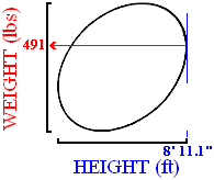
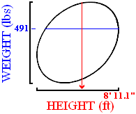
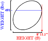

 Display 3-2. Alternative areas all characterized as "High X".